David Funkhouser’s History Of Typography
Typography, that ever-evolving art form and tool for expression, has enjoyed a long and dynamic journey from the first letterpress to tomorrow’s next digital device. Here, Funkhaus Partner and Design Principal David Funkhouser leads the way on a journey through the history of the typography that influenced him as a designer and the work of all of us here at Funkhaus. Read on to learn more and get some visual inspiration of your own.
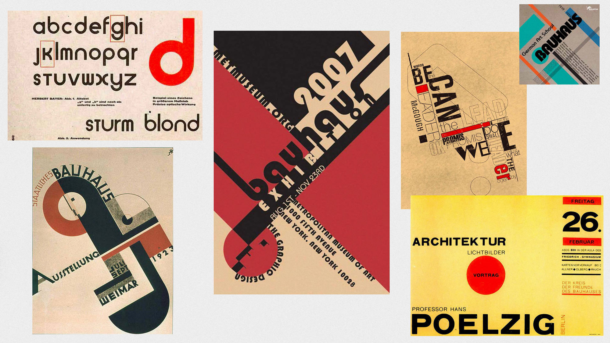
Post Bauhaus & World War I
Our typography tour begins in the 1930s, where the end of WWI gave way to an uncluttered, Bauhaus-inspired aesthetic and an influx of geometric, sans-serif letterforms that prioritized balance and practicality. The Bauhaus movement was so influential on my design sensibilities that I chose a typeface called Baby Mine (very Bauhaus) when it came time to brand Funkhaus.
Hand Crafted + Drawn Type
Many printed materials were hand drawn and printed at this time, lending themselves to a crafty look, full of personality and with nostalgia practically built in. Although the clean sleek typefaces of ‘the now’ are digitally created, there's something about making a little tweak here and there within the letterforms that adds a humanistic element and gives a quality of craftsmanship to the layout. One of the first projects we did as Funkhaus for Mark Mothersbaugh of Devo, Mutato, heavily embraced the hand-crafted aesthetic.
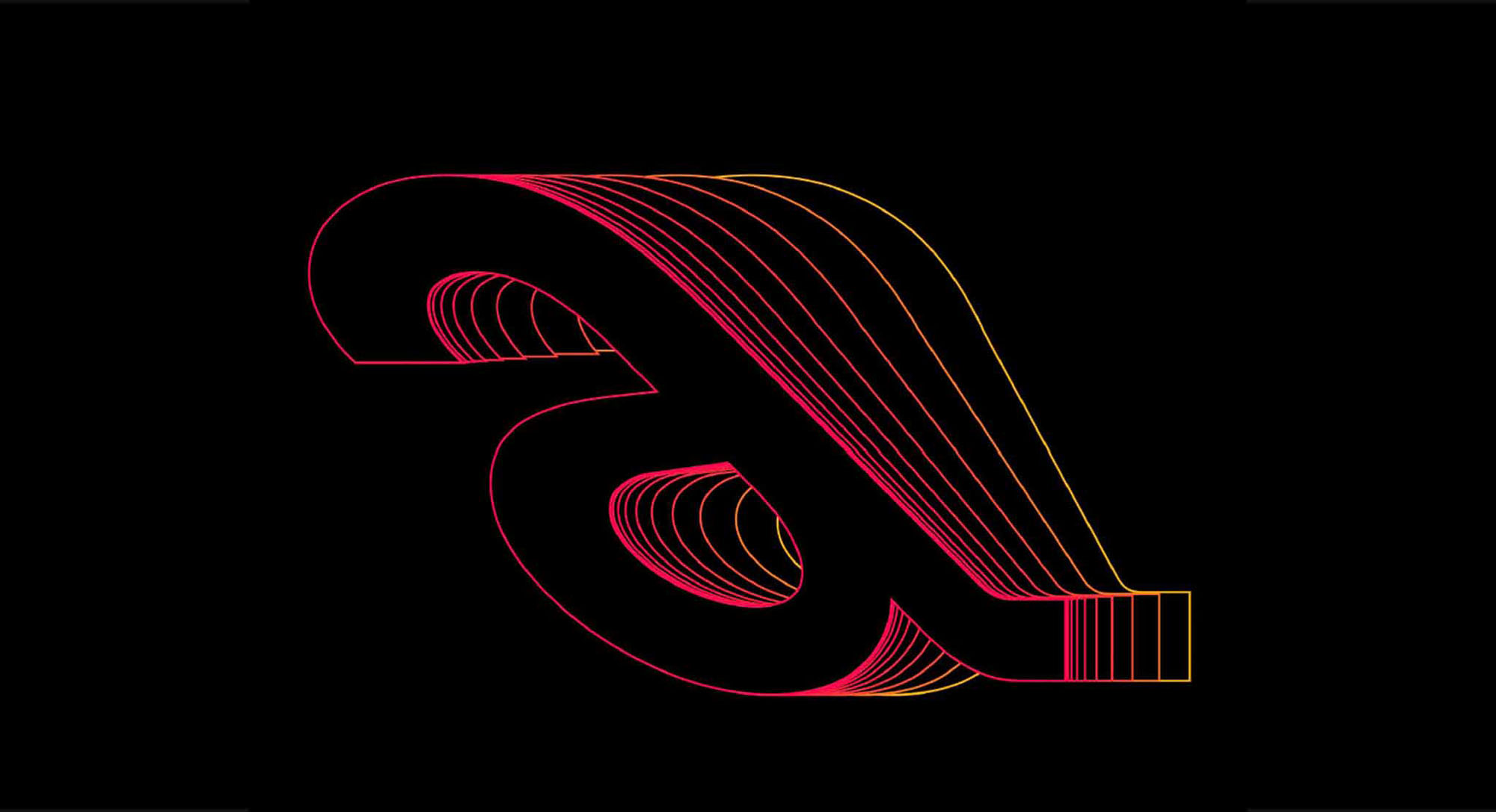
Evolution from Wood to Metal Type
Over time, the industry transitioned from wood to metal type, resulting in a dramatic shift in the way we set and designed typefaces. This recently released typeface, Denim, is a total throwback to this age of type. The subtle dents and imperfections of the heavy use of metal type are accentuated and replicated in this modern font.
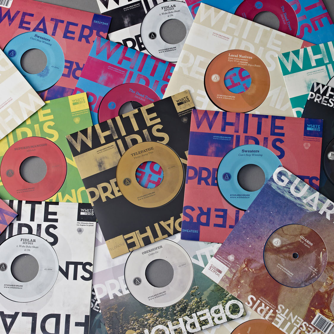
Disco & Psychedelics
The sixties and seventies brought more freedom in many respects, including the realm of design. The use of psychedelics and the rise of disco fever influenced design at this time, resulting in more intense colors, free-flowing lines, and kaleidoscopic patterns. My hand was guided by this movement when we designed a series of 7” covers for White Iris.
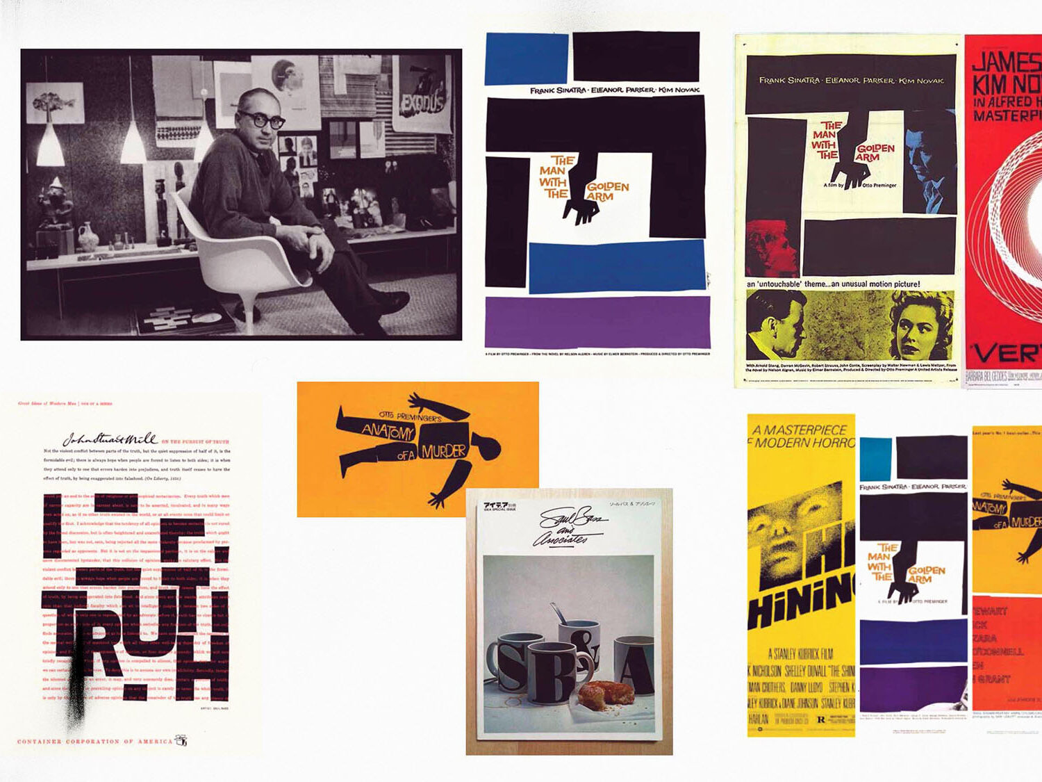
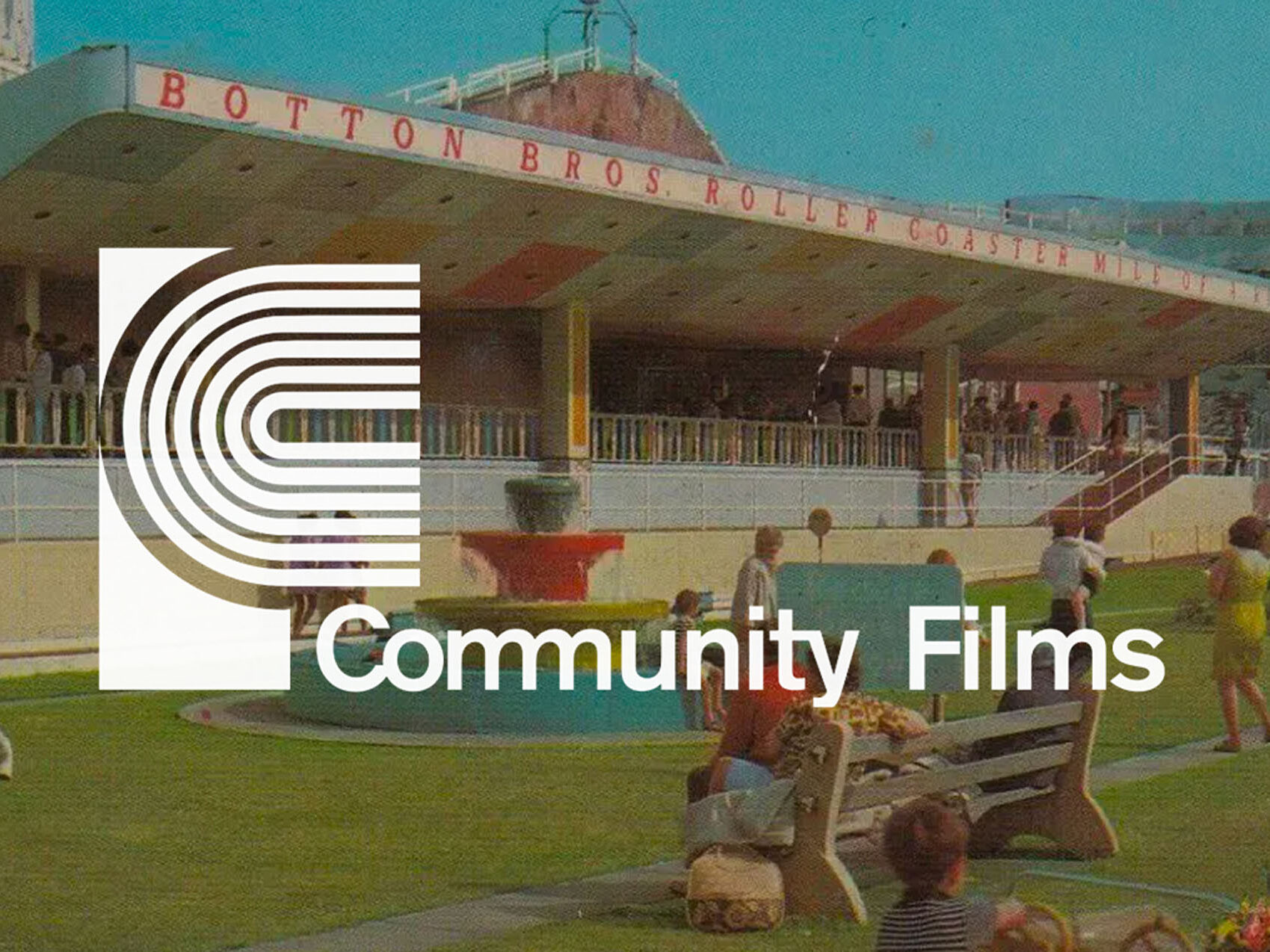
Iconography
Many brands, including ABC, UPS, and more, began to embrace the use of standalone icons to make their brands more engaging and recognizable, and to convey big ideas with a single mark. The design decisions we made while working on website and branding for both Community Films & Biscuit were very much influenced by this movement, and have been strong enough to stand the test of time.
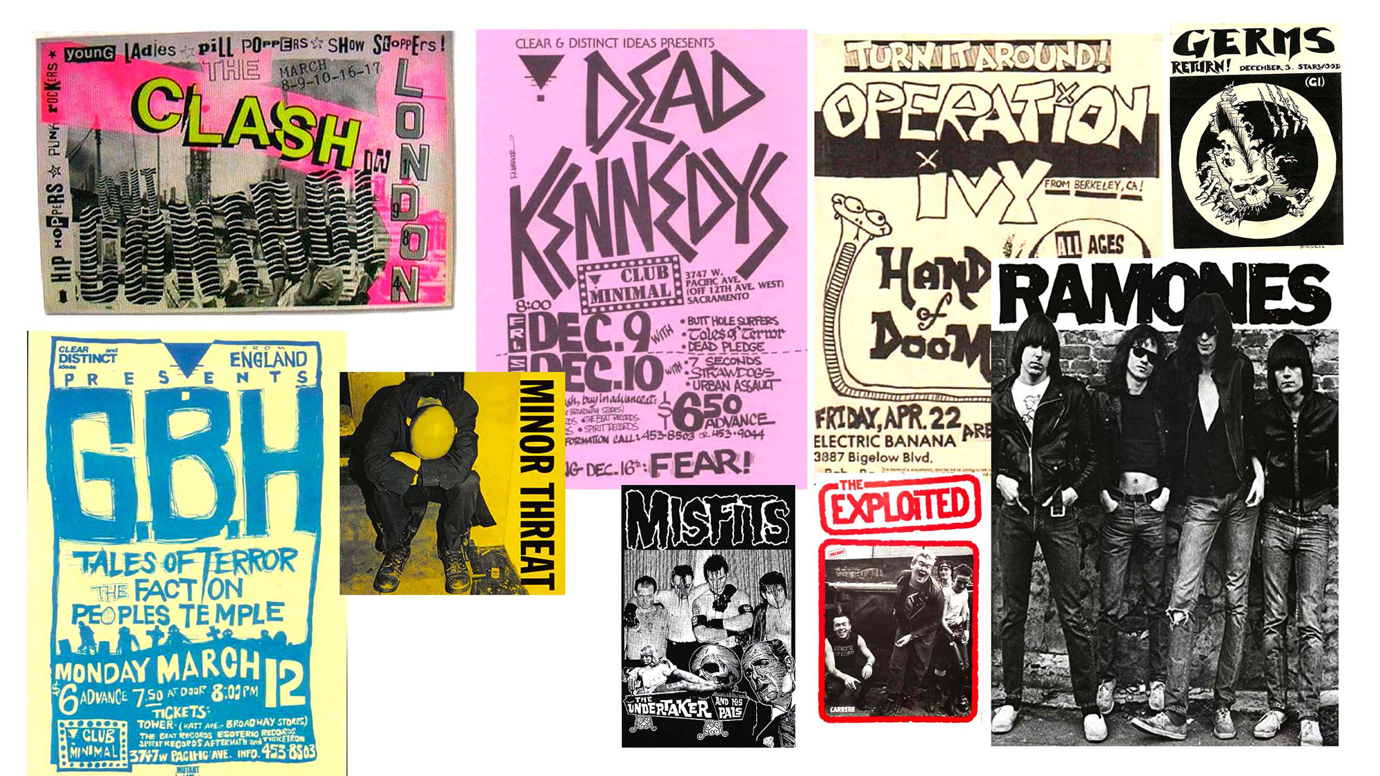
Punk DIY
The 80s brought a radical shift with the rising popularity of punk — both the music and the aesthetic — resulting in the spread of grittier, DIY design reflected in show posters created using sharpies and Xerox machines. I grew up going to punk and goth shows in the early 90s, and that’s really what got me interested in design.
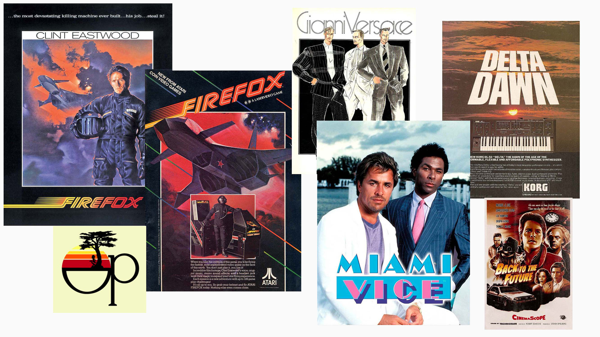
Miami & The Cocaine Generation
On the flip side, the 80s were also defined by the slick and shiny design associated with the glitz and luxury of life in Miami — plus fairly heavy cocaine use. There was nothing like going shopping at the mall in the 80s, rocking my neon Ocean Pacific Body Glove attire, then coming home to watch Miami Vice and Night Rider. That was a huge influence on how I regard working with chunky typefaces and all the gaudy effects you can take advantage of when it comes to design.
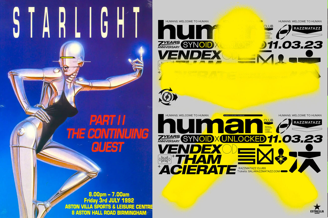
Rave Flyers
A majority of the typeface designers of the late 90s and early 2000s were based out of London, where the ‘all-night rave scene’ was exploding. With young designers (myself being one of them) and art school kids in attendance, these raves were a perfect opportunity for the digital type revolution to converge and produce a truly never-before-seen electronic aesthetic. After a trip to London I took with my fellow art kids in 1999, my inspiration levels were at 110%. All the clubs we hit up and all the posters we saw — it was a flood of design inspiration for layout, color, and type.
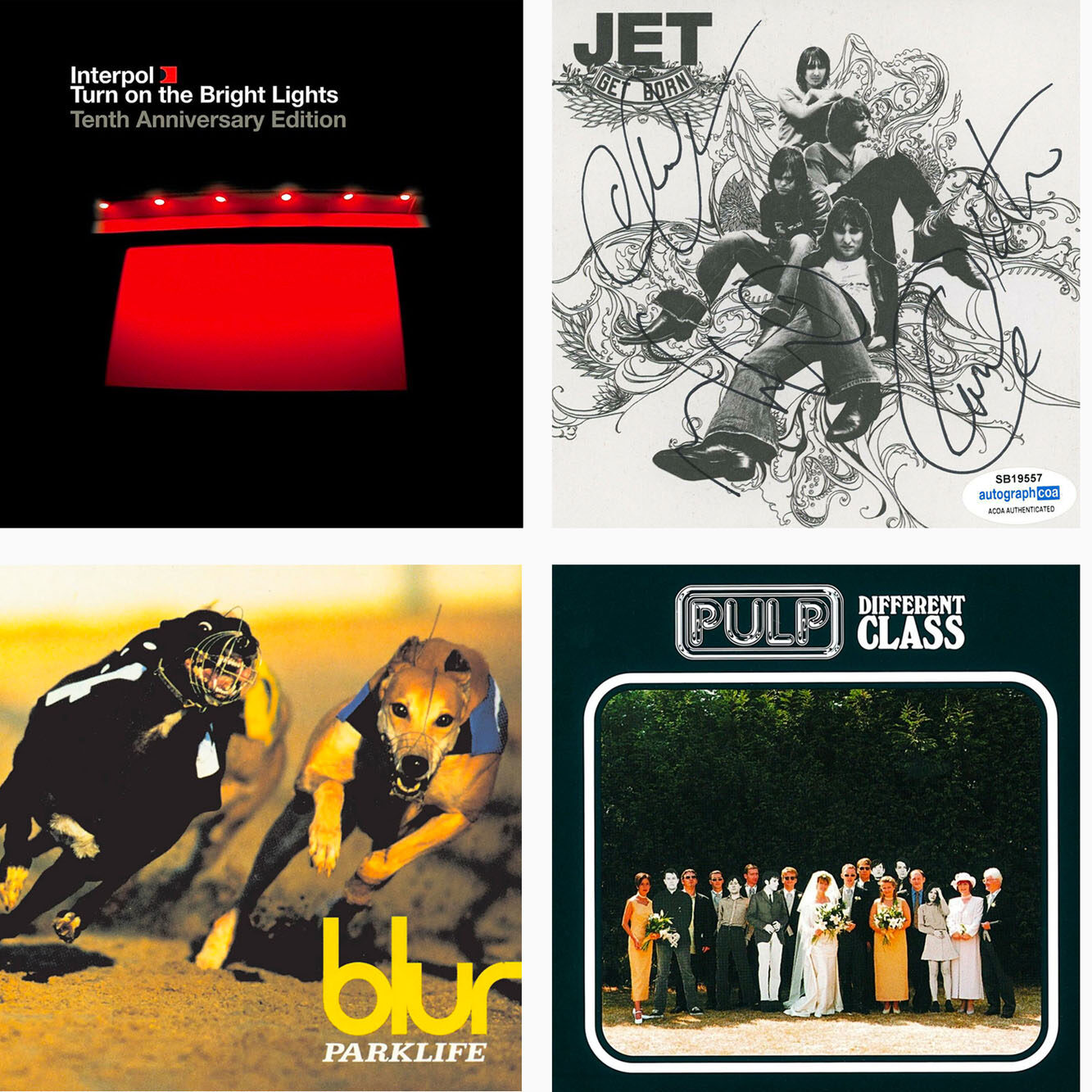
Album Cover Art
This was a golden age of album art, as shown by these cassettes and CDs. A cursory glance through offerings at any record store will prove that these influences are still alive and well today. And don’t forget the art of designing mixtape covers for your friends — cutting up collages with X-Acto blades and assembling them with Scotch tape was my first real world layout experience.
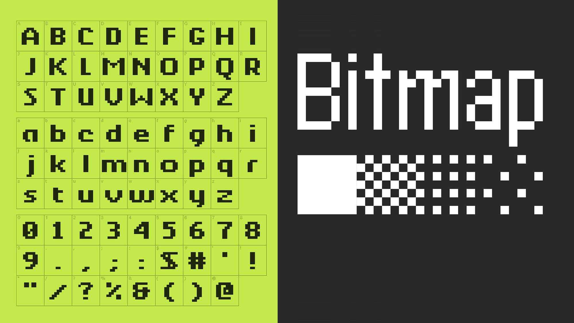
Dawn of Digital Type
These decades ushered in the widespread availability of computers and the age of digital type, punctuated by bitmap, or raster fonts, which use a combination of dots to create individual characters. I spent many hours in front of my Apple G3 on a 56k modem downloading endless free typefaces, which I still have to this day.
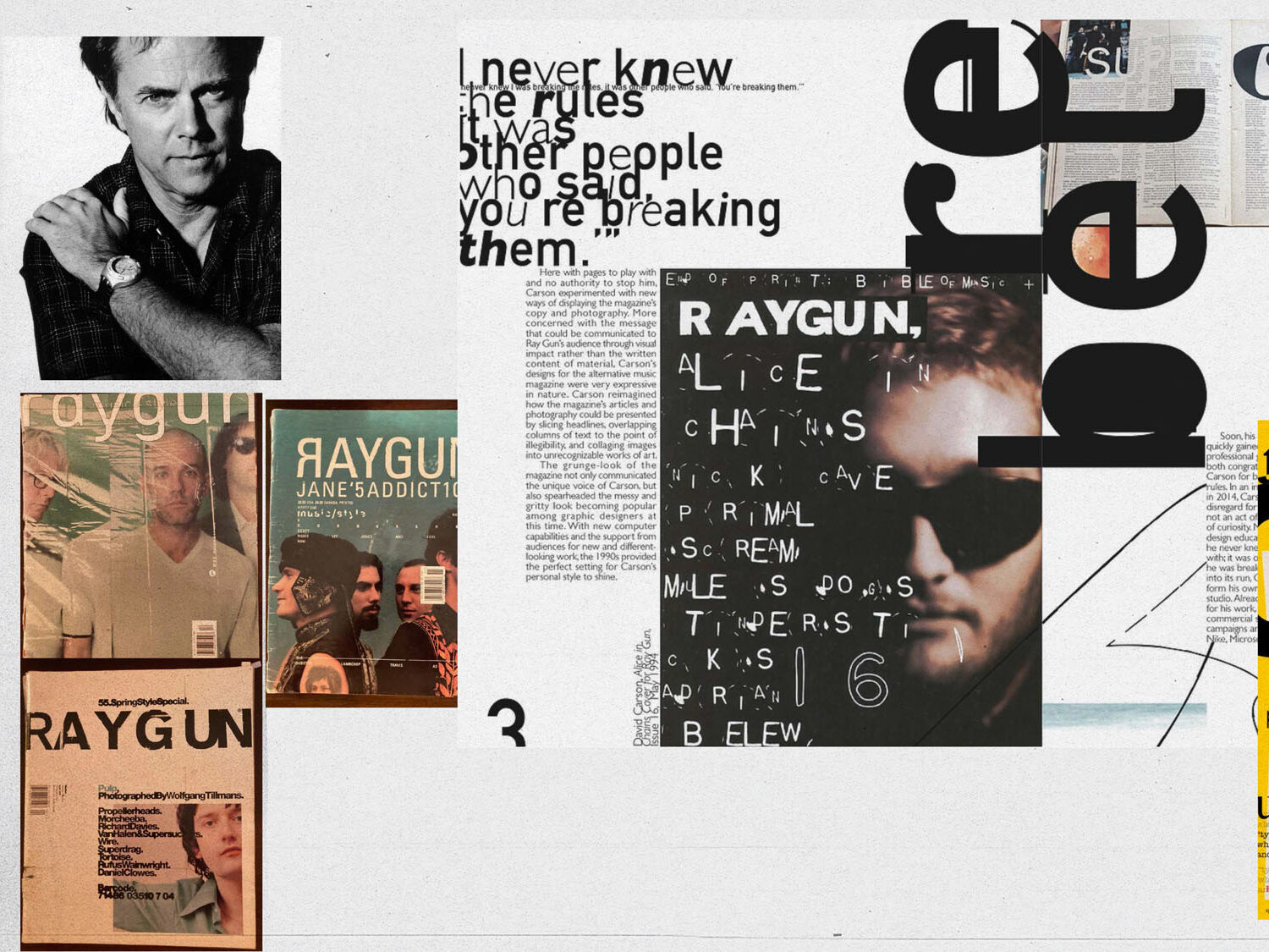
David Carson’s Influence
American graphic designer David Carson’s unconventional style revolutionized typeface in the 1990s, with the distressed textures, layered backgrounds and distinctive, rough layouts he used throughout his designs. In art school, we all wanted to design like Carson and break all the rules. Unfortunately, our professors were trying to teach us the fundamentals of design, and this style was definitely not allowed.
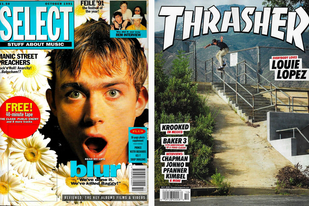
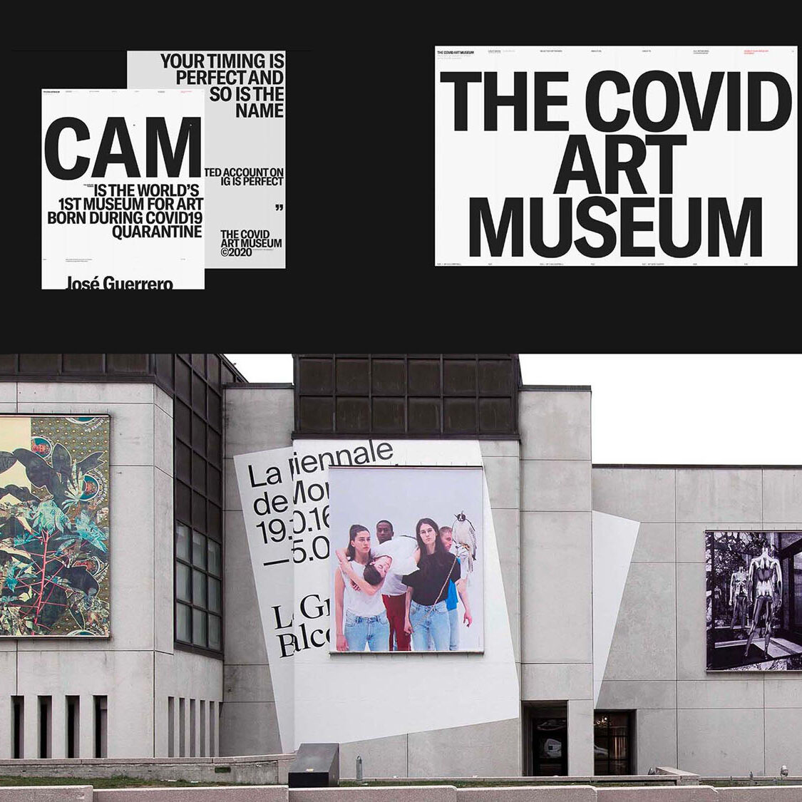
Magazines’ Last Stand
With the advent of digital publications and emergence of blogging in the late 90s, the market of magazines began to fizzle. As a result, magazine designers took their final stand against the digital dissemination of text, with bold and irreverent use of type and image on the printed page. I was living in ATL at this time, and with no design blogs (or any blogs) to speak of, the only way I could find inspiration was by going to the book store and picking up the latest magazines.
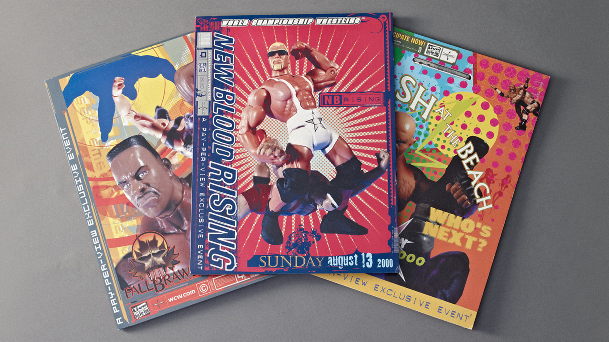
Aftermath of David Carson
In the wake of Carson’s immense influence, his signature roughness and distressed qualities seeped into the advertising world as a whole. You can see echoes of this in unexpected places, like these designs for World Championship Wrestling.
Now that the tools of the trade — Apple computers, Adobe software, digital typeface software, and digital cameras — were democratized and more affordable to the common designer, we saw an explosion in the pure volume of typefaces available for download. In rebellion to the wild style of Carson, the pendulum swung back to cleaner typefaces — a few of our favorites are Avenir, which was designed in the 80s but made a resurgence at this time, Helvetica Inserat Compressed, and Akzidenz-Grotesk.
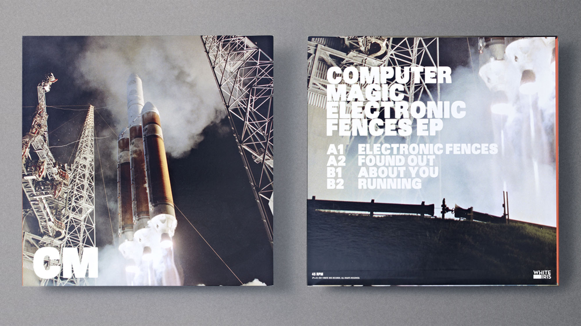
Hipsters Barfed Brandon Onto The Scene
You know the typeface in question — it was inescapable at this time. As hipster aesthetics came into vogue, so did Brandon Grotesque, a font as warm and inviting as a pour of whiskey in a mason jar. I used it in the album design for the Electronic Fences EP by Computer Magic.
Swiss Resurgence in Fashion
Swiss modernism attracted designers in many disciplines for its simplicity, neutrality, and predictable uniformity. As it found increased popularity in the fashion world, the corresponding type was in demand as well. While I'll always love this timeless style, I will admit I’m experiencing Swiss fatigue. To keep it fresh, we need to expand upon the core tenants of the movement to push it forward from a layout perspective.
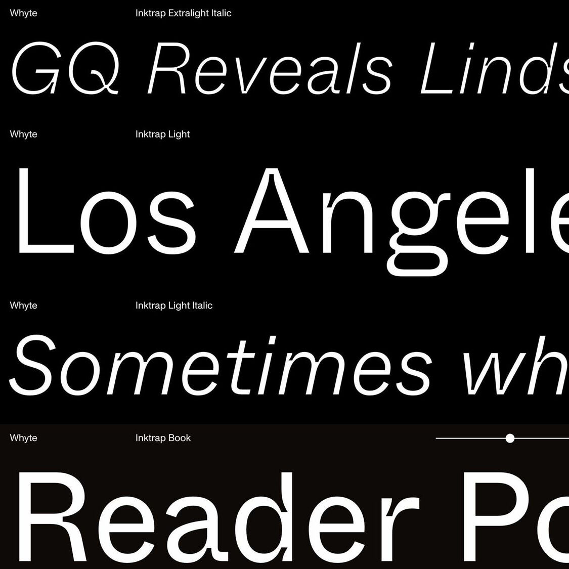
Ink Traps
Though ink traps — negative spaces built into letterforms to keep ink from pooling and unintentionally boldening text — once served a practical purpose, however in modern typefaces they are usually included for the sake of style. Timeless, or a flash in the pan…only time will tell.
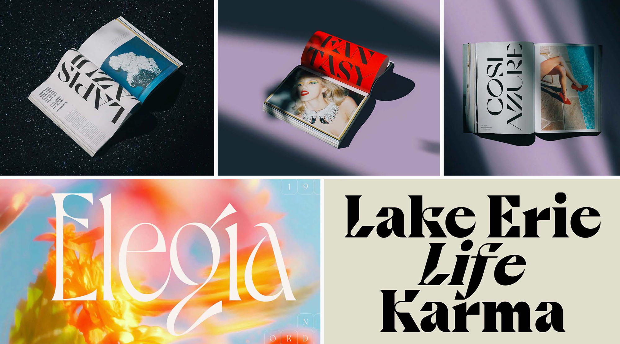
Idiosyncratic Fluid
Hearkening back to psychedelic design in a fresh way, these typefaces combine organic movement with sophisticated serifs and flourish-like embellishments that are surprisingly modern and elegant. This movement was very unexpected, but these typefaces can really add a lot to any product or hospitality branding design project.
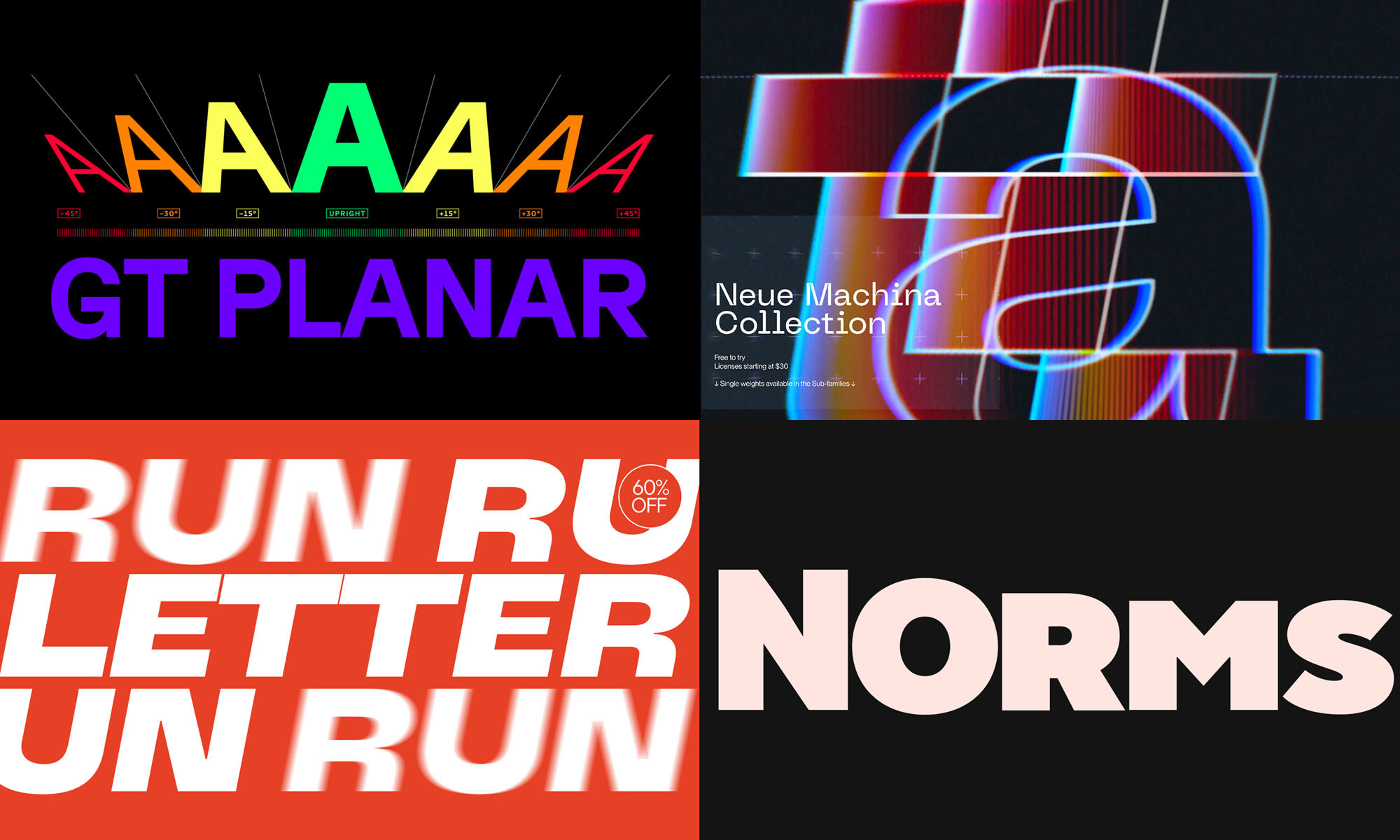
Variable type
Variable fonts — or OpenType Font Variations — remove the explicit distinctions between different weights and styles, creating endless possibilities for the slant, weight, or width of type. The fluidity of motion and kinetic expression that it gives to the designer is the way forward. We have a site launching soon that we designed using this type, and we’re making it a mandate at Funkhaus to use Variable Type whenever we get the chance — it's the next level.