Making CO Architects
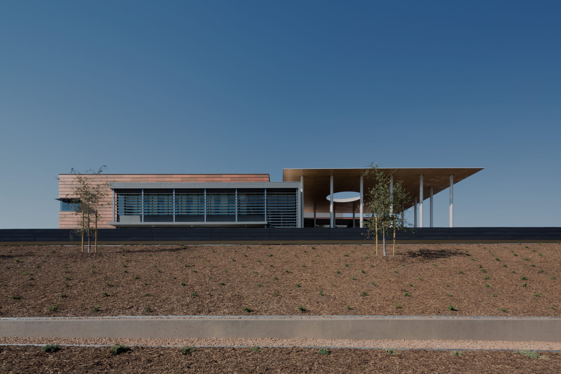
How we forged a true collaboration and created a site that stands out in the architecture space.
The partnership between CO Architects and Funkhaus was a natural one from the start. They were looking for a firm that was local to Southern California to design a fresh site for them, and they saw in our entertainment portfolio that we are experts in the world of visual creative spaces and that our work lends itself well to architecture and hospitality. “Ultimately we found that there was a great cultural alignment between the two of us,” says CO Architects Design Principal Fabian Kremkus. “What was great about Funkhaus was the level of expertise that they brought to the table. They offered ideas, like the blueprint theme as a throughline on the site, that I've not seen anywhere else. We had a shared vision for the project that we worked for as a true team.”
Our first order of business was to conduct an extensive and thorough discovery exercise with the team. This meant interviewing 20 to 30 individuals from their organization across all their disciplines and asking questions about what they wanted from their website, which helped us not only solidify our goals with the project but determine how far we could push the design and the UX. “It was more than a design exercise - they were really looking to us for partnership in holding their hand and guiding them through how they positioned themselves digitally, knowing that they had a lot of stakeholders involved and that it needed a little bit of a therapy process,” says Nick Dies, our Managing Partner. “We encouraged them to be open and transparent, which ultimately helped us capture their story through their branding and their site.”
“What was great about Funkhaus was the level of expertise that they brought to the table. They offered ideas that I've not seen anywhere else. We had a shared vision for the project that we worked for as a true team.”
Fabian Kremkus, CO Architects Design Principal
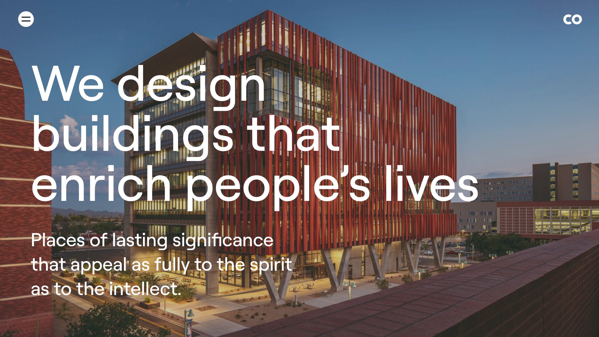
We distilled our findings and presented what we thought would be the best direction for them to occupy amongst their competitive set, while being true to themselves. “So many of the brand values are in their name — they're all about approachability, collaboration, and working together, so we knew that that’s where we were going to go with this website,” says Funkhaus Design Principal David Funkhouser. “We just needed to think about how we should audit the site and get intuitive as far as navigation, while allowing the design to be classic and subtle.”
To evolve their brand as it lives online, we gave CO Architects an aesthetic refresh, including an edited color scheme and a new typeface. Both of these elements not only paid homage to where their brand was, but served as modern updates that reflect where the brand is now. This site was an exercise in simplification - since their business is diverse across disciplines, we needed to ensure that their site was organized in a way that makes sense for the user, and that their menu was easy and enjoyable to navigate. “It would've been very easy for a firm to come to them and deliver a corporate presentation of the company,” says David. “We leveled it up by making sure to dig into their identity and embrace their DNA.”
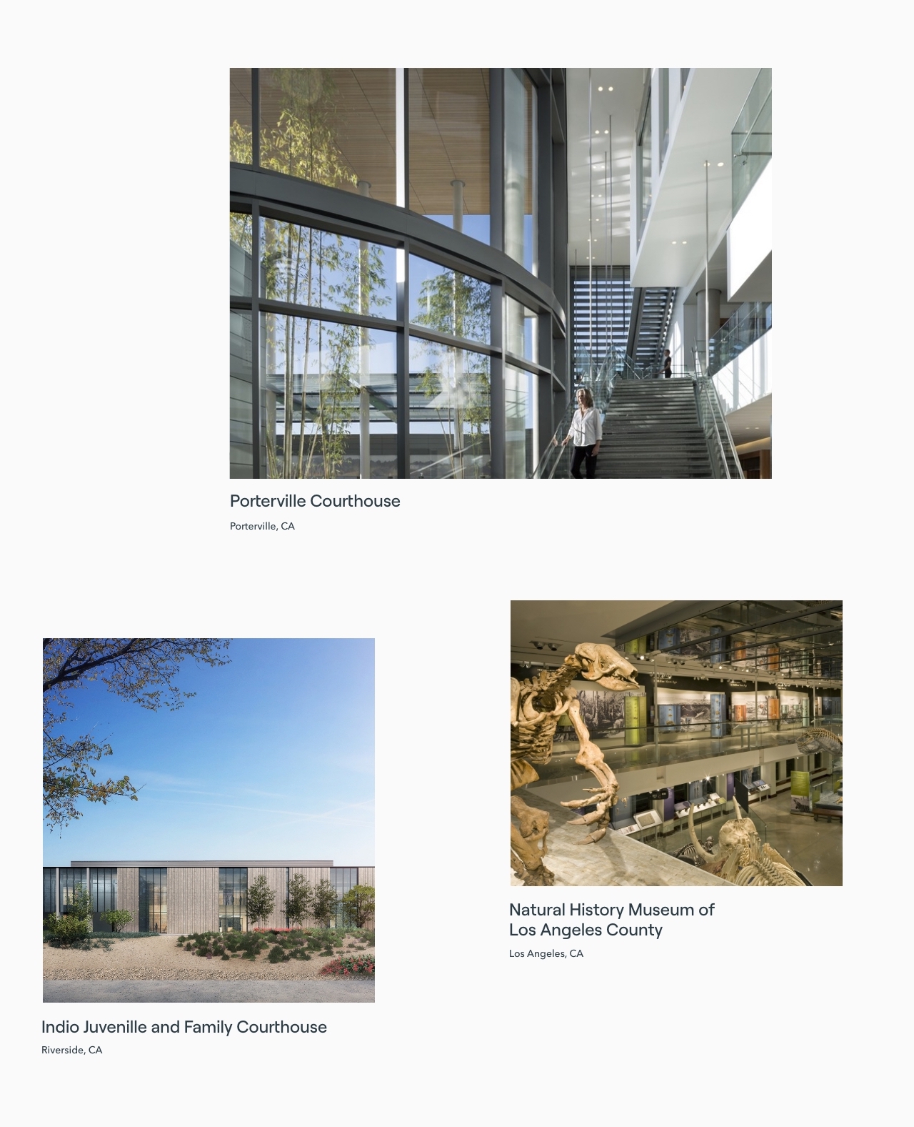
CO Architects are natural storytellers, and from the start they expressed a strong desire to share the narratives that drove each project on the site, including early ideation, process, and inspiration for the design. “To communicate visually that each one of their projects is rooted in its location, we used diptychs: pairing project photos with a photo of the landscape that inspired it,” says David. “It’s a subtle element but it really makes a difference, as it shows effort and attention to brand and story.” Though it required some continued lifting and commitment on the client’s end to execute, CO Architects was all in. They also allowed design to use negative space to their advantage as well throughout the site, which further allows them to showcase their work beautifully.
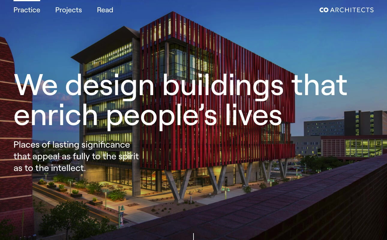
The biggest design risk and development challenge turned out to be the biggest win: the blueprint theme. When a user clicks on various parts of the menu, it reverts to a simplified schematic blueprint reminiscent of old-school architectural renderings. From design to execution, we knew this element of the site would be a standout. “The blueprint theme is a good example of edgy design and tech implementation coming together to create something memorable,” says Funkhaus Lead Developer Derek Chiampas. “Design and programming were really able to work with each other to execute this animation that flows with the site, fits the brand, and looks cool. Once we tackled those relatively complicated animations, including the blueprint theme and the rotating intro text, the rest of the site fell right into place.”
We considered this project finished only after we had set CO Architects for continued future success. Our content team polished the company’s messaging and created legacy content for their Journal section to have in their back pocket for launch. We also offered longer term suggestions for creative direction, which helped the project continue to evolve even after handoff. “We suggested that CO Architects hire a photographer to shoot updated headshots of their team to achieve a really polished and cohesive look,” says Dylan King, our Head of Operations. “They followed through with that, which was a great move that showed continued commitment to their visual identity.”
In the end, CO Architects lived up to their name: they were true collaborators on this project, allowing us to get creative and embracing new ideas. “They were open to dialogue about what's working and what's not,” says Nick. “We made sure there was a diplomacy to the design that worked for everybody. We also had a really strong partnership with the core group of stakeholders, who were good at giving us valuable feedback.” From a design standpoint, our team found that working with a group of design-minded architects was uniquely rewarding. “It was very gratifying to work with such wonderful students — as architects, they’ve done years of schooling to get their credentials, and they're super detail-oriented, but they're also very aesthetically minded,” says David. “They’re pros in their space, so we all appreciate how much they trusted us as far as all things creative.”
“It was an inspirational process,” says Fabian. “In the end, Funkhaus created a site that as a whole represents us so much better than what existed before.”