Making Songs from Scratch

How we built the digital manifestation of a one-of-a-kind musical experience.
When Yours Truly Creative approached Funkhaus with this creatively challenging project, we knew we were in for something good. This is one we’re particularly proud of — and not just because we won a Webby for it (although that doesn’t hurt). Whenever we can execute on such a unique, experimental, and gratifying project, we’re happy.
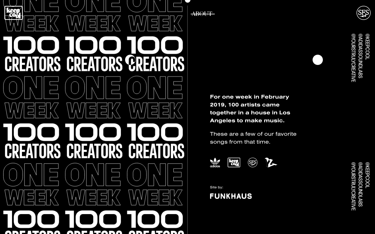
Yours Truly asked us to partner with them to ideate and build a site that would memorialize the music and imagery from the Songs from Scratch writer’s camp — a weekend event hosted by adidas Originals where songwriters and musicians from different backgrounds came together to create something that sounds totally new. Just like the songs that come out of Songs from Scratch sessions, this project was a brand new vision. “Designing and building dynamic websites that display imagery and video in compelling, design forward ways is something we’re really good at here at Funkhaus, but it’s not often we get to do that in an experimental, art-house way, so it was a challenge I was excited for,” says Rick Baker, senior designer at Funkhaus.

As with any creative challenge, some brainstorming was required — so we headed to the whiteboard. “We were given free rein to get creative here, since we were building something that we’d never seen before,” says Nick Dies, partnerships director at Funkhaus. “Ultimately, what we set out to create was an art piece that really does justice to the concept at hand.” As a team, we experimented with new ideas, played with animation examples, mockups, and prototypes, and drew inspiration from previous Songs from Scratch imagery.
Babak Khoshnoud, co-founder and creative director of Yours Truly Creative
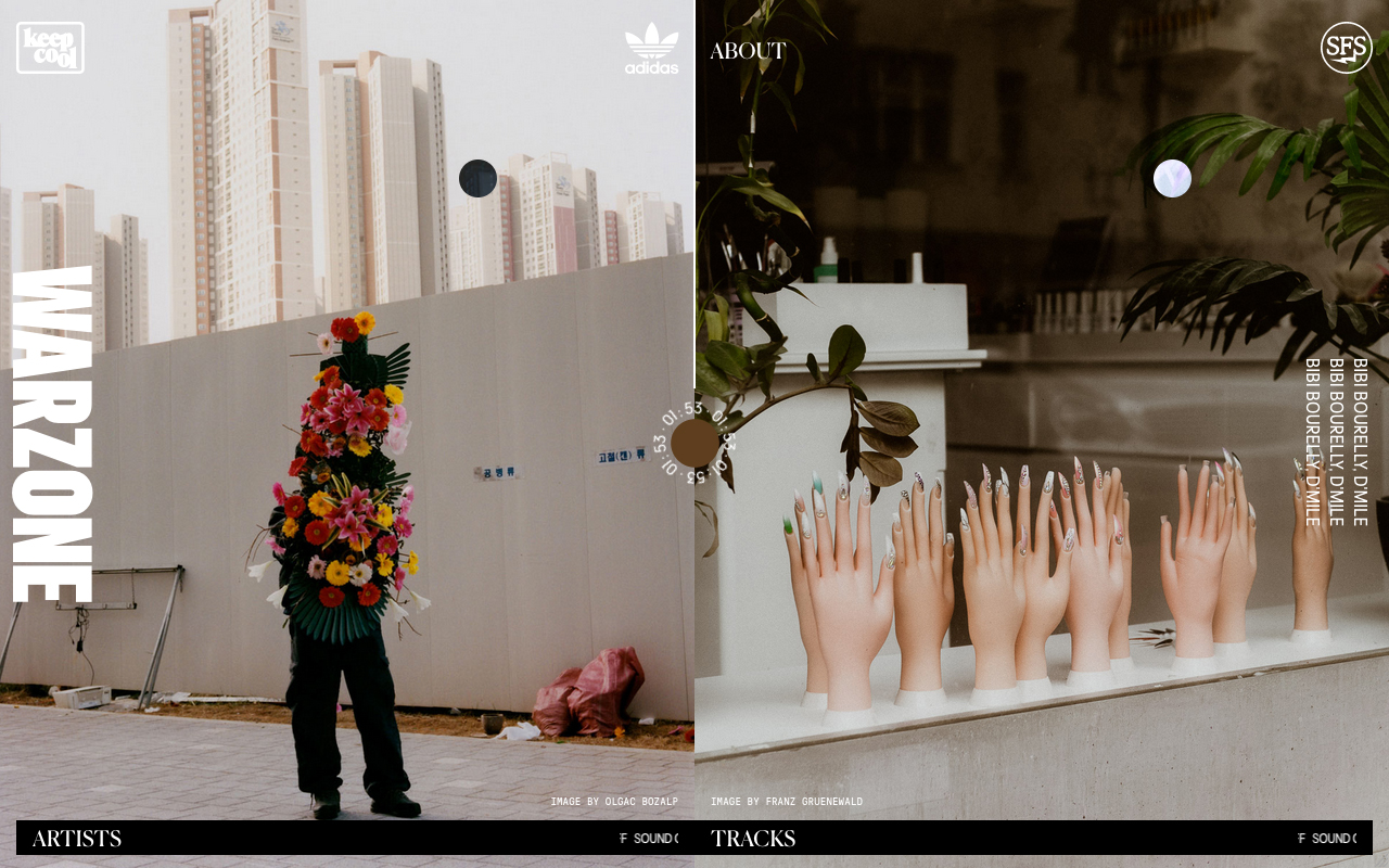
We set out to create a space that invited the user to slow down, watch, and listen. “We wanted people to take their time with the music, as if they were a passenger on the train and watching a beautiful landscape go by,” says Babak. “I equate this experience with that — time slows down and you're not worried about anything else but listening to the music.” To set the scene for a sitback experience and visually represent the duality and connection of two artists coming together in harmony, we decided to play on the idea of a diptych, which meant housing simultaneously changing images side by side on the page, controlled by a dual cursor, and paired with a bespoke music player. As the user listens to a track, the site randomizes image combinations to provide a visual backdrop for the song. Scrolling switches up both the track and the images.

“The dual cursor effect and the way the slideshow of images is timed to the music are the big wow factors for me,” says Drew Baker, technical director at Funkhaus. “I don’t think I’d ever seen that done before, and the designers really knocked it out of the park.” This aspect of the site took some real thinking and collaboration, and a lot of tweaking between design and development. “The dual cursor required some hard thinking of how the user experience could educate one about a radical user interface,” adds Rick. “That entry experience was really important to nail, but we also needed to consider how different navigation elements and menus would be accessible no matter which cursor the user decided was the primary one.”

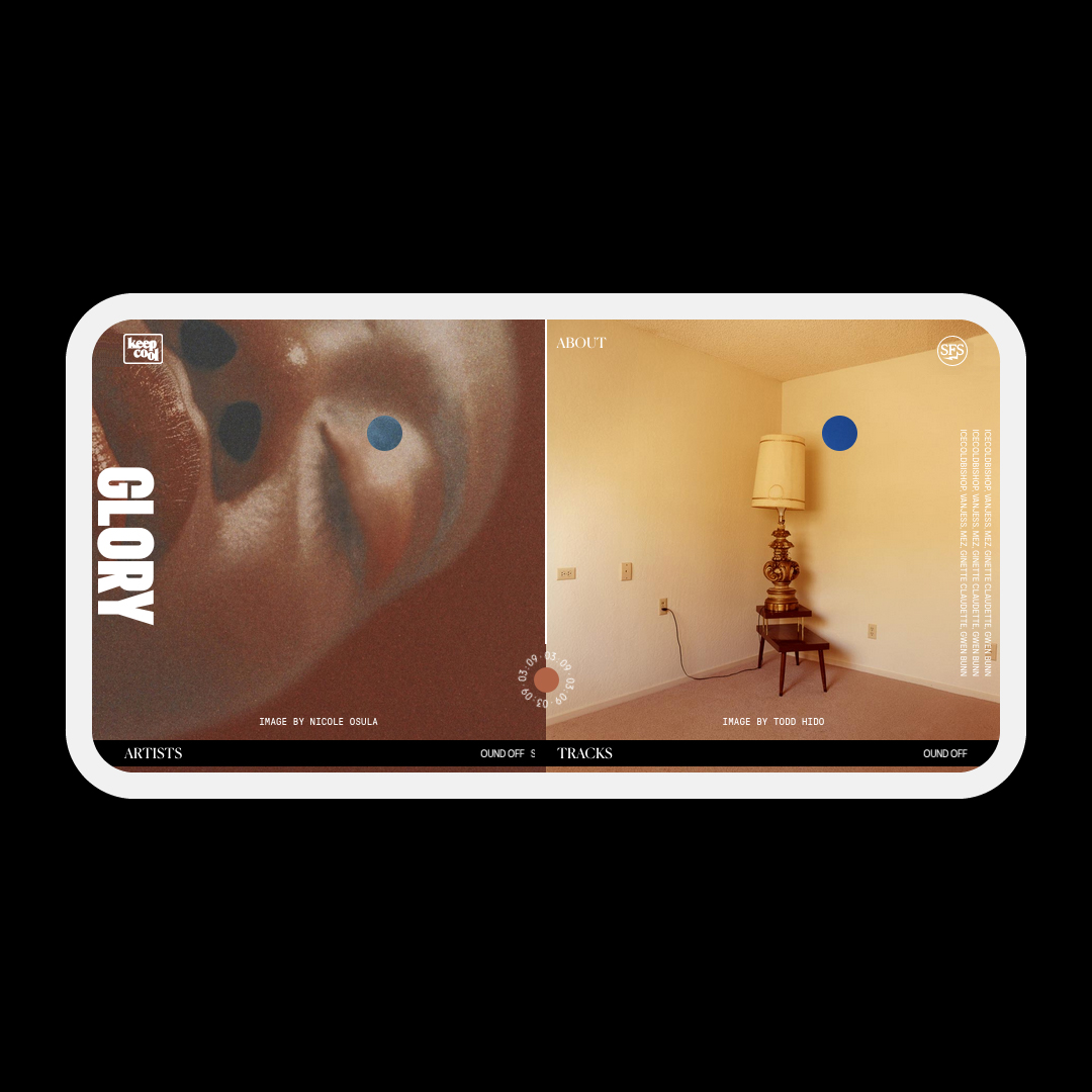
It was top of mind for the team to make sure that the site not only loaded quickly and smoothly, but worked as well as possible across all devices. To make sure that the mobile experience was top notch, we limited use on phones to a landscape format, prompting the user to turn their phone at site entry. The music player, built to respond to scrolling, uses a Javascript library called Howler.js, which was a first for the team. Another first was sorting the image library based on file color; this color-matches the images as a user scrolls through the site and creates a subtle but impactful visual effect. “I hoped that subconsciously, the viewer would ‘feel’ the imagery like they would 'feel’ a song,” notes Rick.
The site framework was built on a Nuxt frontend running as a static site, powered by a headless Wordpress CMS that the Adidas Soundless team could update after site launch. “That’s the biggest win for me, that the site is something that can evolve,” says Babak. “It’s a tool we can continue to use to showcase new music in the future.”
All in all, this now Webby-winning project is a testament to how collaboration opens doors to creativity. “I’m proud to have taken on an initiative that took some company investment as far as thinking outside the box and using our medium in the digital space to work with a truly creative concept,” says Nick. “Having a partner like Yours Truly that is so highly creative, our powers really accentuated each other and gave us a strong pedestal to live online.” Make sure to check out the site here.