Making Strada: How We Built A New Brand & Website For This Bay Area Developer

Creating a holistic, approachable digital presence for an established development company.
San Francisco-based Strada Investment Group came to us through a friendly introduction, and once we began chatting with their team, we got an immediate impression of where they wanted to go with the next phase of their company. Founding Partner Jesse Blout had served as Deputy Chief of Staff to Mayor Gavin Newsom, acting as the chief advisor on all land use, development, and economic policy matters before moving into real estate and development. Joining with Principal Michael Cohen, they built Strada on the foundational idea that a real estate company can achieve outstanding results through a commitment to civic leadership, creative deal sourcing, and a relentless focus on project execution.
At Strada’s inception, it was all about establishing legitimacy and presenting themselves as a strong, pedigreed firm. Now that some time had passed, the team felt that they were ready to refocus. “Strada’s rebrand shifted them away from their earlier financial-focused strategy and toward a holistic, community based development practice,” says Nick Dies, our Managing Partner. “The way they think about their projects goes beyond the property line, considering the surrounding impact and how to give back to the broader community stakeholders.”

With this new goal in mind, we set out to help Strada lean into their approachability by softening their image, using their website to tell the story behind their company and behind each project, and delivering a brand new website along with updated brand identity and positioning and a fresh new logomark. Though the work they do is often in large, institutional fields, the people behind the projects are cool, engaging, smart, and determined, and those characteristics come through in the language used to talk about Strada.

When it came to the brand mark, we took the opportunity to play around with case and curvature. Making their mark lowercase and adding softer swoops to their logomark communicates a friendliness that sets them apart. The final form of the logomark is strong, contemporary, approachable, and fundamentally architectural.
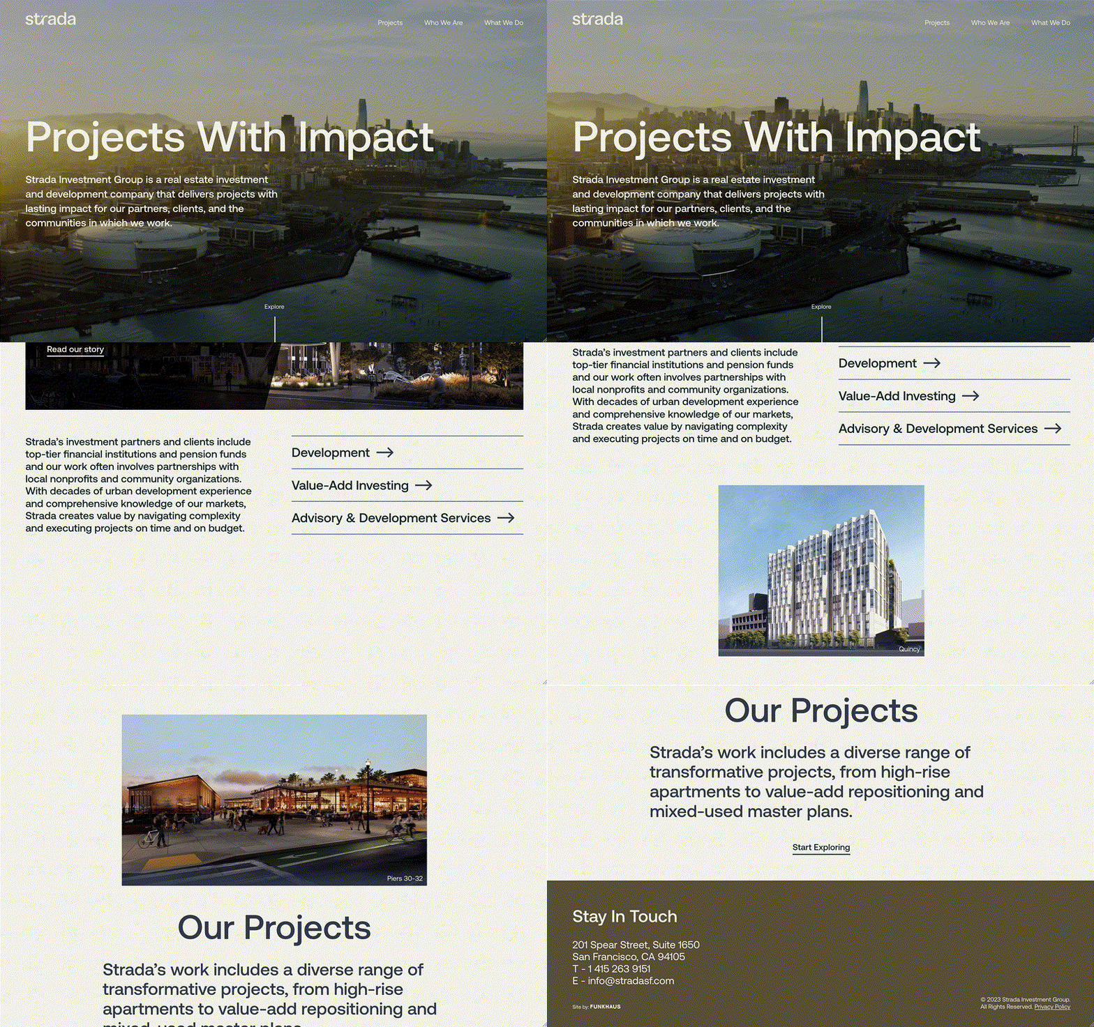
While working on the new brand, we also considered how we could use their website as a platform to showcase the company’s approachable authority. “Strada is able to take complexity in any given project and distill and demystify it so it's accessible and simple for everyone involved — from those in charge of on-the-ground construction to investors,” says our Design Principal Dave Funkhouser. “In turn, we made design choices that take the breadth and depth of their capabilities and streamline it into a fresh, holistic presentation.” Now, their new case study framework tells the stories behind their projects, giving the user a dynamic way to interact with their portfolio, which ranges in scale and complexity.

Imbuing Strada’s personality into every element of the project was top of mind throughout this rebrand, as well as considering how this new framework can grow with them. At the end of the day, Strada’s established strengths and their proclivity for complexity shine in all elements of their new digital presence.
Read more about our collaboration with Strada in our case study.
Interested in learning how Funkhaus can help you with a rebrand of your own? Email us at whatsup@funkhaus.us.