Sketch vs Adobe XD – Why this Design Shop Decided to Go All In on XD

Funkhaus Design Director Rick Baker explains his preference for using Adobe XD.
Q: Adobe versus Sketch. How did you go about choosing?
A: The decision to use XD involved months of extensive research, combined with thoroughly assessing our needs, our clients’ needs, and anticipating the evolution of those needs as we move into the future. We evaluated how we present designs to clients, how the project management team shares and collects feedback, and how design communicates with development.
With all of that in mind, we thought XD was a good all-in-one solution to those needs. We also already had access to the Adobe suite, so the fact that it was a part of that ecosystem was a positive.
Using an industry standard software such as Sketch is beneficial when your teams are scattered or you rely on outsourcing. But our development team and our designers are in-house, which made it far easier to adapt to a new software and simultaneously educate ourselves.
Q: Considering the market’s options of design softwares, why XD?
A: We wanted to make communicating design to the client more effective. Sketch revolutionized the UI of all design apps, however Adobe really understood the balance between being a fast design tool, presenting to the client, receiving client feedback, and then handing it off to a developer, all without 3rd party services like InVision or Zeppelin. It has been exciting to pair a new design workflow with a state-of-the-art tech stack that both push each other.
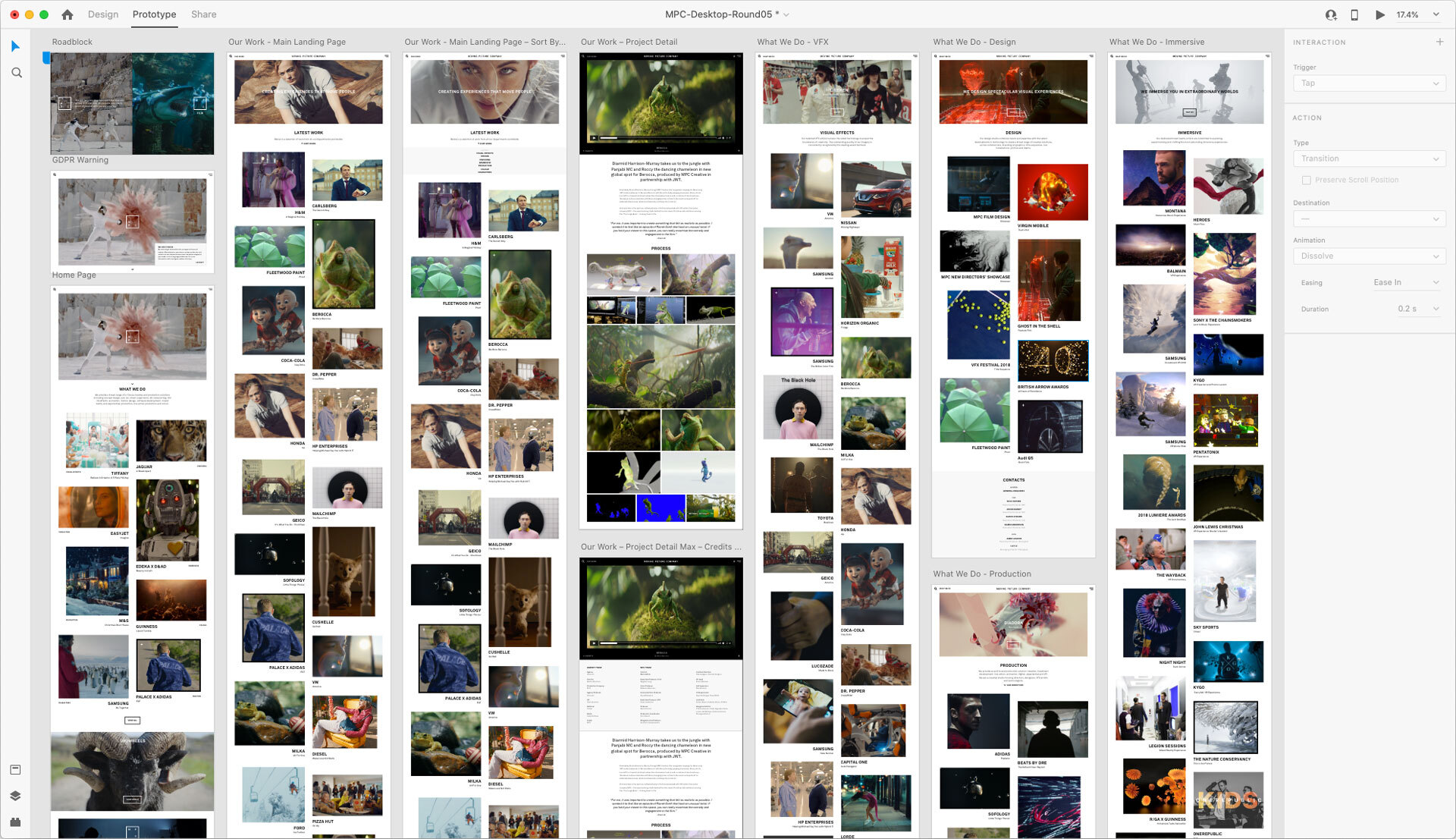
All of that is to say the most important aspect of XD is not so much its design capabilities as much as its prototype capabilities. XD allows extremely fast prototyping, and allows clients to leave comments directly within the Adobe ecosystem which expedites the entire process, making the collaboration smoother for us and for the client. If anything, clients now expect that level of intuitive integration.

Q: What challenges did you face when switching tools?
A: As the Design Director, I had to teach my team a new workflow and tool set, develop best-practices, and then learn alongside the project management team how clients want to use XD. I knew it would take a commitment for my own education on the tool, and given the frequency of updates, XD certainly requires an early adopters' attitude to new features and concepts. On that, we’ve found internal cross pollination of new techniques very beneficial. Of course, you have to think long term and this is for sure paying dividends!
Q: What are the drawbacks to using XD?
A: When we first switched tools, there was some basic functionality that XD did not have yet that Sketch/Figma/InVision Studio did offer, such as components/symbols. However, Adobe deploys updates frequently, maybe every month. So we had to adopt a bit of patience while they worked in some of the expected functions of the peer offerings. We just got hover-states, and their implementation could be better, but so far Adobe has shown real commitment to building upon XD.
There is a strong trend in the UI and UX design community towards animations, and we think that’s going to continue to grow in concert with browser and online technology advancements. While I respect Adobe’s effort to give us prototyping tools that are industry-leading fast, I think its offloading to After Effects of more advanced animation is a negative. I can foresee needing another high-fidelity animation tool if clients continue to seek that trend beyond the prototyping abilities of XD, which is a challenge given the lack of compatibility of XD outside the Adobe suite.
Overall, we have been very pleased with the decision to switch to XD. Clients have responded well to it and the development team prefer it. Certain designs are not possible to translate in a flat design, but with the capabilities of XD, we can communicate UI and UX to a client with greater precision and efficiency. We are excited that this software has amplified the design process by unifying programming and motion.