Holland Partners, an established real estate investment and development company, came to Funkhaus drawn by our design sensibility and our roots as an LA-based firm. Since that first introduction, we’ve collaborated on three emerging communities, building brand worlds from the ground up, including names, identities, and the visual language for each upcoming building.
Holland Partners
Strong, storied identities for design-forward properties
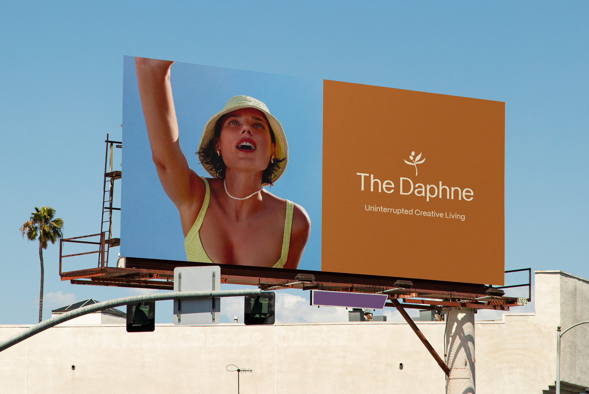
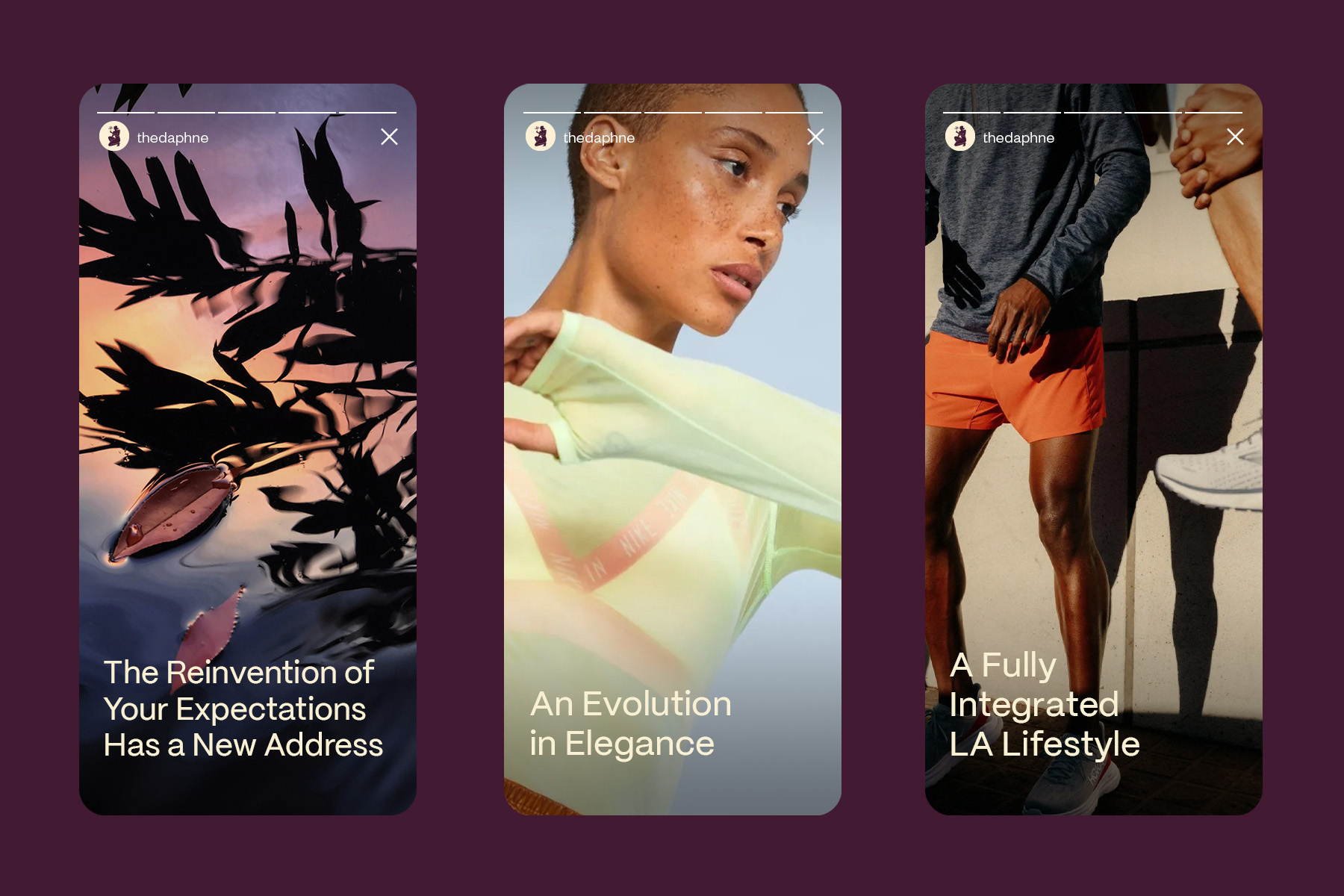
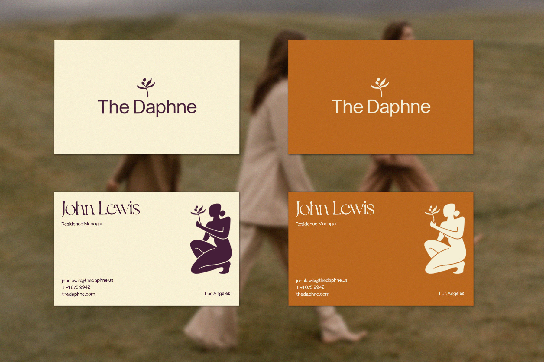
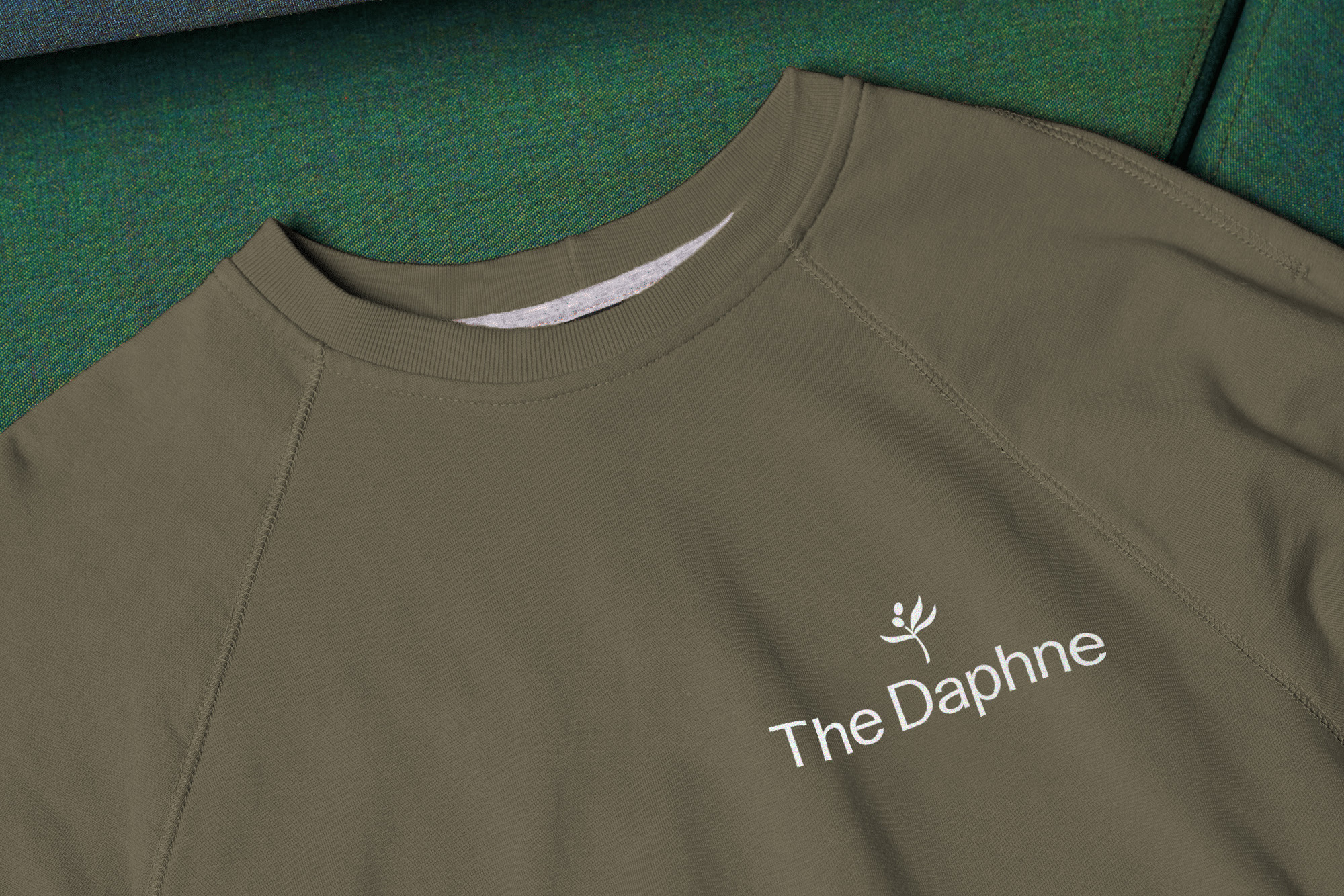
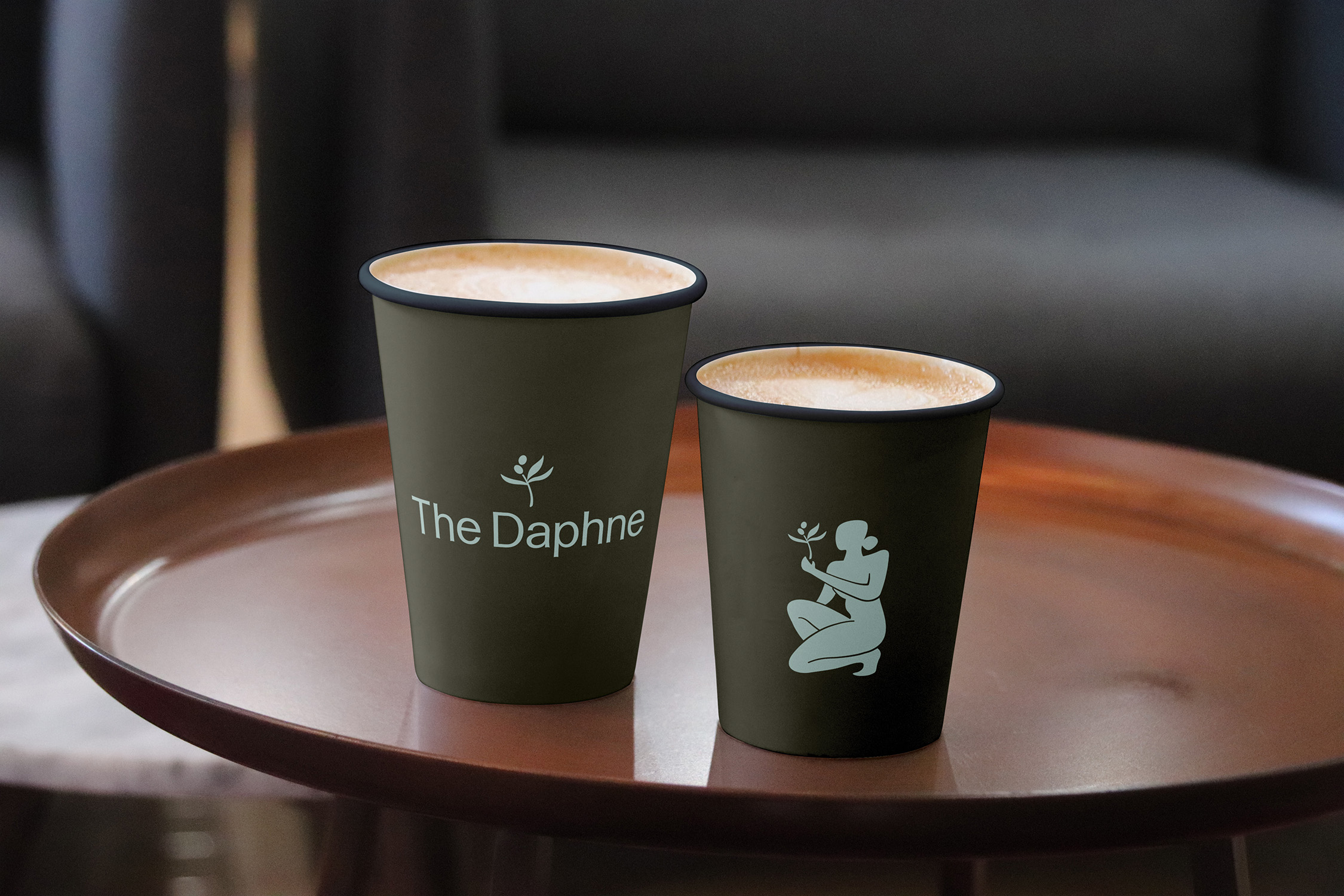
The Daphne
A classical oasis for creatives on 3rd & Fairfax
Named for the Laurel Nymph of Greek mythology, the Daphne’s moniker pays homage to the lush laurel trees that are emblematic of the area and the namesake of the canyon that feeds into the street where the property sits. Their new mark — combined with a humanistic logotype that echoes text chiseled into marble and a classic color palette — is sensual and modern, inspired by Matisse’s forms, and perfectly balanced between feminine and masculine elements.

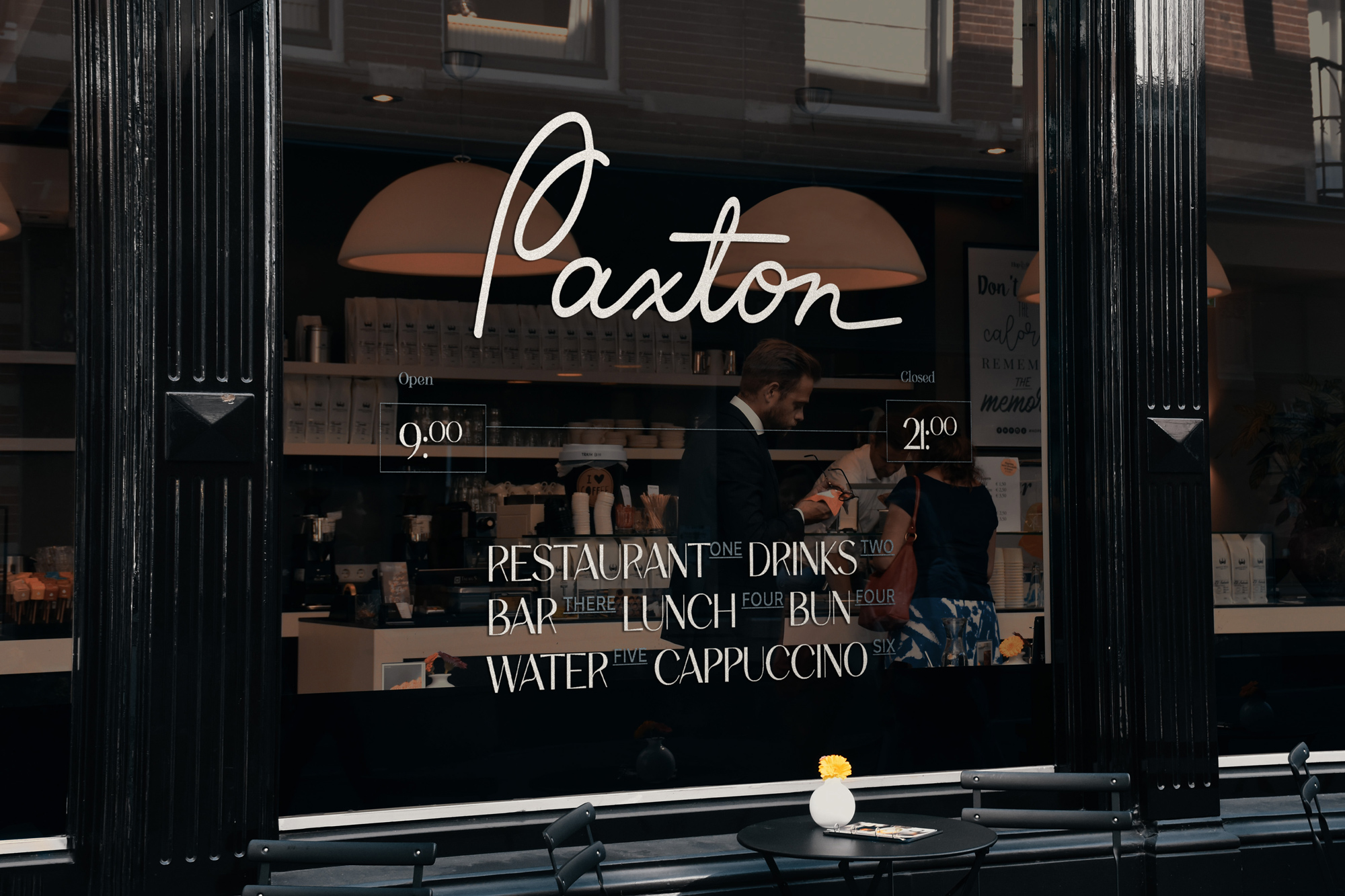
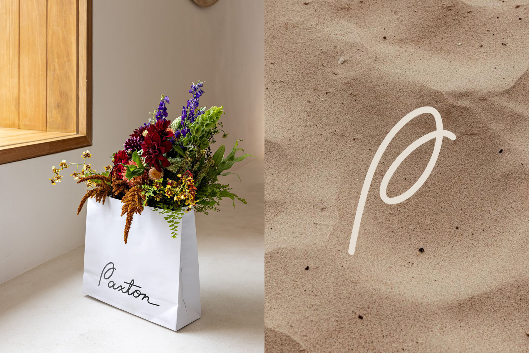
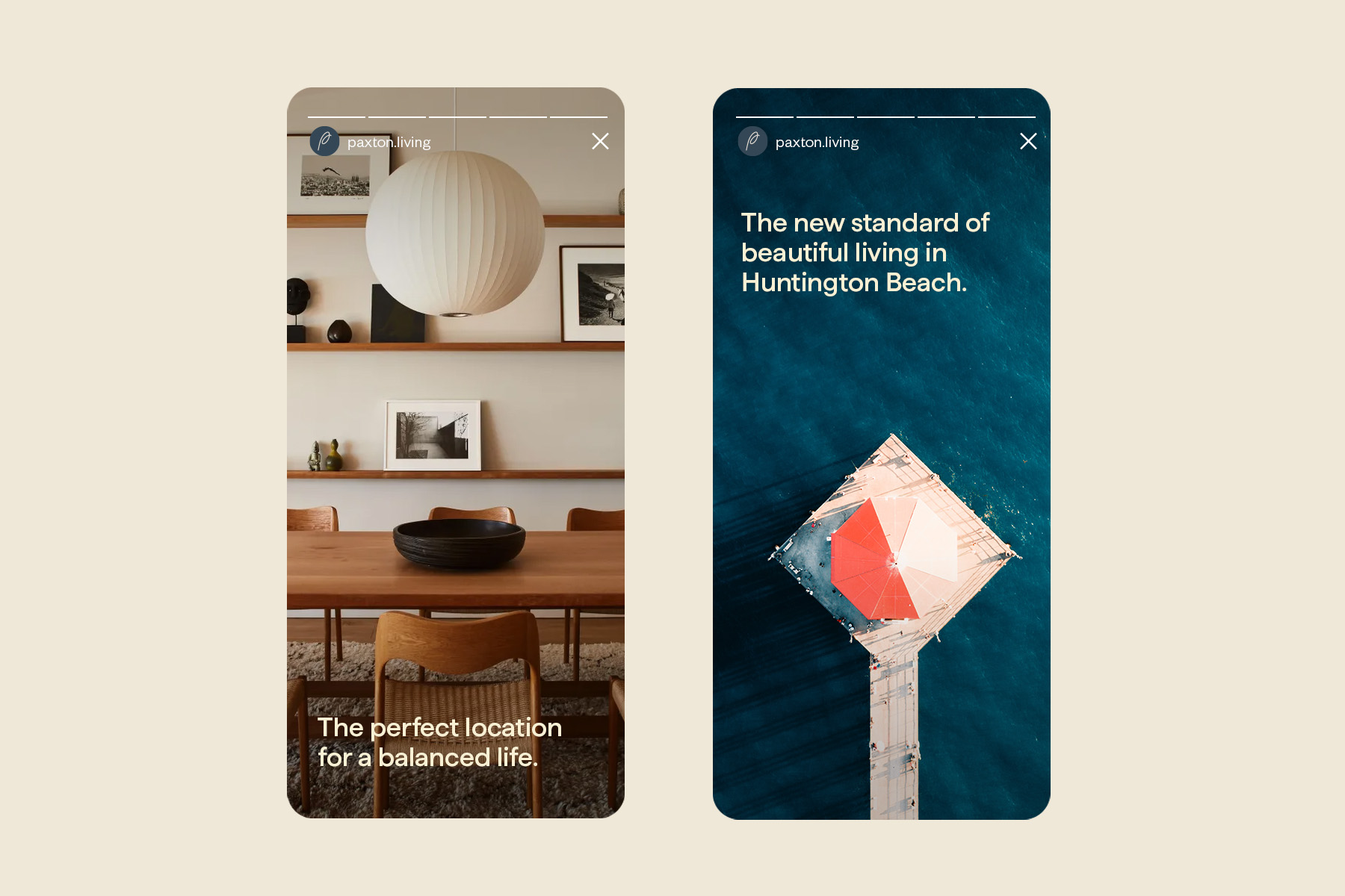
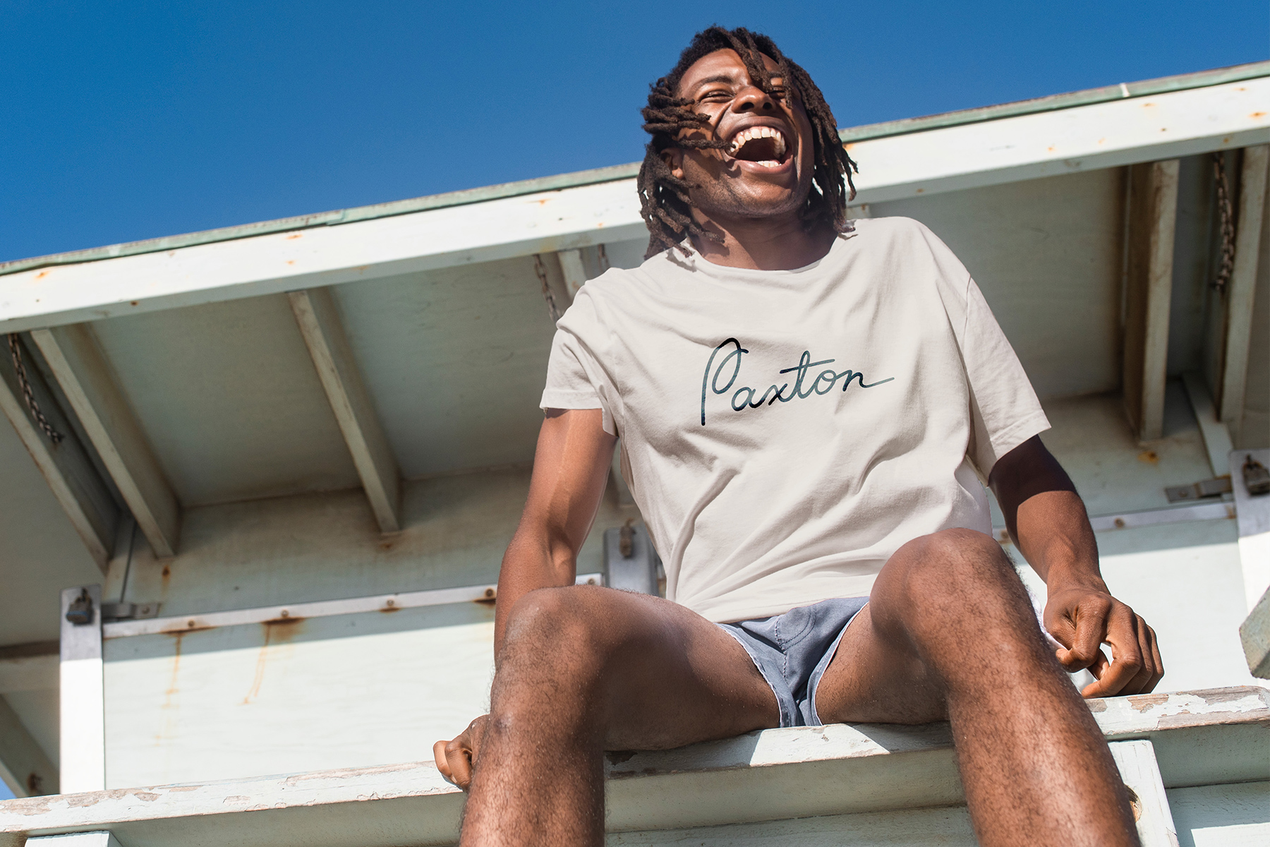
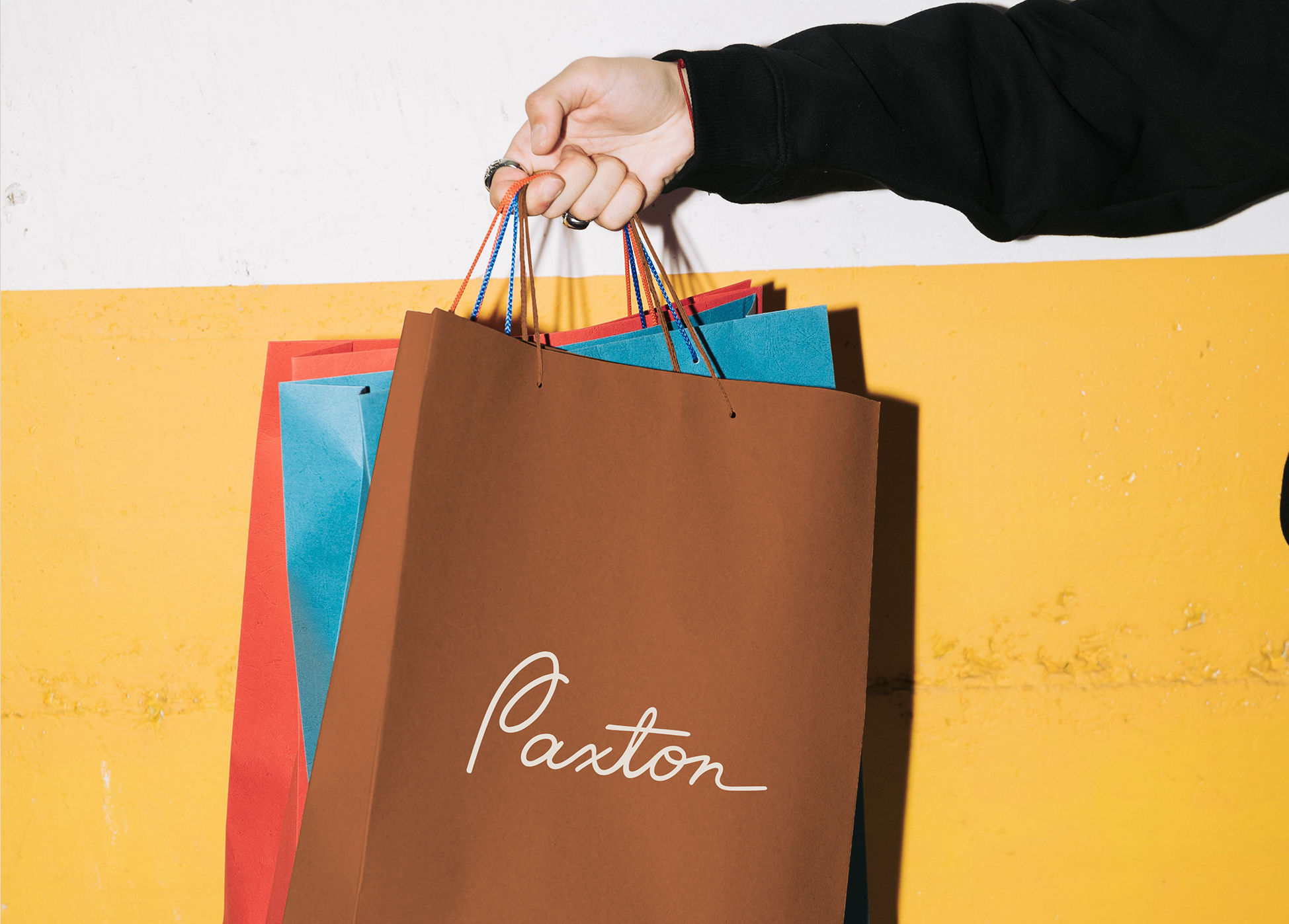
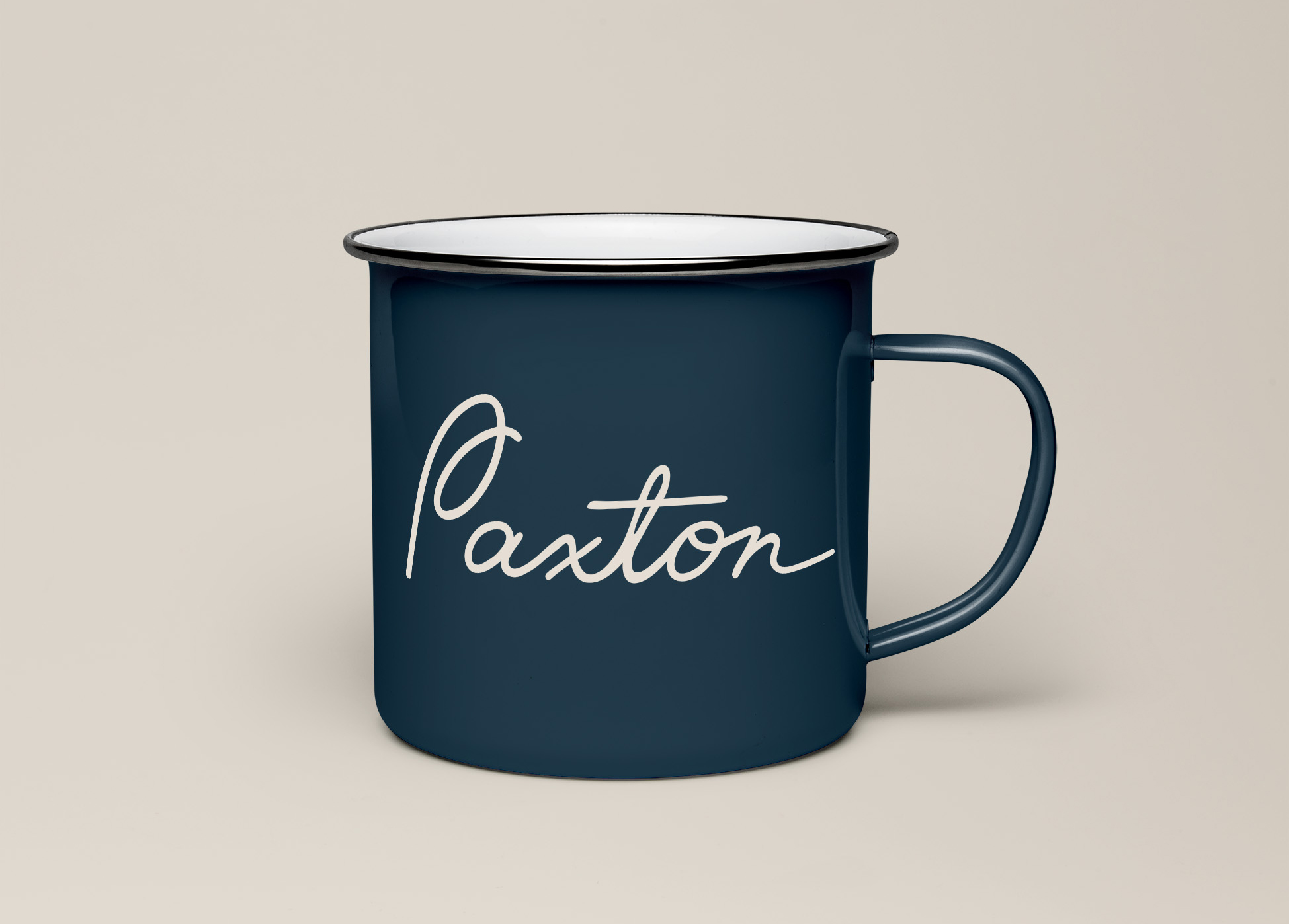
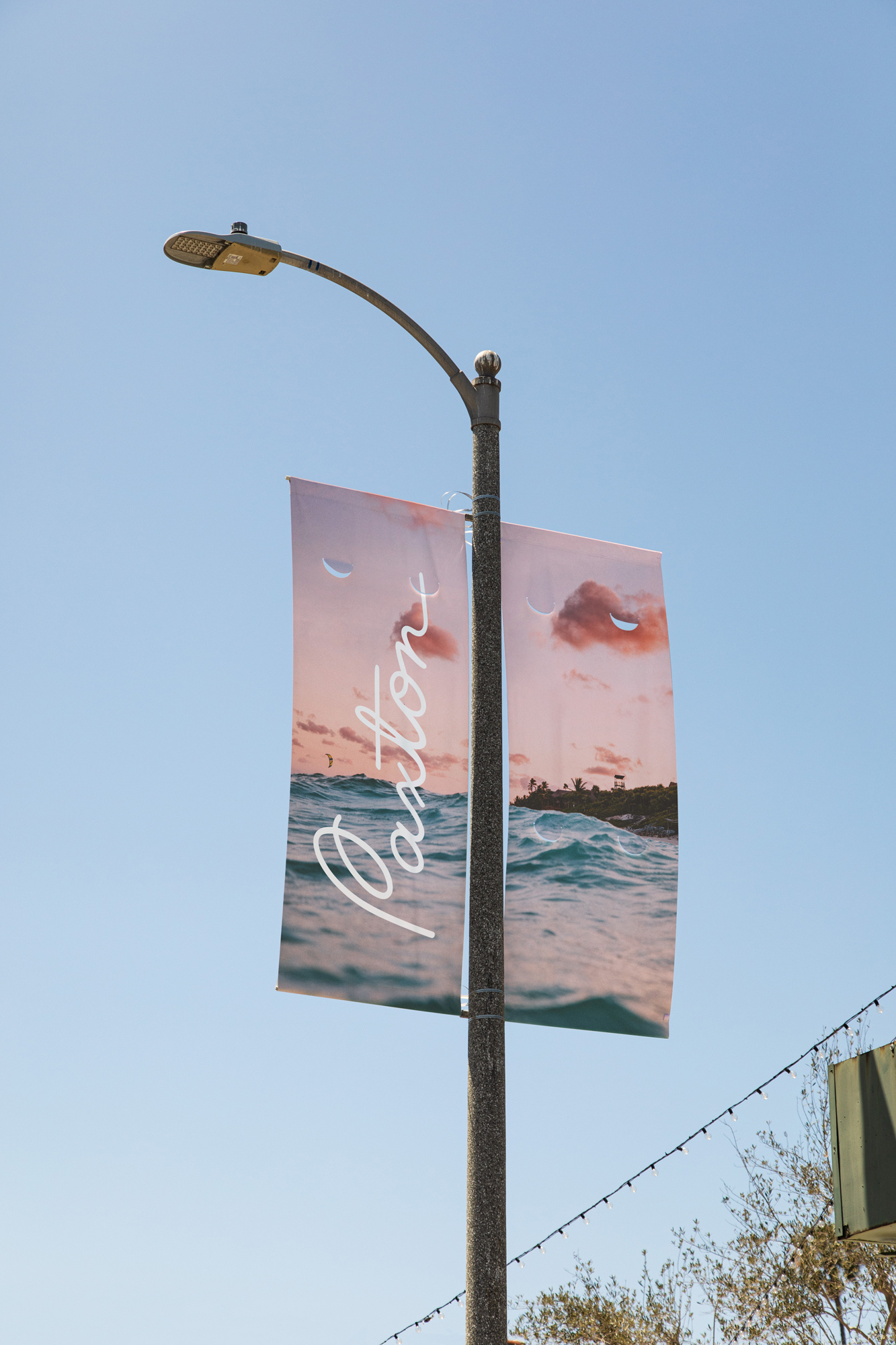
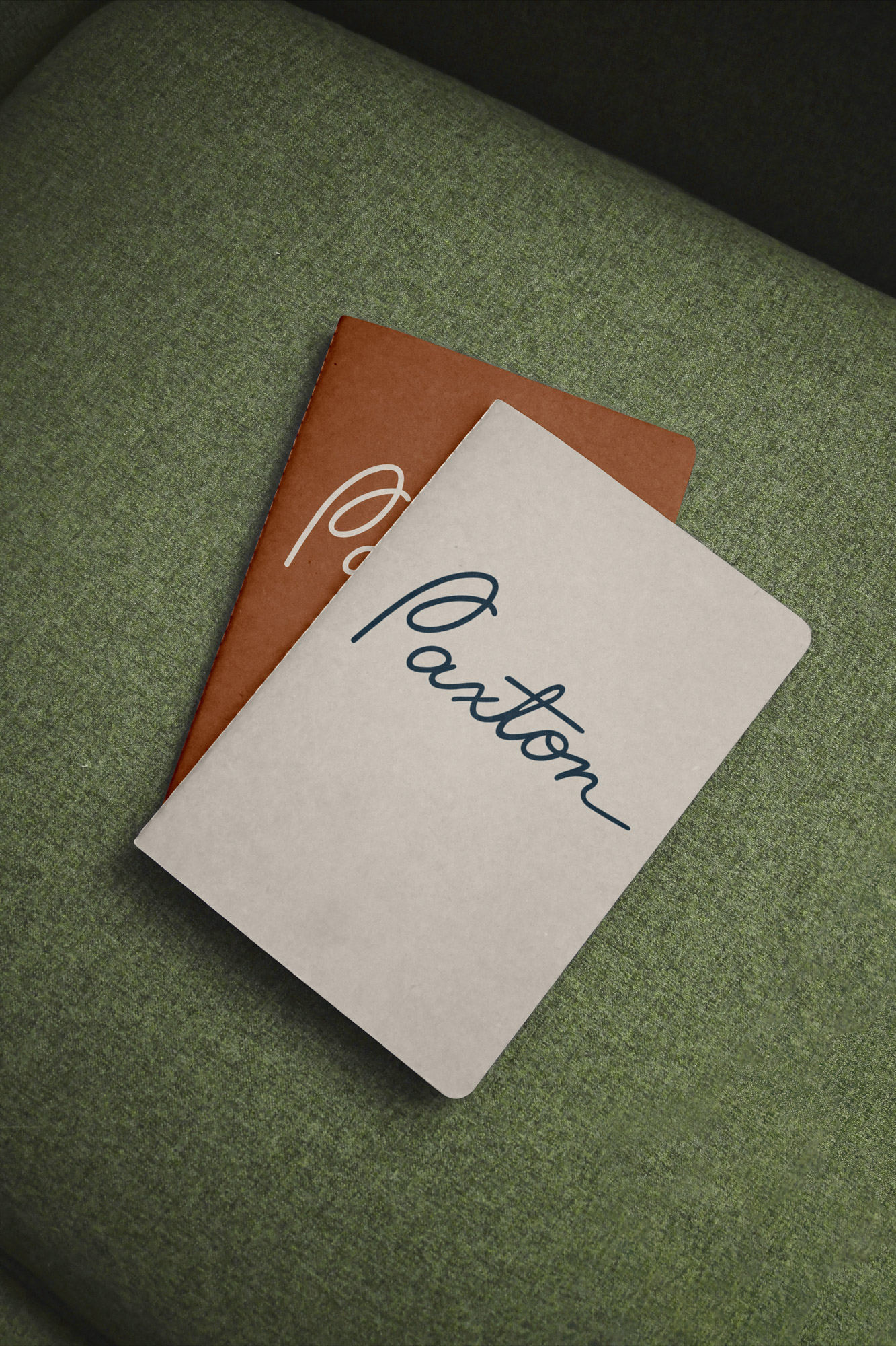
The Paxton
Refined surf city life in Huntington Beach
Located in the original Surf City USA, Huntington Beach, The Paxton acknowledges the strong surf culture of its locale while differentiating itself from competitors and embodying effortless sophistication. With a name meaning “peaceful settlement” and a laid-back logomark that evokes an ocean breeze, the Paxton’s branding captures the upscale comfort that the community offers, with a perfect balance of beach and city life.
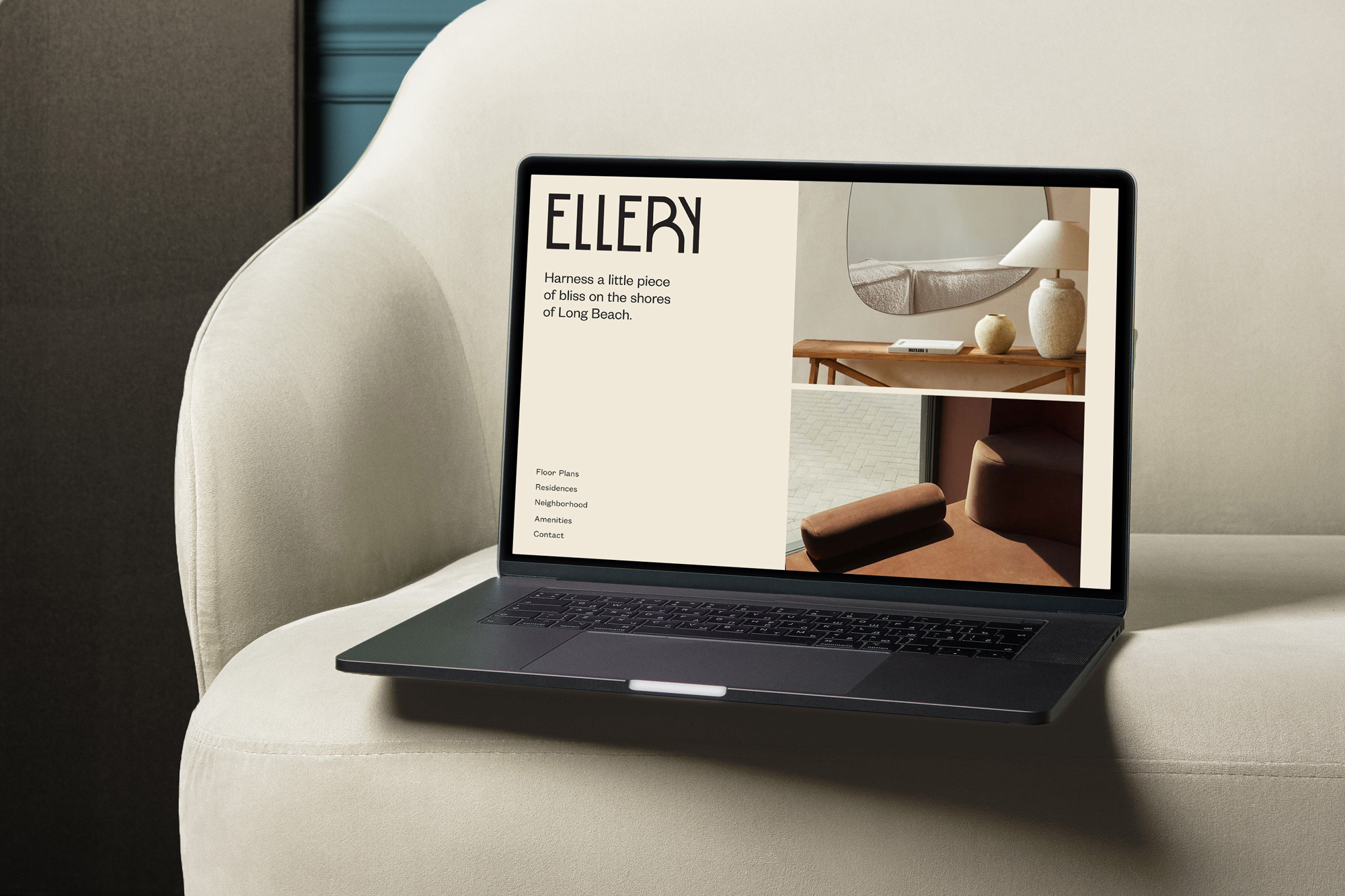
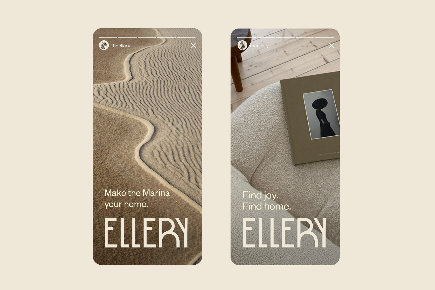
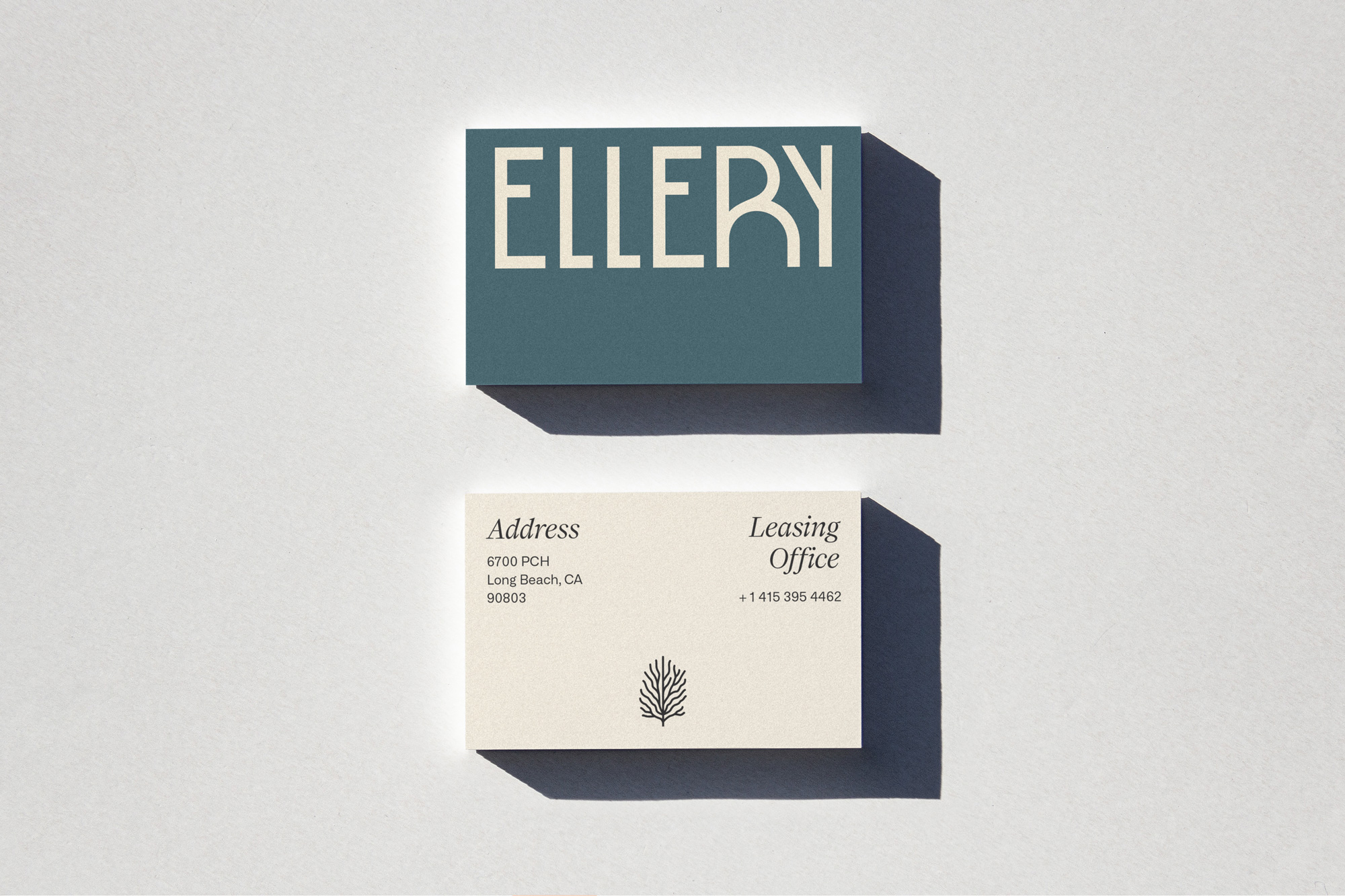
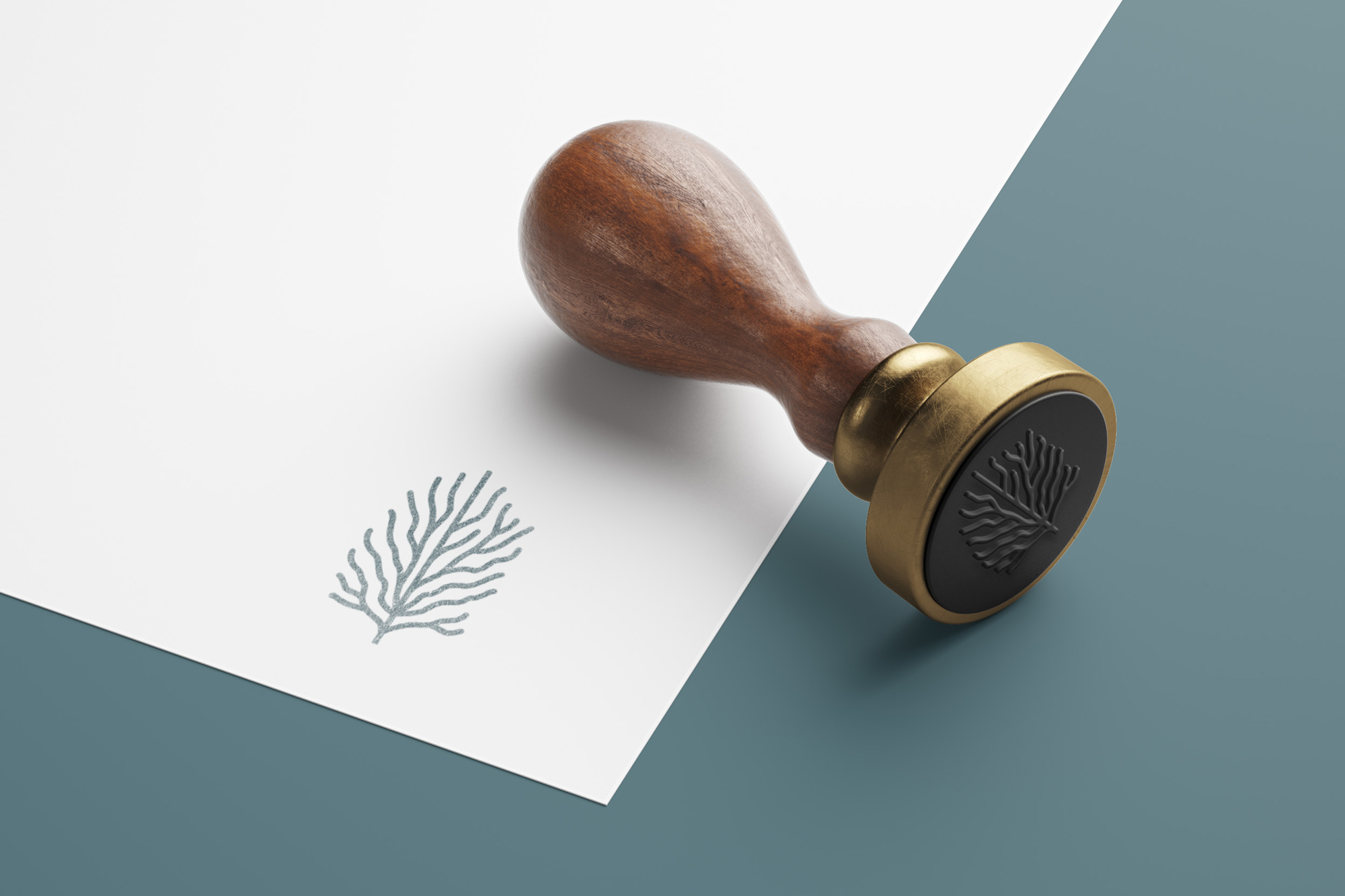
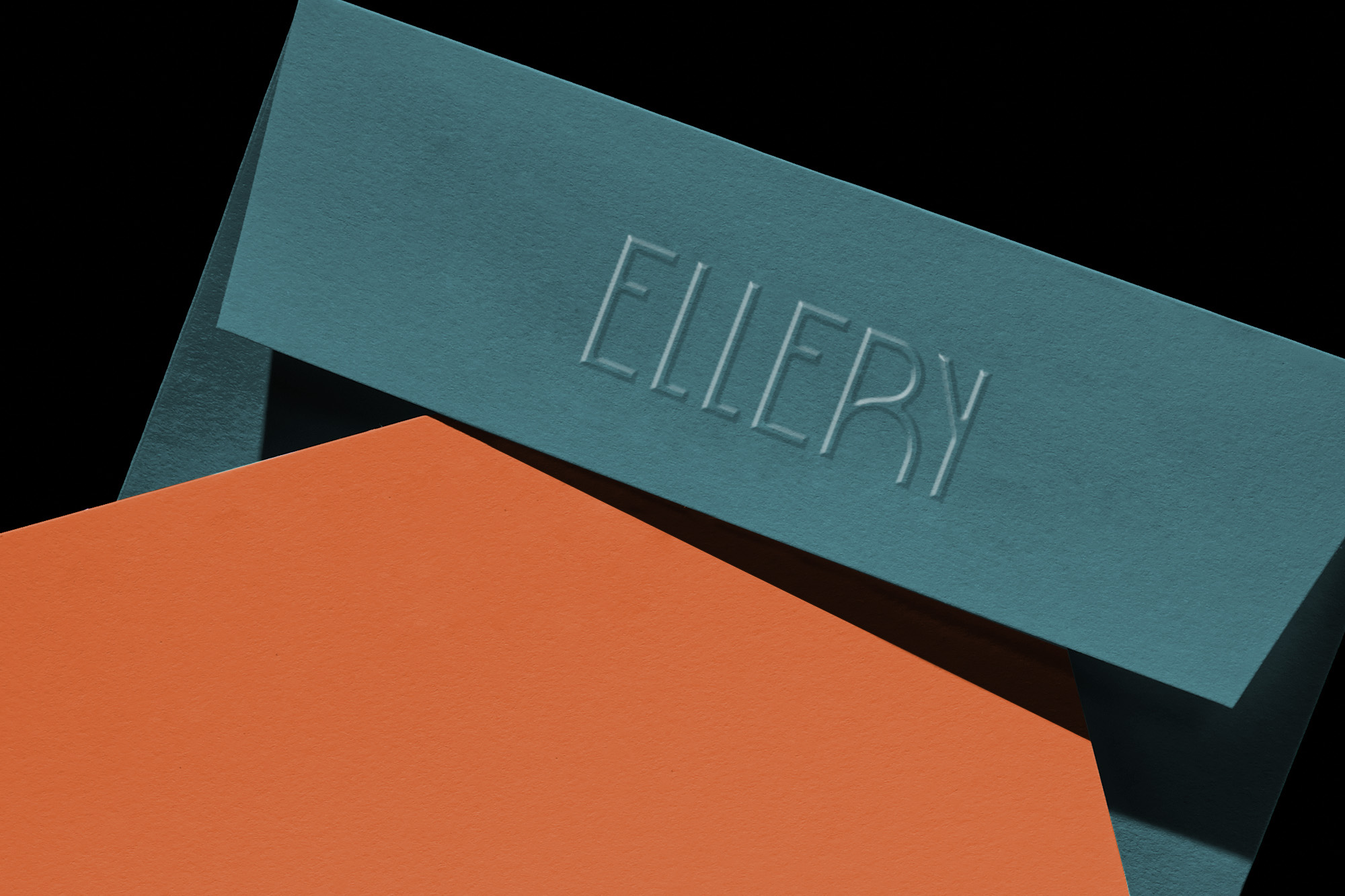
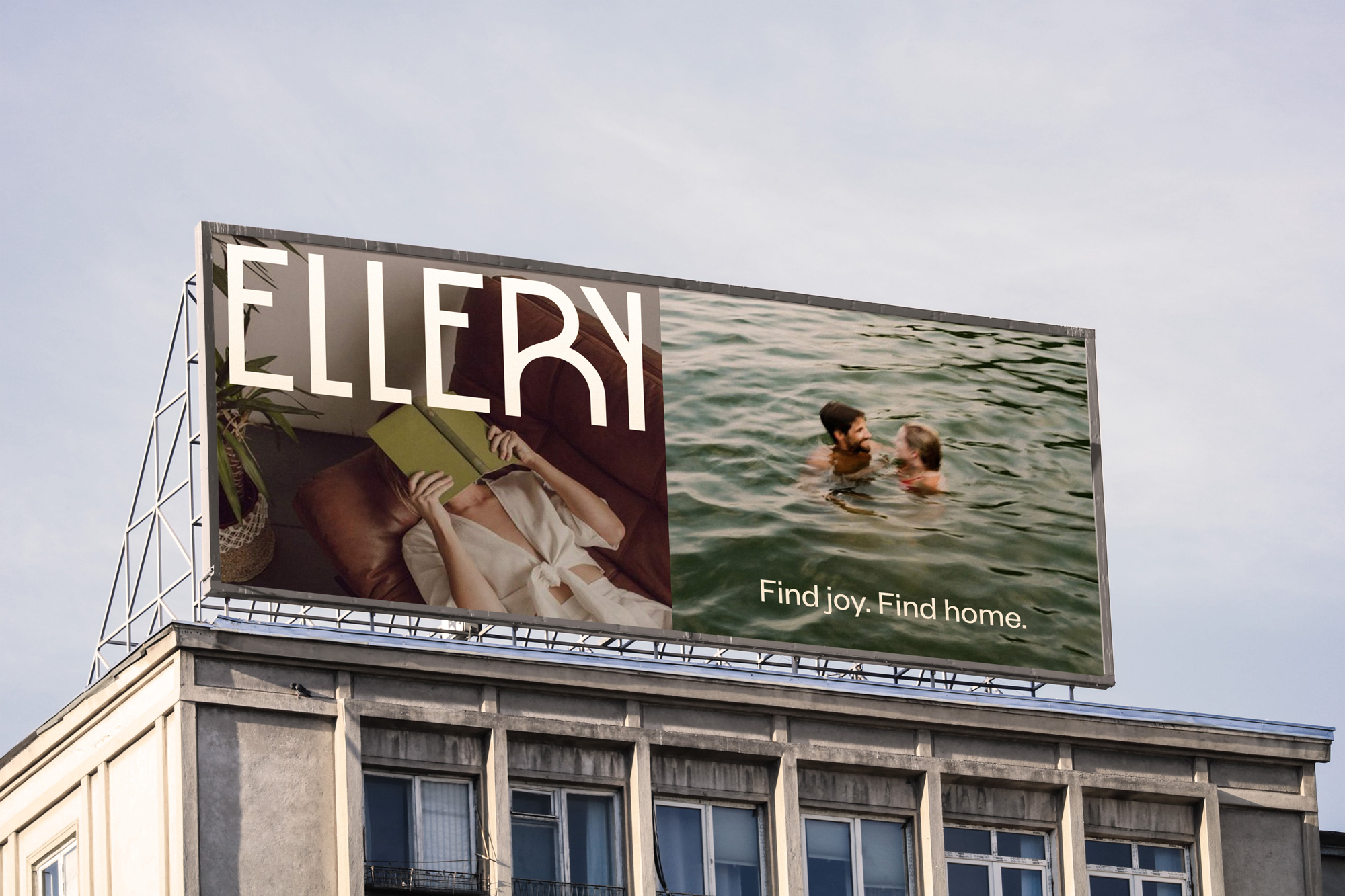
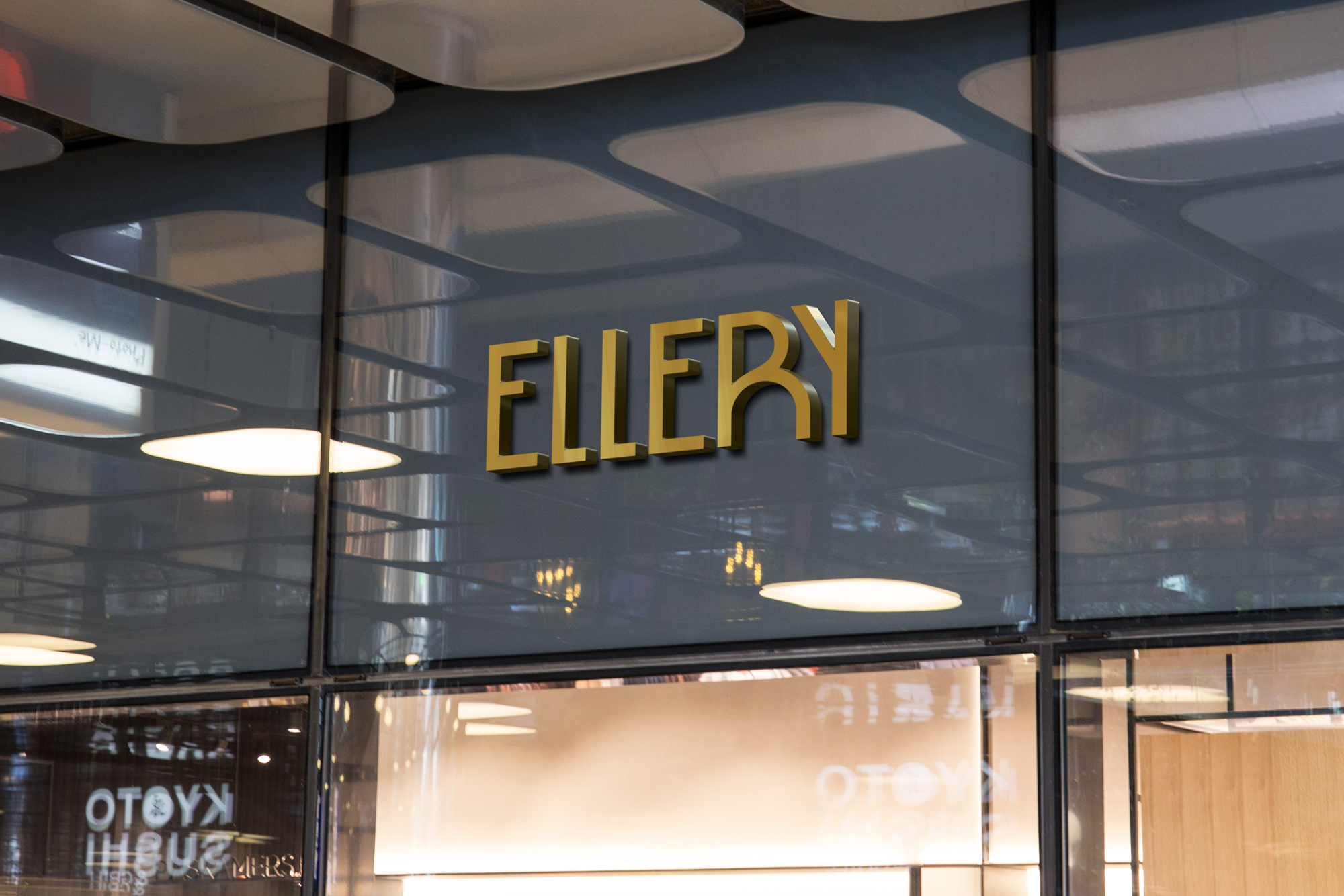
The Ellery
Subtle nautical meets updated Art Deco in Long Beach
As a catalyst for reinvention of Long Beach’s iconic Marina, The Ellery needed to have a truly modern feel. With a name meaning “joyful” and a playful yet sophisticated logotype, the building’s branding captures the serene feel of the neighborhood and the youthful energy of the tenants they hope to attract. Their logomark and indicia draw subtle inspiration from classic nautical elements and Art Deco sensibilities, while nodding to the curvatures of the building itself, whose architecture was inspired by a ship.
With established brand guidelines now in place, each Holland Partners property is able to tell a compelling story that matches the level of luxury offered in units and amenities alike, differentiates them in the market, and clearly communicates their value to potential tenants.
Cohesive marketing materials are a toolkit they can use through all stages, from pre-marketing their unique selling proposition to their community to aligning launch and post-launch promotion.