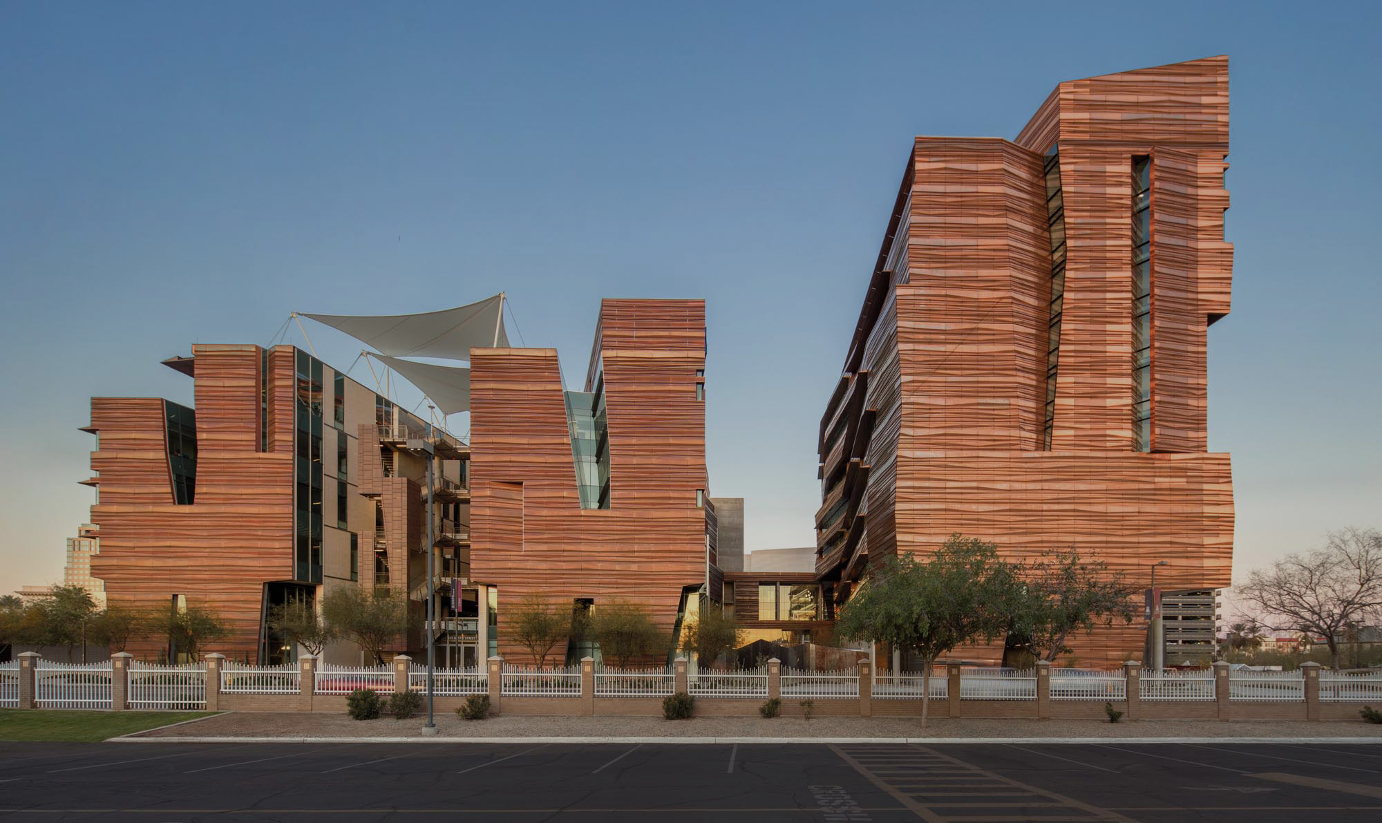
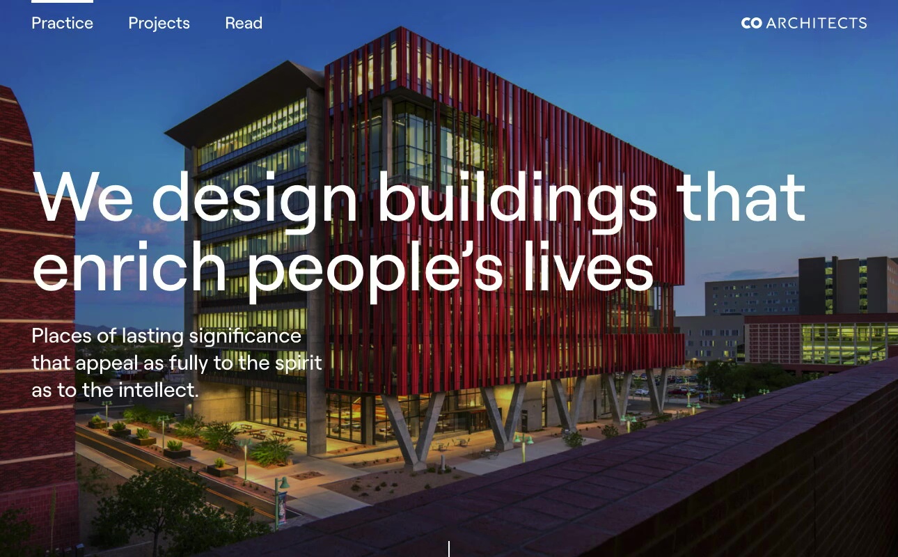
CO Architects approached Funkhaus to design and execute a website that more authentically expressed who they are as a company: innovative, intentional, precise, and collaborative. Their ethos is all about collaboration, bringing multiple points of view together on a project, and being a strong partner for their clients; all qualities that shine through in both their company culture and their portfolio of projects. They ultimately wanted their online presence to do the same.
CO Architects
Our Approach
Funkhaus led an extensive discovery exercise, where we interviewed stakeholders across departments and disciplines to distill and understand the shared values and desires for this new website.
Through this, we discerned that the new site needed to appeal across CO-Architects’ client base, showcase the breadth and value of their work, and solidify them as market leaders in their segments.


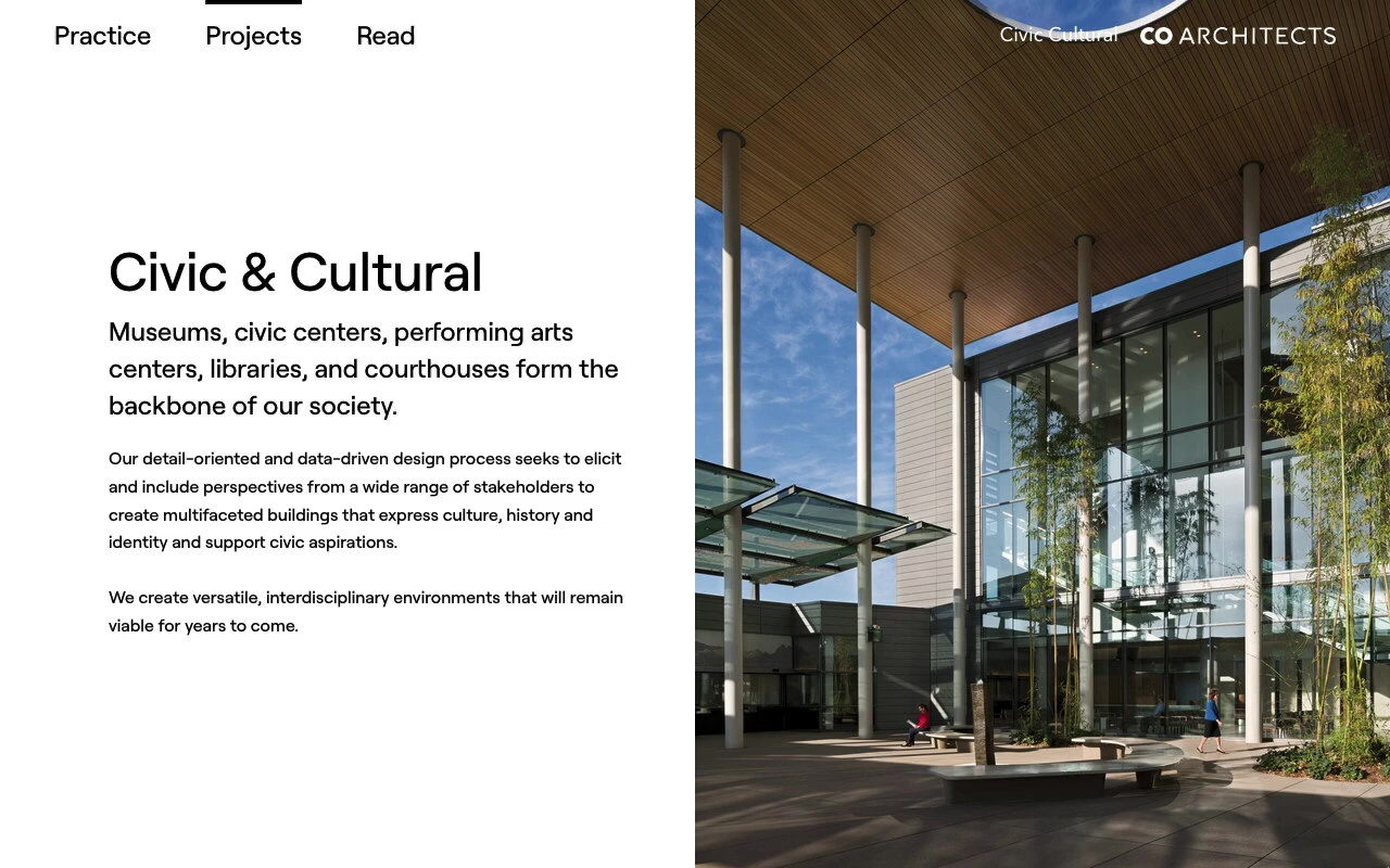
In the design process, we decided upon elements like sleek, modern grids, negative space, and pops of blue, that highlight the company’s forward-thinking nature while maintaining a level of polish that fits the formality of their industry.
Illustrating projects with visual storytelling
CO-Architects are natural storytellers, and from the start they expressed a strong desire to share the narratives that drove each project on the site, including early ideation, process, and inspiration for the design.
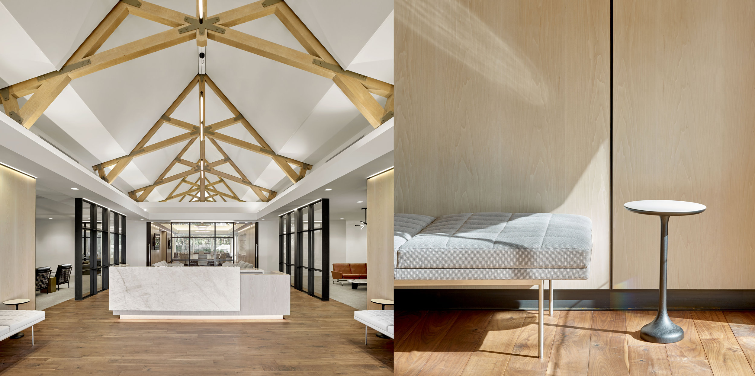
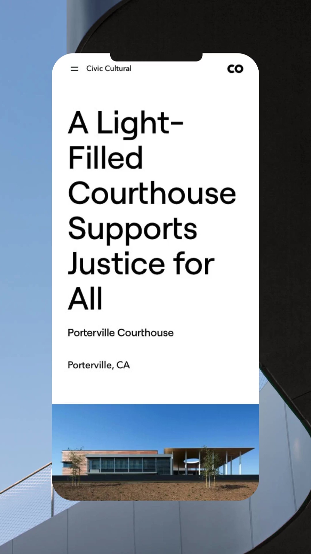
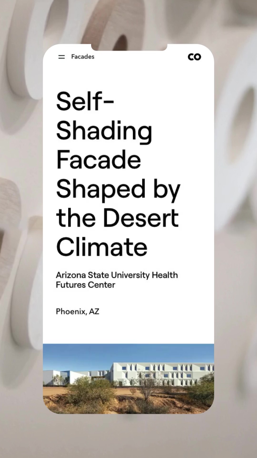
Each project has a distinct DNA that is directly inspired by the location, which was especially important to highlight. We achieved this by creating pages that are dynamic and modular, with featured diptych mood images that help the user visualize the story and understand the inspiration behind the project.
Using blueprints to bridge tradition and modernity
As a through-line to the site, a visitor will find that navigating between sections transforms the elements on-page to simplified, schematic blueprints, hailing back to the old-school carbon-printed documents that have been so integral to the field of architecture.
