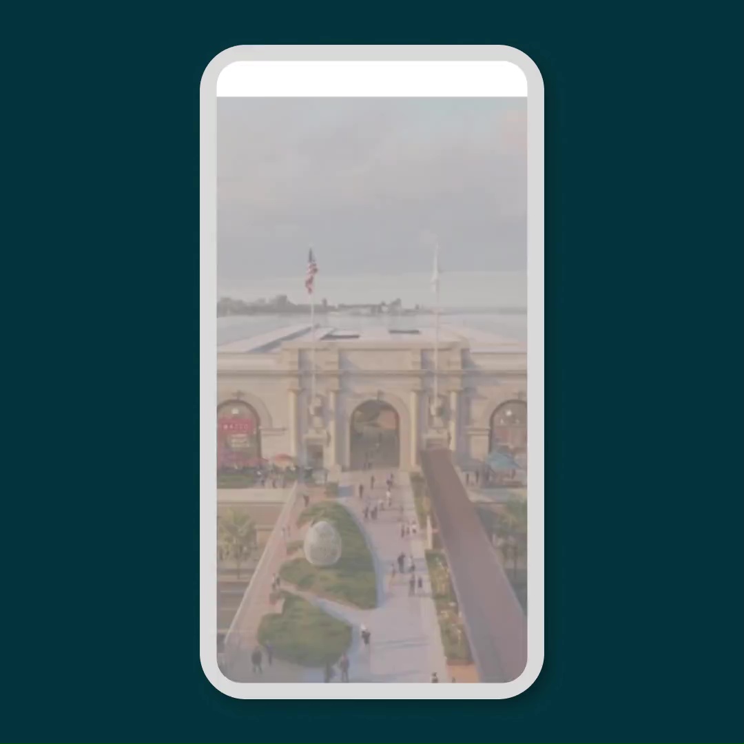
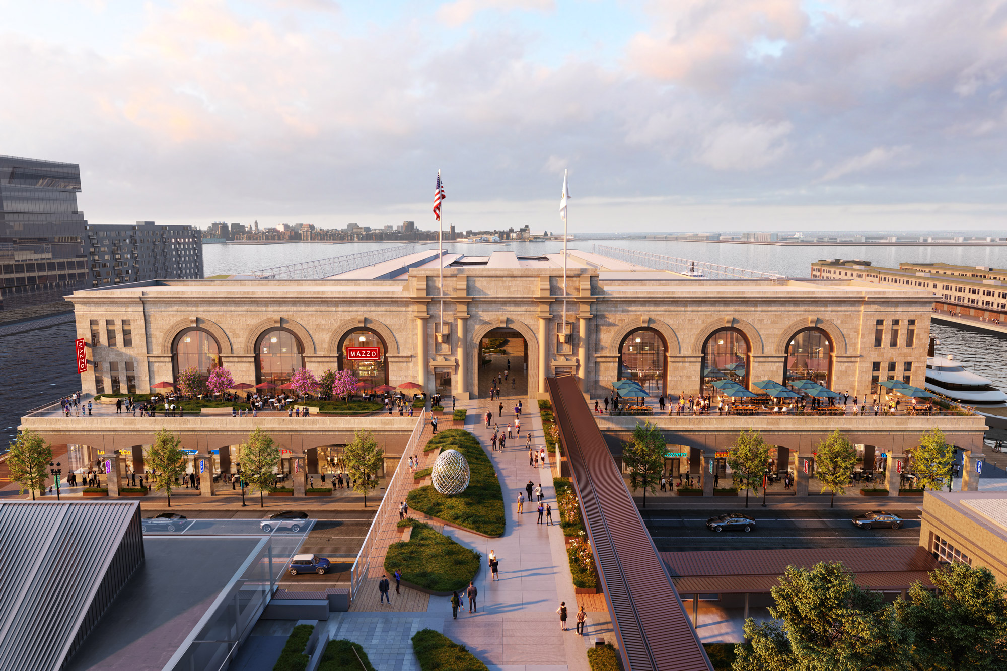
Commonwealth Pier, a Pembroke Real Estate property, came to Funkhaus in need of an experiential and widely accessible site to encompass all aspects of their soon-to-launch iconic Pier destination in Boston. With places to work, shop, eat, and enjoy public art, this is a space that will naturally draw people in — and their digital presence needed to do the same. Their new site showcases the 360° experience of visiting Commonwealth Pier, offering information beyond the details of the physical space.
Commonwealth Pier
Digital
Bringing the experience of Commonwealth Pier online
Like the property itself, which was designed to be a meeting place, Commonwealth Pier’s new website focuses on bringing a community together. As their informational North Star, tenants and visitors alike can visit the site, including their new robust news page, to find out what’s happening at every point in the development’s’s ecosystem.
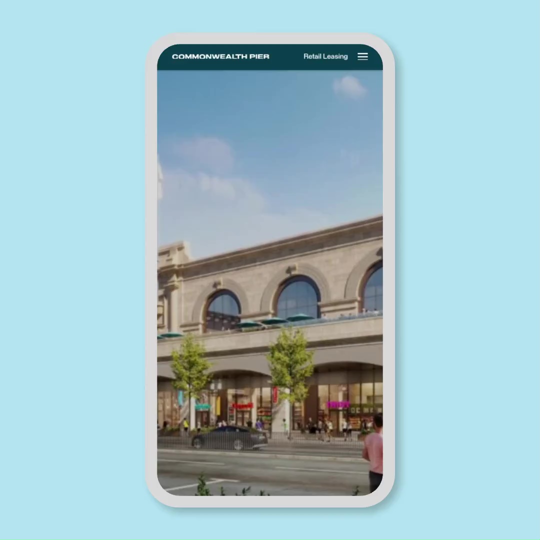
Connected to the on-site experience through QR coding and digital wayfinding, the website can be used to supplement the user’s journey on the ground, whether by providing historical information on the surrounding waterfront or by offering a new perspective on an art installation in real-time.
Accessibility
Reaching multiple target audiences with easy-to-navigate design
To be widely usable, the site is designed with accessibility best-practices baked into every interface decision. We selected an alternating grid structure that was easy to see and navigate, leaned into color decisions that promote visibility, and kept menus simple and without dropdowns to complicate navigation. The resulting layout drives the eye down the page, telling the story of Commonwealth Pier in clear terms.
Brand Application
Adding visual interest to a traditionally corporate concept
Commonwealth Pier worked with digital experience design studio SOSO to explore visual wayfinding for the project — including signage, LED flat screen displays, maps, and branding. We in turn worked with SOSO to translate their work into web content, taking the lead from their brand, their colors, and their logo, and creating a digital experience that drew in that same visual interest while building from our knowledge of what people want when they go to a space.
