Since its inception in 1949, LA-based Gersh has emerged as one of the biggest names in talent and has solidified their status as a top-tier full-service agency. With a legacy long established, they found themselves in need of a refresh, which led them to Funkhaus. They sought an agency to be a true partner throughout the process, provide direction and creative expertise, and deliver a website reinvention that captured everybody’s desires and dreams. With a reverence for the agency’s history, we gave them a fresh new digital presence that reflects their future.
Gersh
Balancing legacy and modernity for an entertainment juggernaut
Gersh Balancing legacy and modernity for an entertainment juggernaut
Strategy
Creative partnership with a pillar in the world of entertainment
We began our process by interviewing stakeholders across the company’s many departments to understand what each individual unit needed this new website to provide.
Weaving those findings together, we developed a design language and a plan for their digital presence that was a uniform umbrella for the company to live under while individually speaking to the needs of each of the business’ arms. Their industry is one that traditionally opts for a conservative and restrained look, however Gersh was willing to push the bounds in their digital presentation, ultimately opting for a visual-first design.
Website
Refined design to launch the brand into future ventures
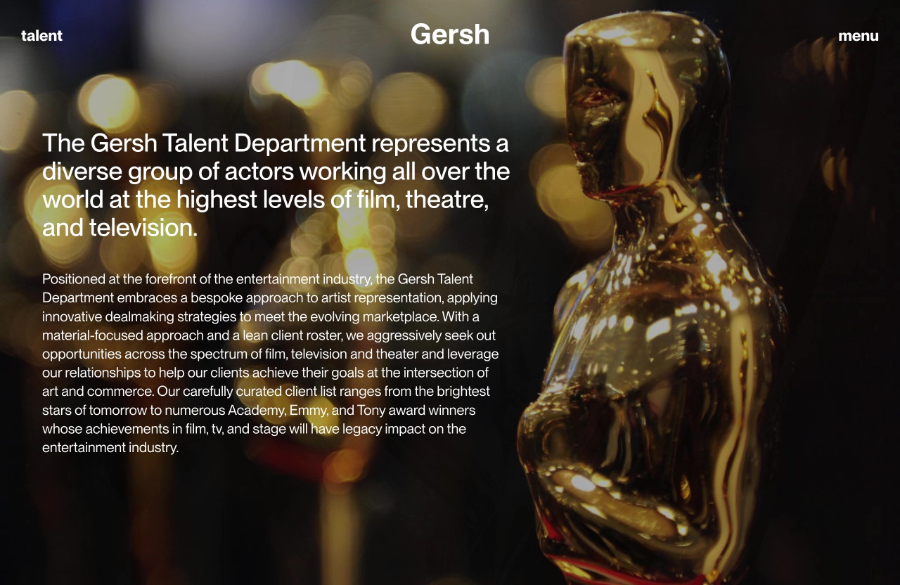
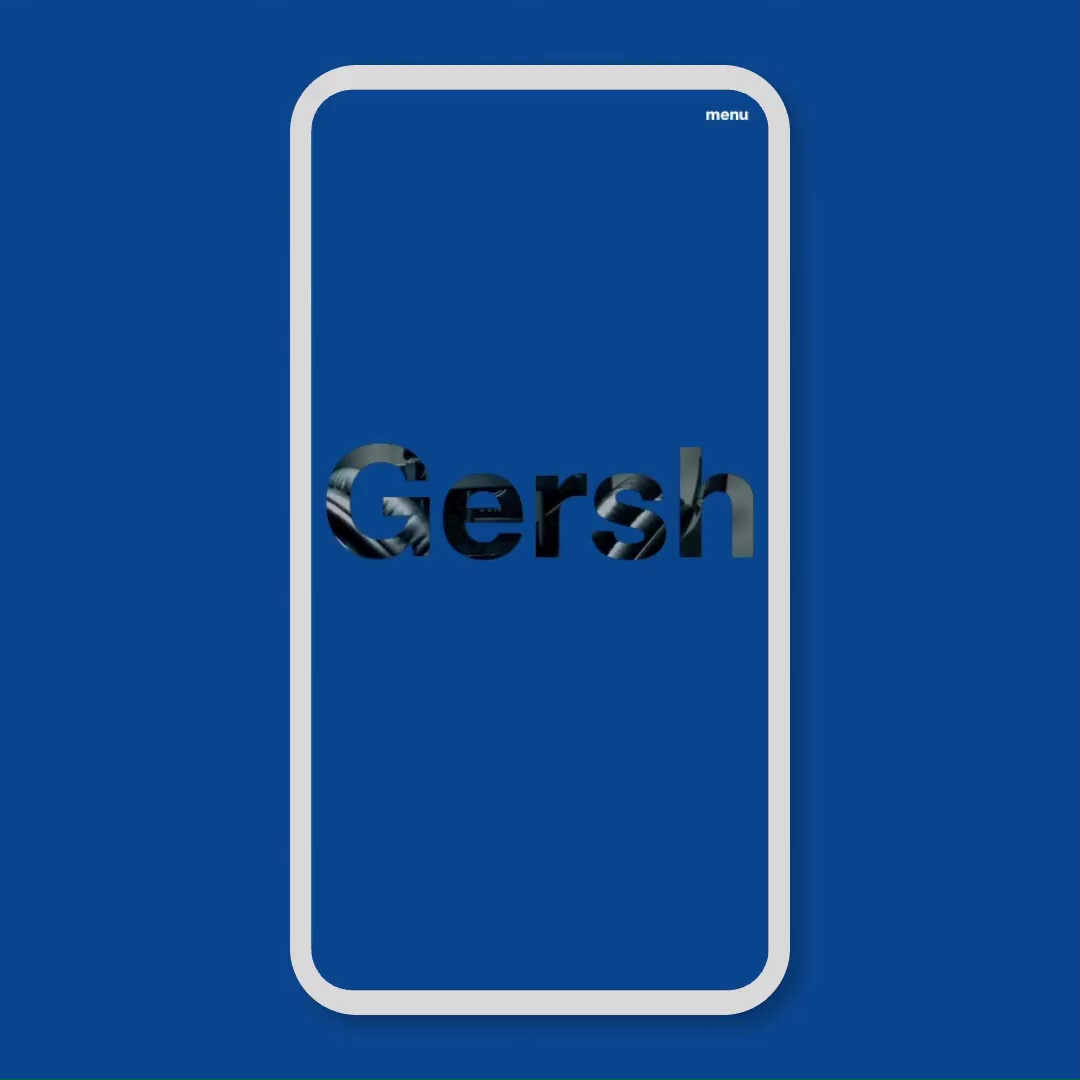
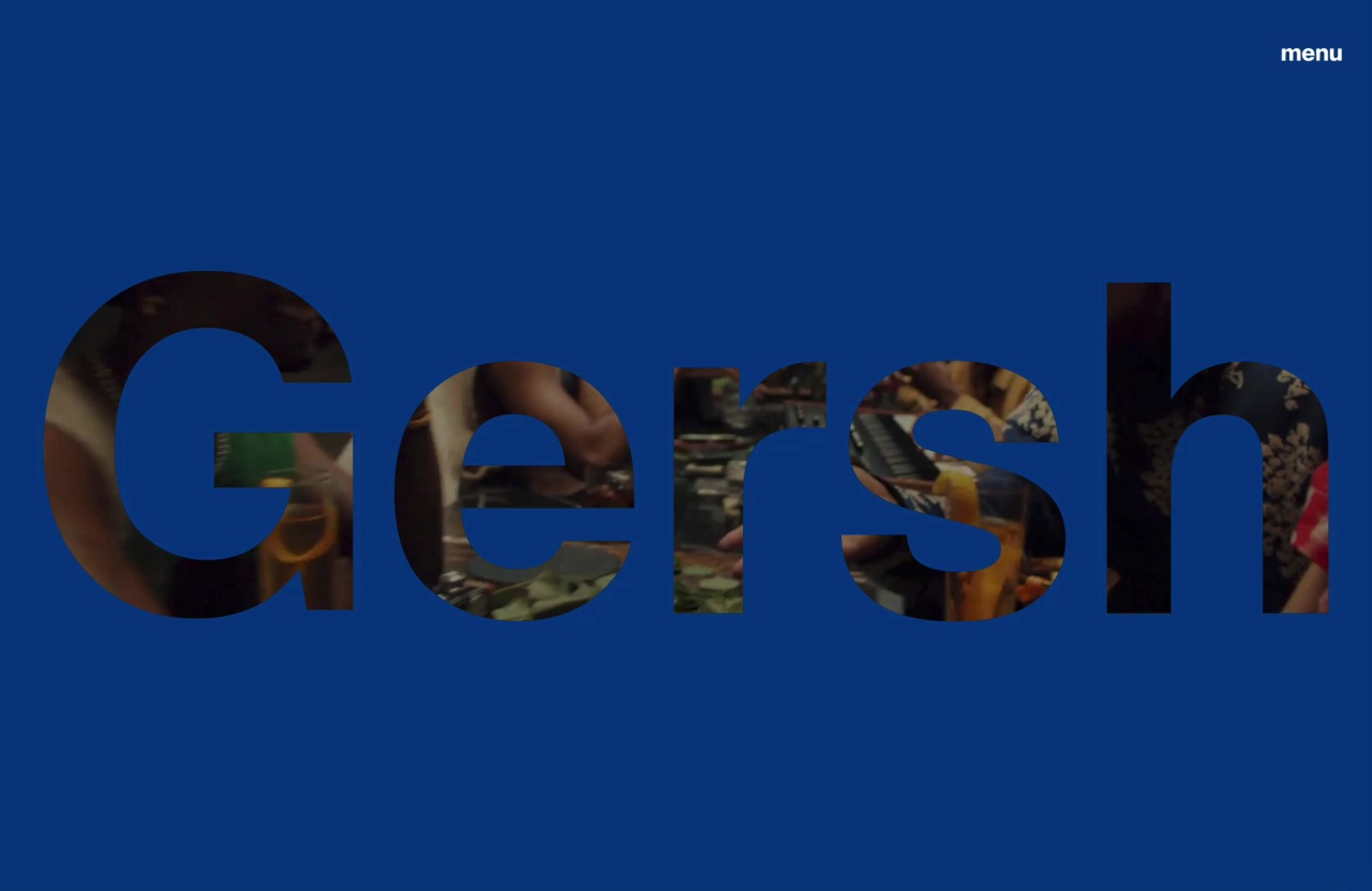
With the use of their signature blue as a connective theme, Gersh’s new website is a modernized iteration of their distinct and discerning digital identity.
We wanted to make it immediately clear to the user that Gersh is a vessel with which creativity happens, so we jumped right into that messaging with a homepage that puts their name front and center. A masked video moving within the letters of their name energizes the visual impact and nods to the breadth of work going on at Gersh.
Design
Communicating a modern legacy through type
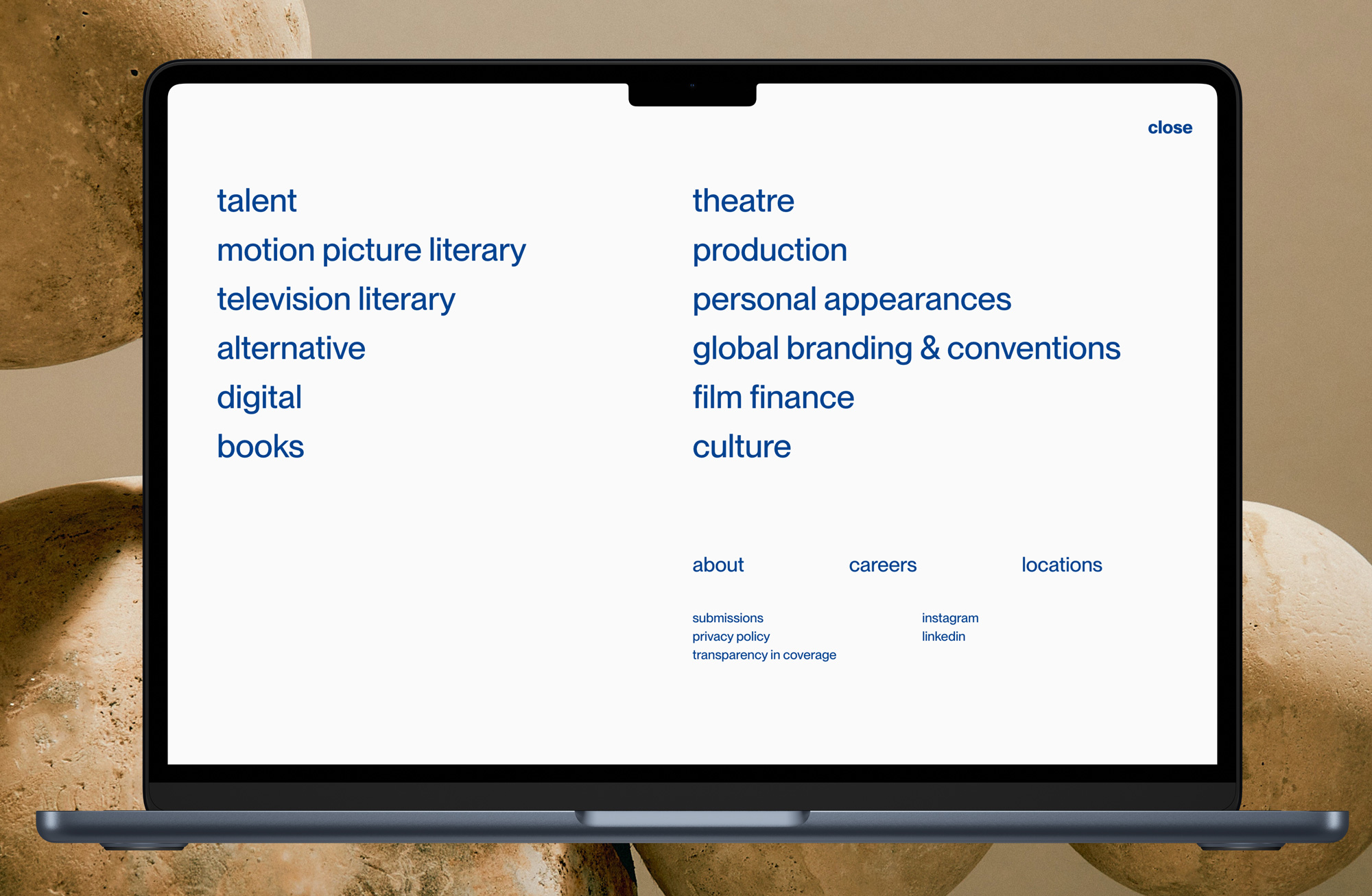
Type throughout the site was selected with strong rigor, always staying true to the foundational feeling of their brand. In service of a minimal look, type remains lowercase across headings and navigation, projecting a humble confidence and a sense of approachability.
Their 1960’s-inspired navigation menu, with a form more closely resembling a paragraph than a list, adds a sense of relaxed timelessness and enduring style. The resulting visual feel is akin to their legacy: classic with modern touches.