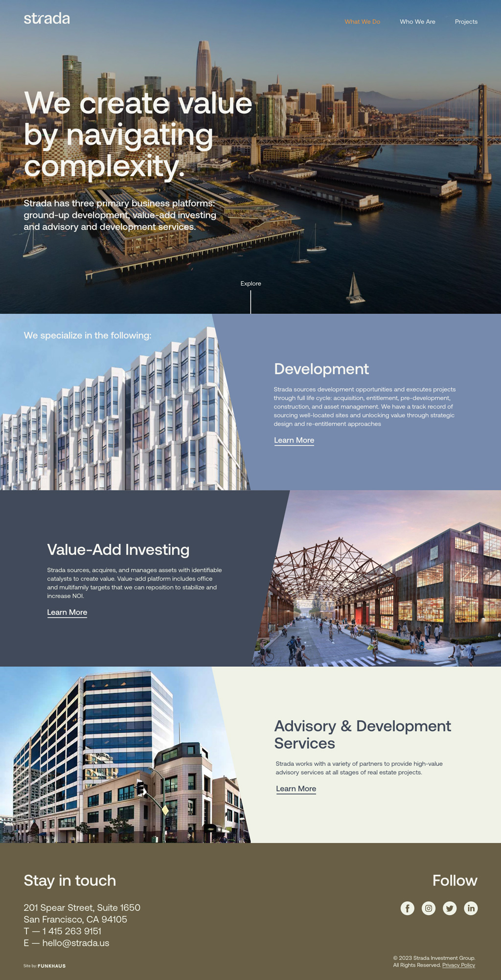
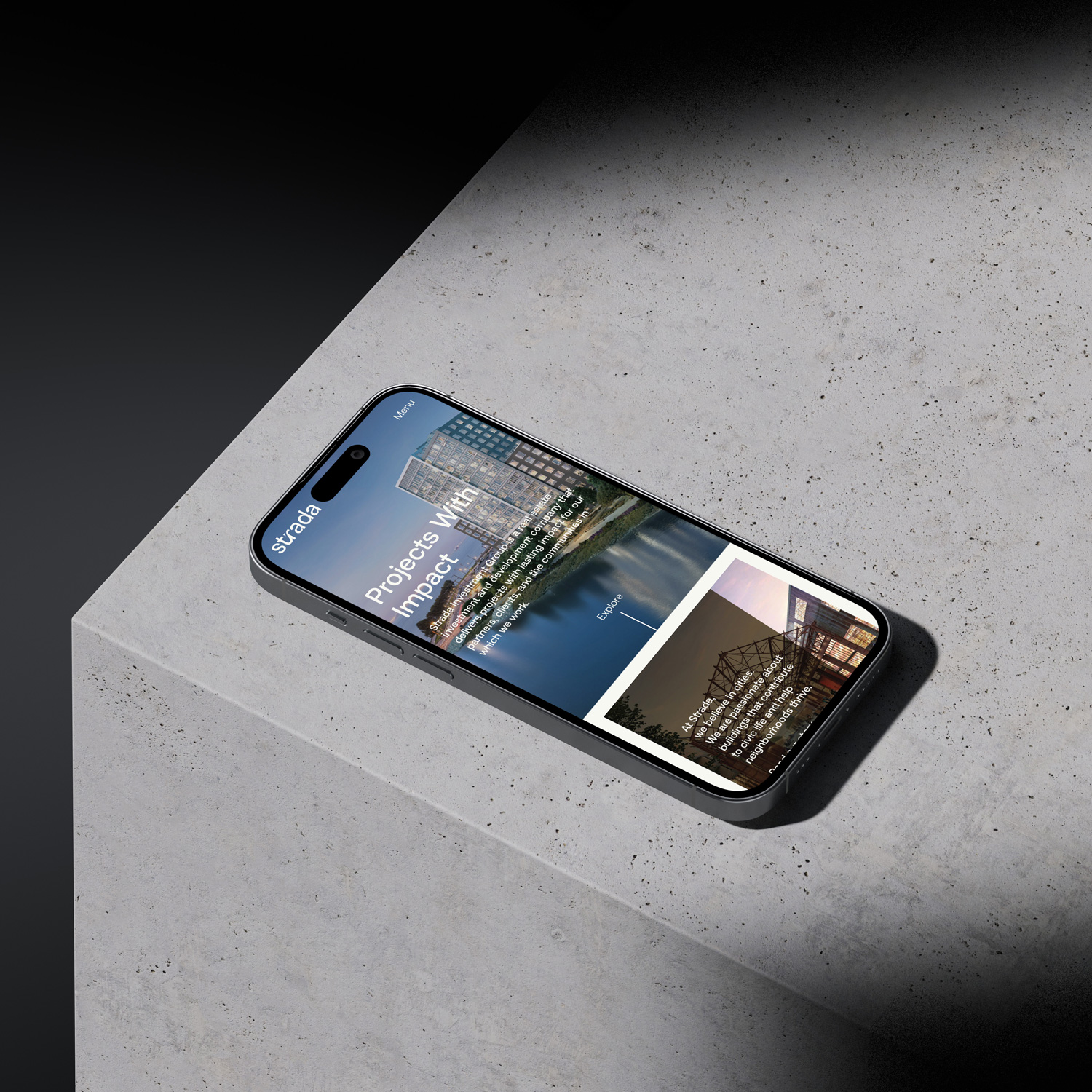
Having established themselves as a respected real estate developer and investor that makes a lasting, positive impact on the communities they work in, Strada found themselves ready for a new look to match their status. They enlisted Funkhaus to build a holistic new brand identity, market positioning, and website design, presenting a cohesive image of an organization that is sophisticated yet approachable, with a track record of being able to navigate complexity. Though they remain true to their Bay Area roots, Strada is innovative enough to thrive anywhere, and their new identity will be able to grow with them as they expand their reach to other areas.
Strada
Brand Identity
Approachable sophistication in a logomark
Operating on a scale from residential projects to massive stadiums, Strada needed branding that encompasses their full identity, equally proficient as they are conscientious.

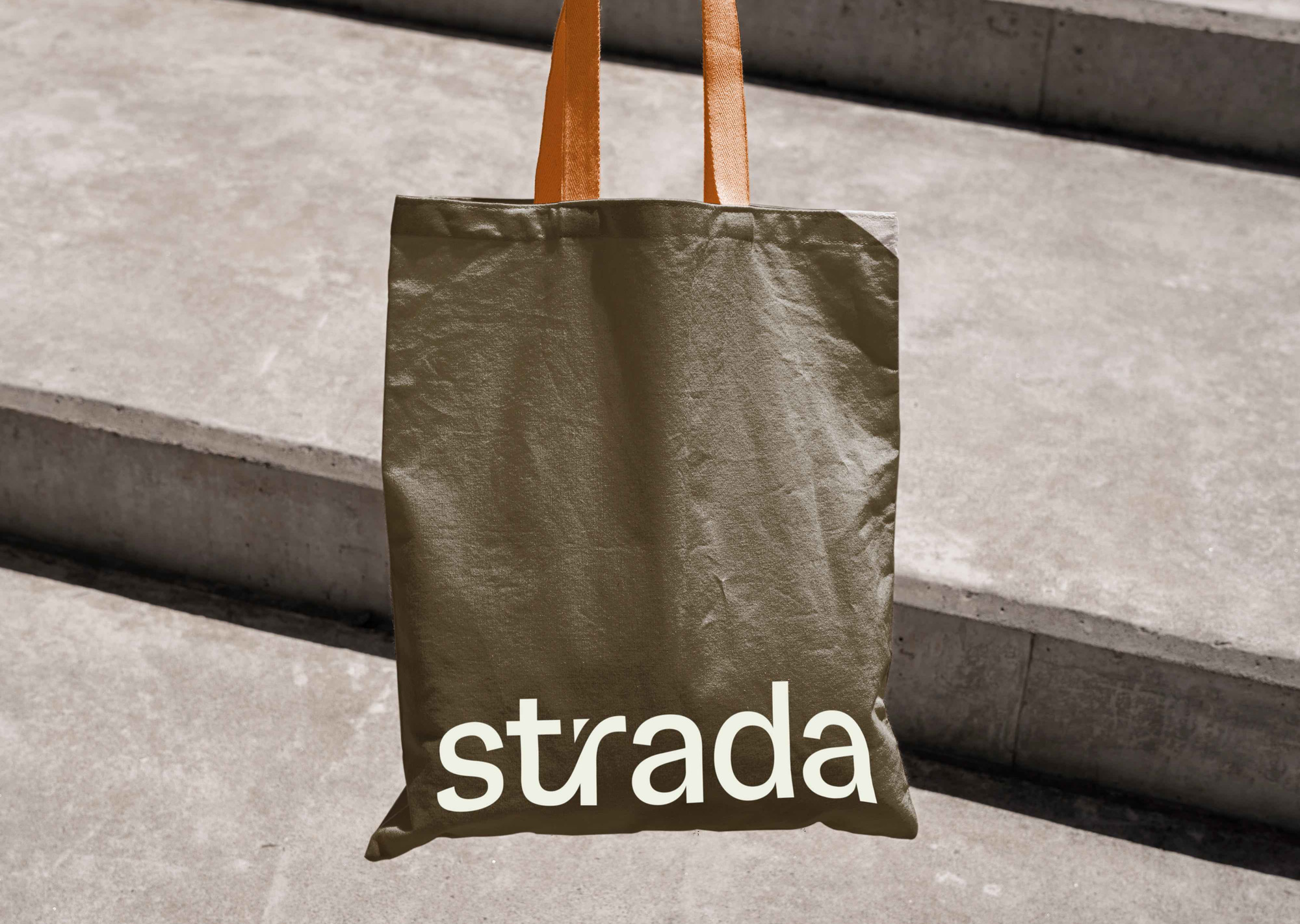
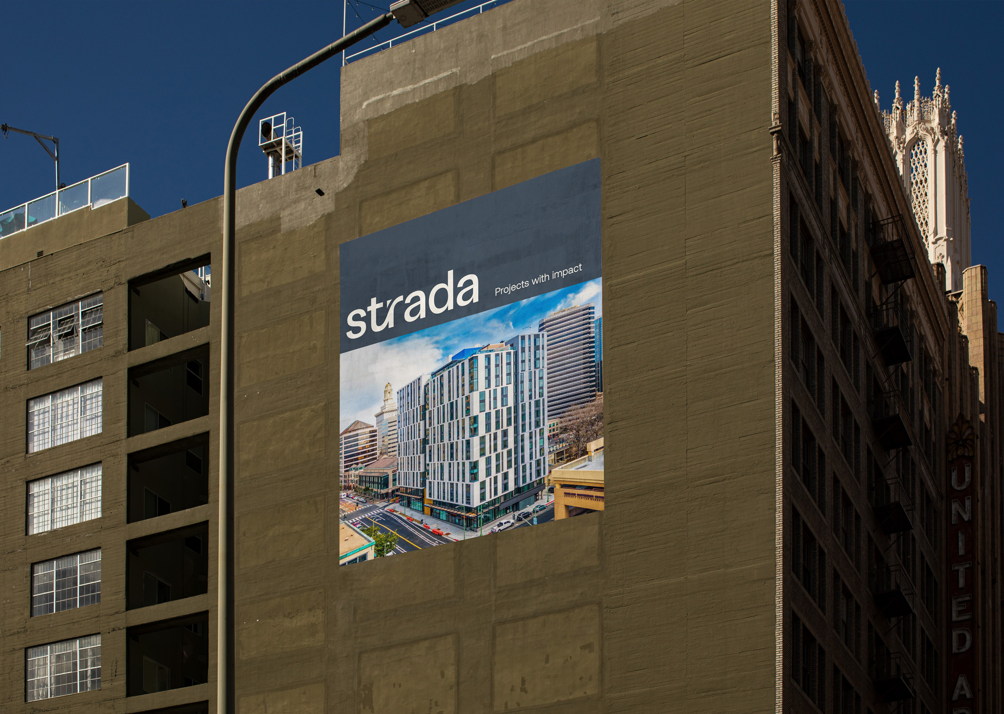
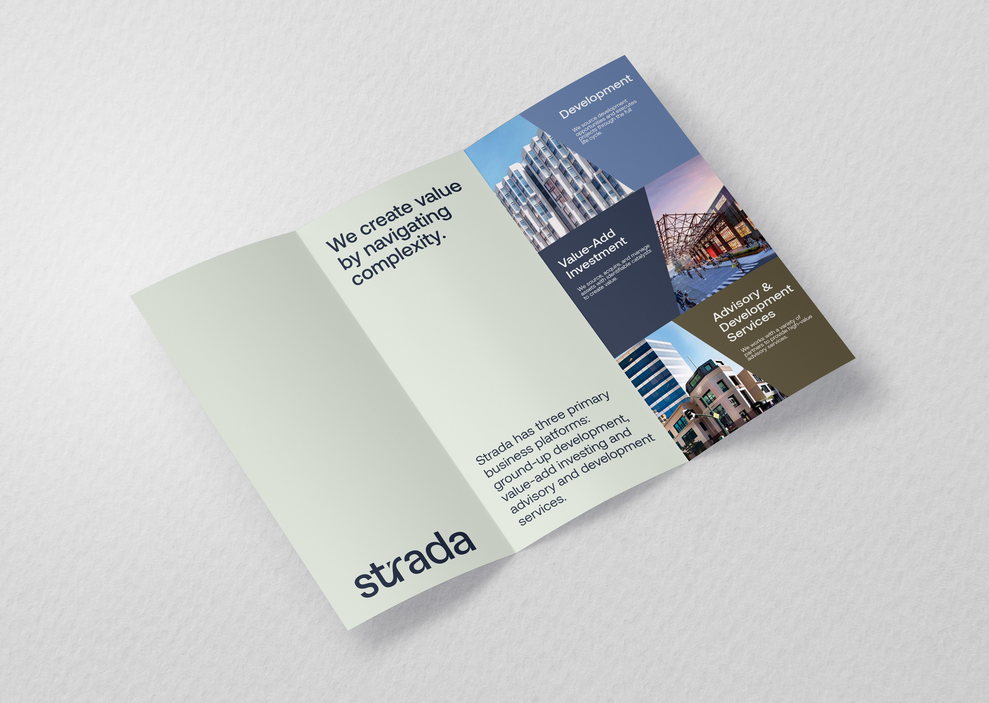
We utilized lowercase lettering and incorporated unique curvature that is reminiscent of a top-down, birds-eye view of a city to add a sense of levity and approachability while still exuding expertise and trustworthiness. Their resulting logomark is simple, sophisticated, and uniquely theirs.
Positioning
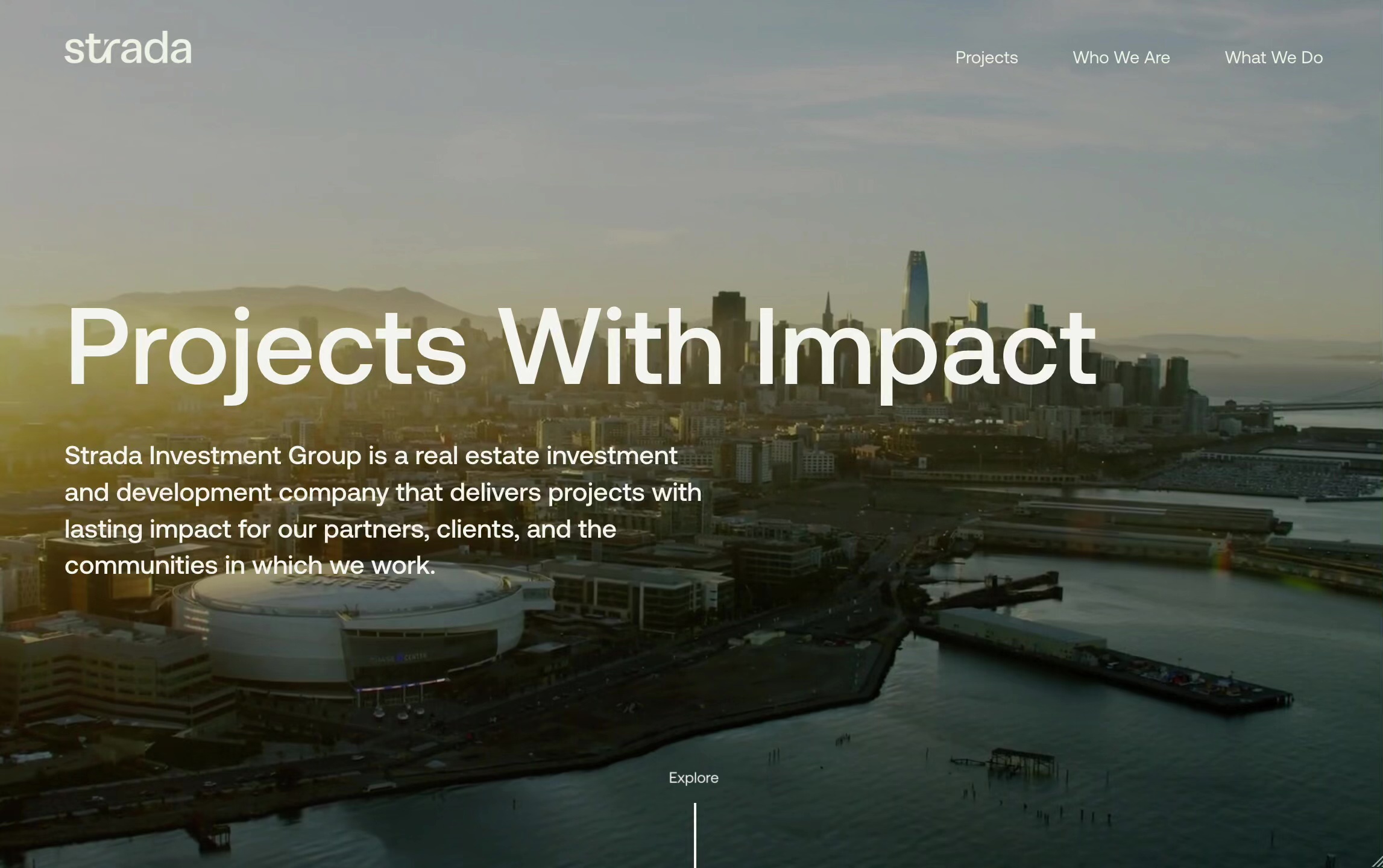
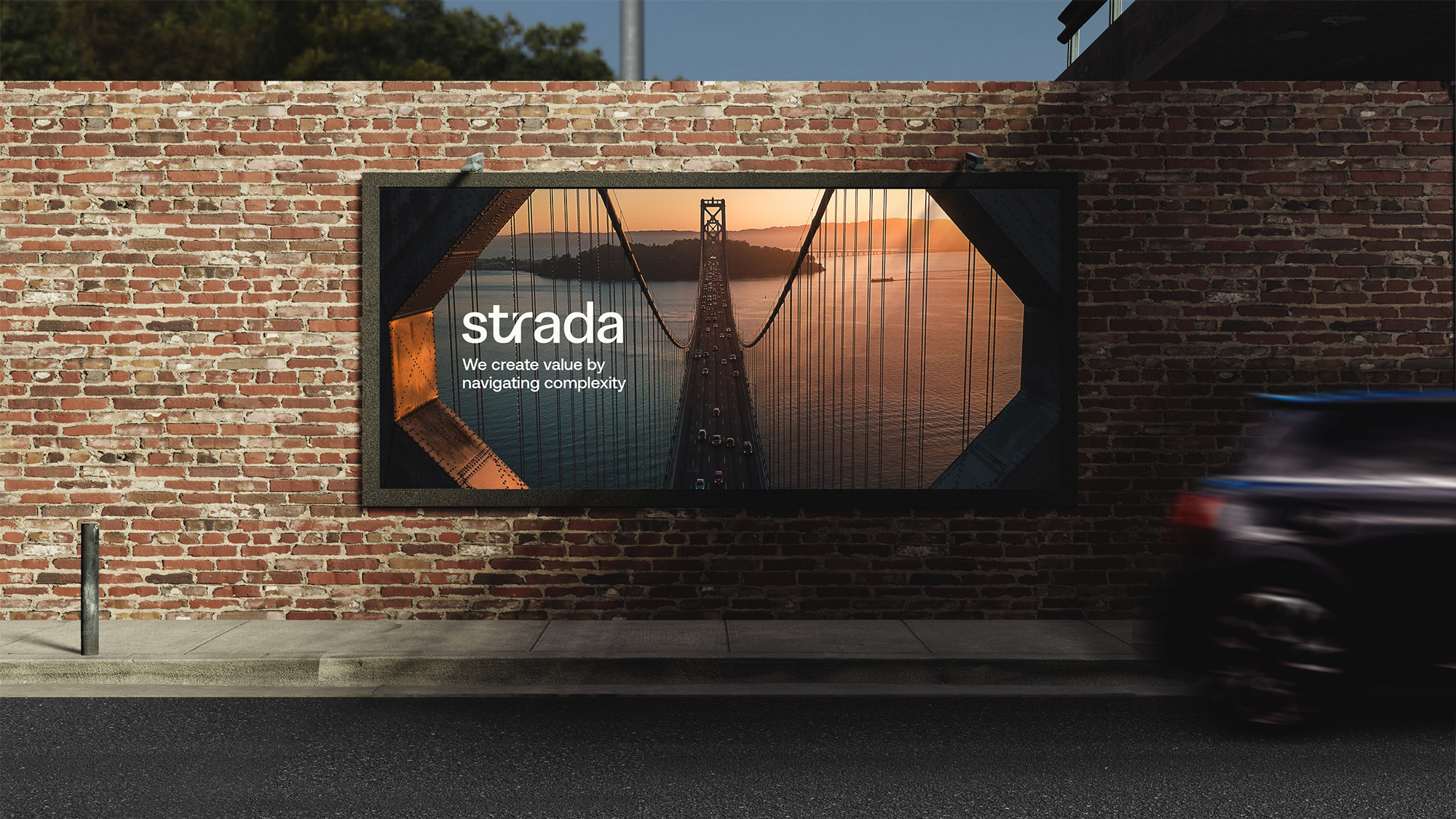
A new holistic language that reflects where they are and where they are going
When Strada first launched, their goal was to establish legitimacy. Now, they are well past that stage of their growth, and what is important to them to convey is their involvement and their investment in the wellbeing of the communities they work in.
We developed positioning and brand messaging to reflect their current stature in the Bay Area, and their position as being poised to expand their reach, their deep understanding of their field, and their humanity and approachability. Though the work they do is considered more traditional, the people behind it are cool, engaging, smart, and determined, and those characteristics come through in the language used to talk about Strada.
Website Design
Telling a broader story through a welcoming digital presence
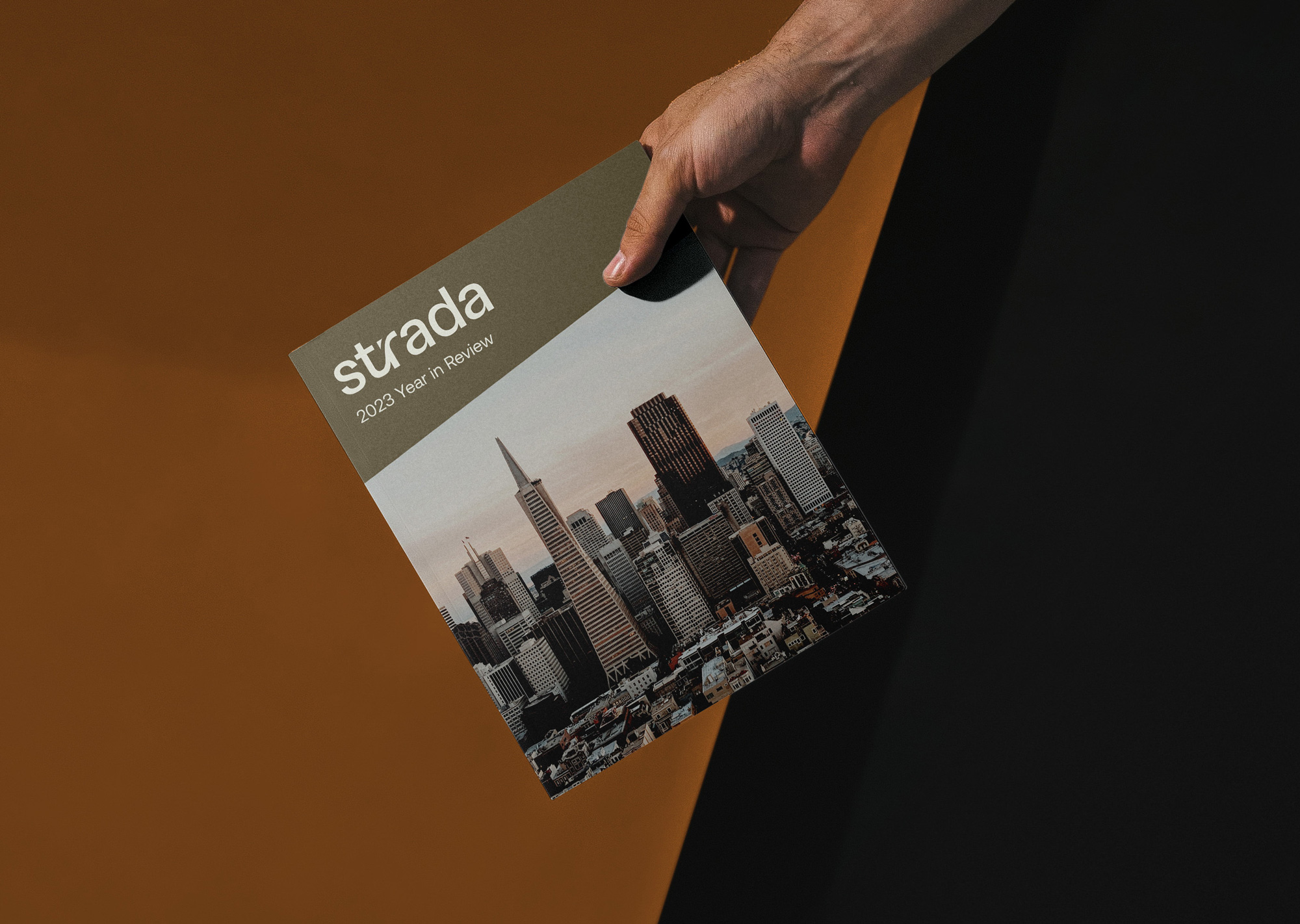
Strada’s updated website tells their broader story, bringing humanity to their digital presence and offering insight into the backstory and processes of their projects. Their new case study framework tells those stories, giving the user a dynamic way to interact with their portfolio, which ranges in scale and complexity.
We utilized a diagonal cut on hover for images as a design theme across project pages, suggesting their architectural background and increasing engagement through movement.
Calm blues and neutral tones incorporated throughout convey ease and steadfastness, but in a way that feels more welcoming than the industry standard.
