When entrepreneur and investor Chris Burch approached Funkhaus for a relaunch of Burch Creative Capital, we knew that we’d be given the chance to approach private equity in a unique way, inspired by the colorful man himself. The final brand and website capture the depth and breadth of their portfolio, with a playful, modern, and unexpected tone that is fitting for their approach to the investing game.
Burch

Brand
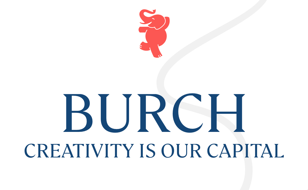
Creating a playful custom logotype that can live across media
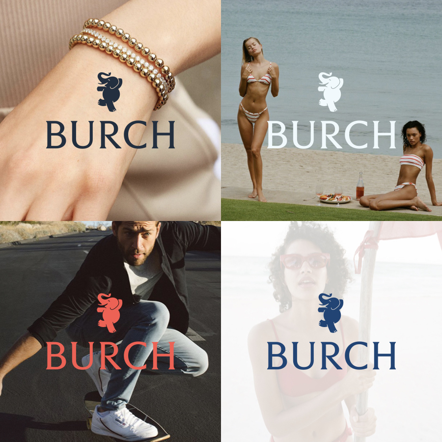
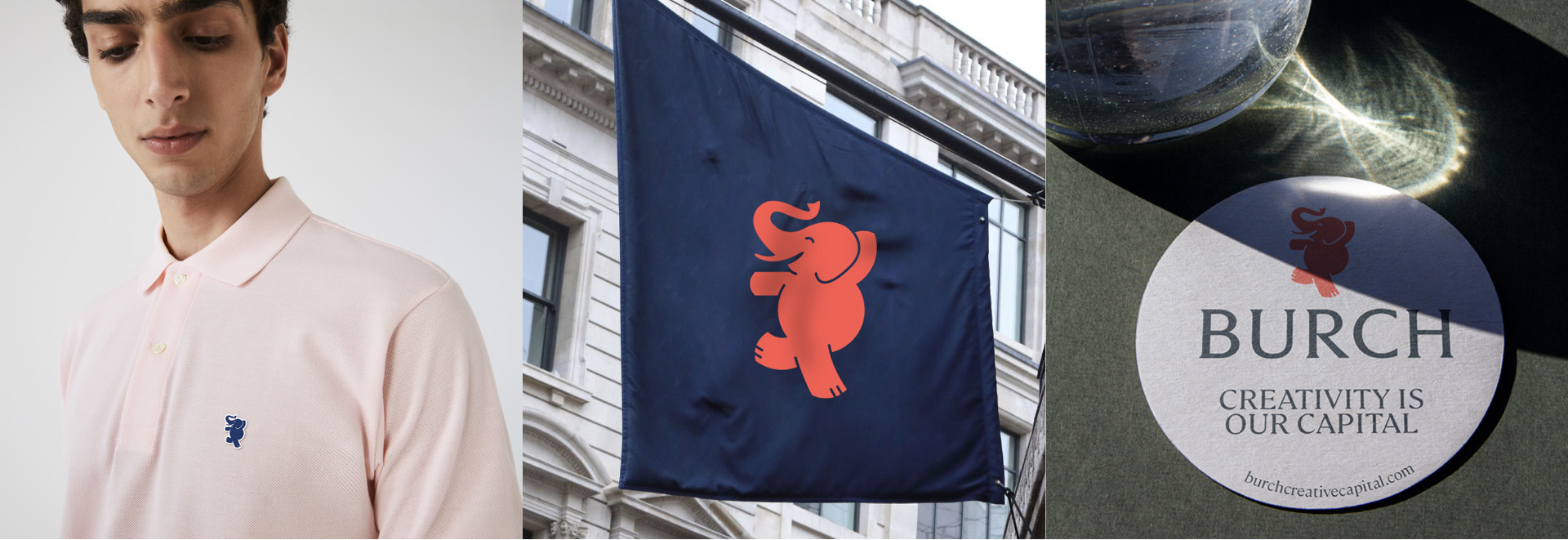
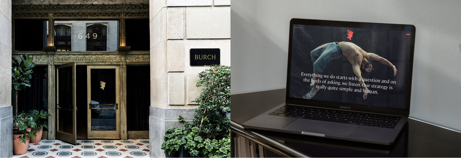
The updated branding took direct inspiration from Mr. Burch, whose energy and confidence is fully encapsulated by the concept: an elephant logomark that can be brought to life through motion. The custom logotype grounds this playful caricature with a classic serif that is strong enough to stand alone. Application is everything, and this identity can be dressed up or down and spread across digital, print, and product alike.
Positioning + Content
Driving home a distinctive identity through content
As someone who’s not afraid to take chances with investments, Burch stands out from the pack. Positioning and case studies demonstrated his experience in the field, highlighted the successes of the unique entrepreneurs in his portfolio, and illustrated his creative and lively approach to private equity.

Website
Illustrating a lively throughline with digital design
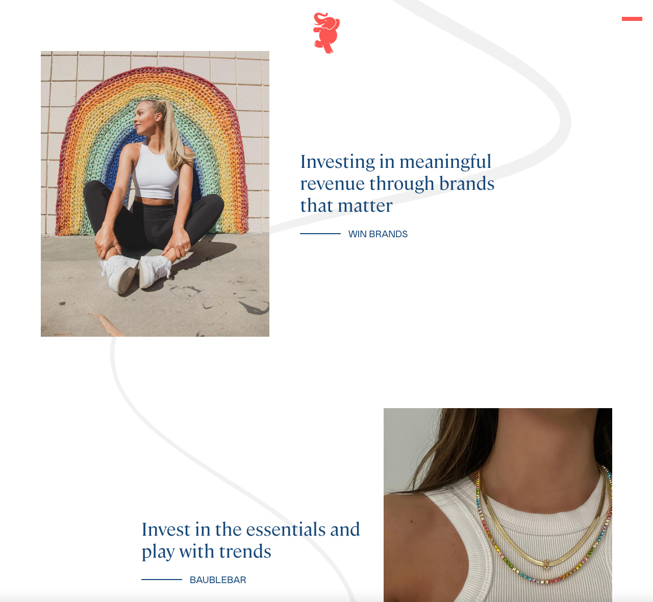
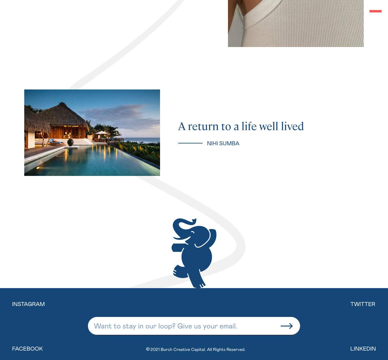
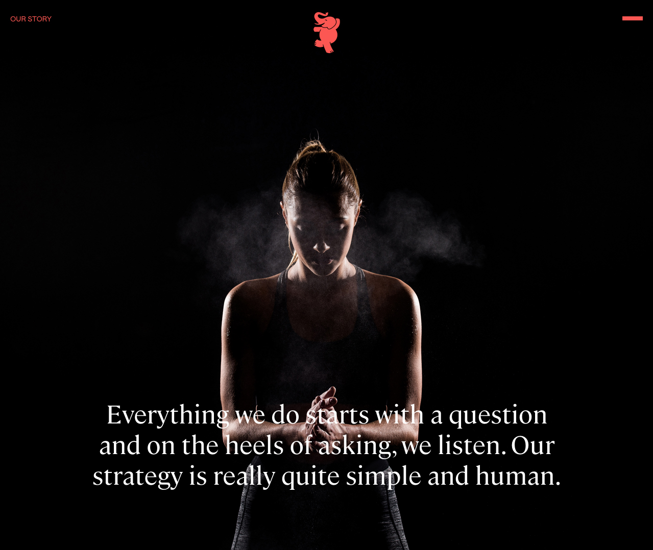
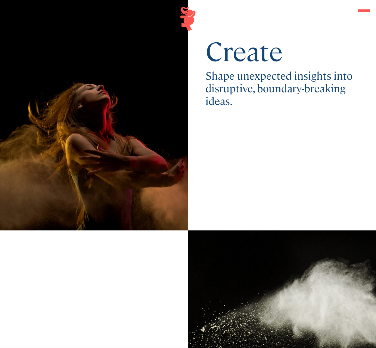
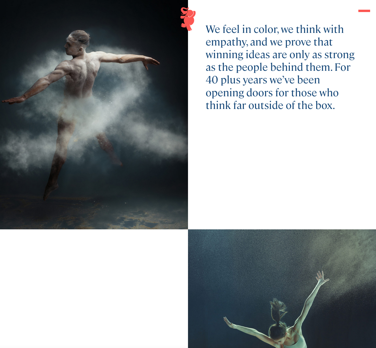
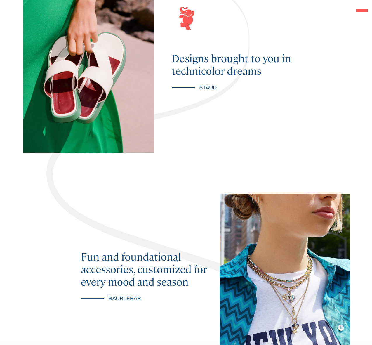
Continuing with the emphasis on personality, we helped source creative imagery for the site that was emotive, cohesive, and ultimately human. Creativity is the ribbon that ties Burch together, and a moving ribbon motif unifies the design of the site and reflects the ethos of the brand.
