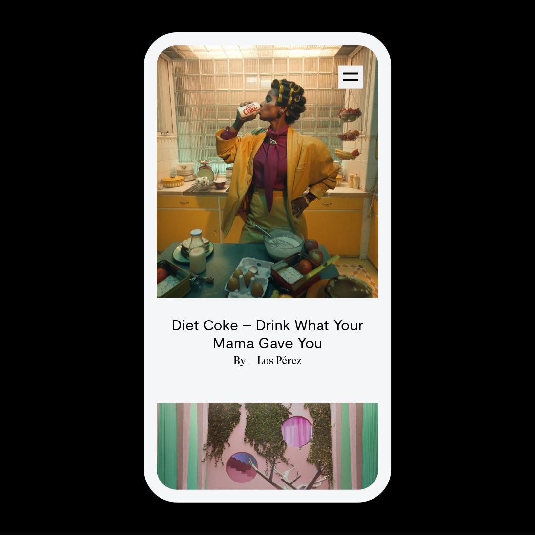
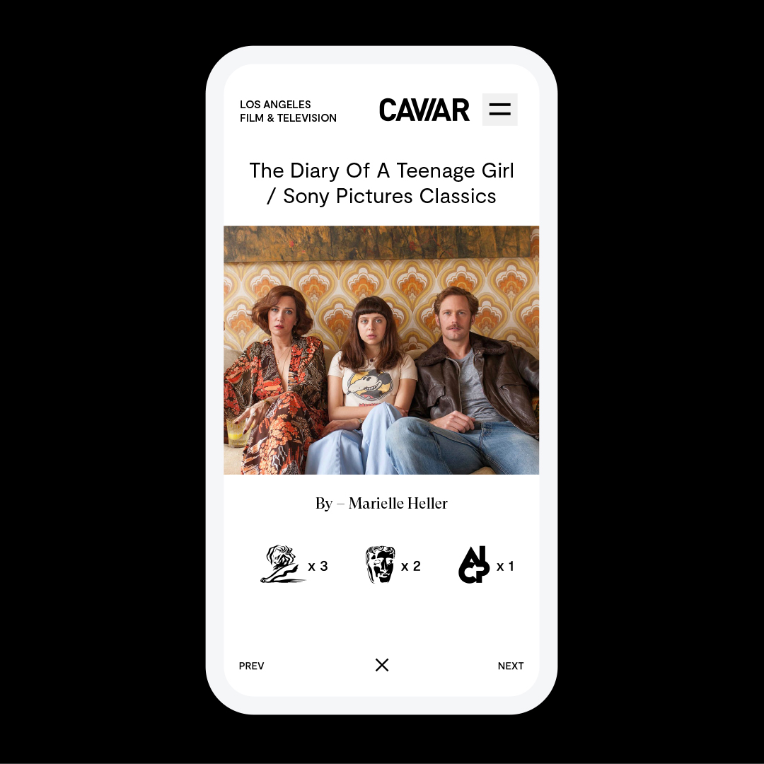
Caviar has been a longstanding partner to Funkhaus, and their previous website wasn’t keeping pace with the growth of their business across their offices. They needed a website with regional-specific flexibility and a future-proofed architecture that could stretch up and down uniquely for each market.
Caviar
Brand Identity Refresh
“Minimal European Street”
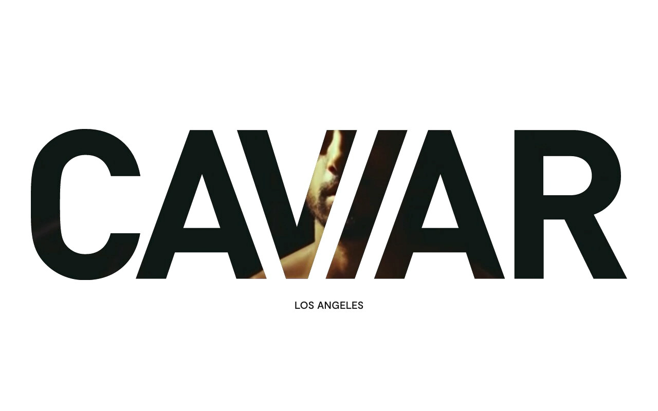
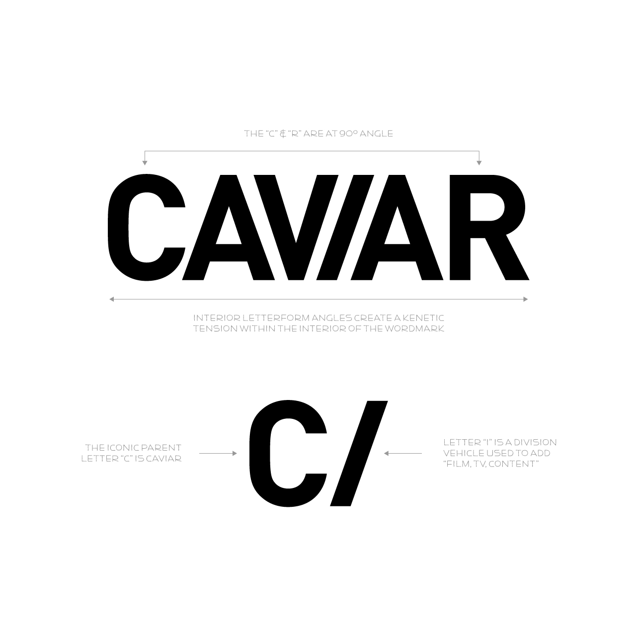
Going back to the original inspiration of the Caviar logo we designed back in 2010, the website project served as a vehicle to modernize their identity in the supplemental fonts, color, and layout.
Website Design
An International Creative Force Made Cohesive
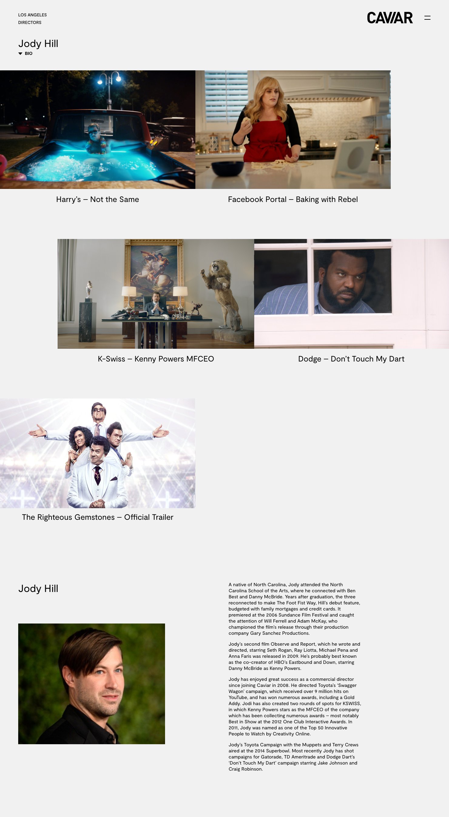
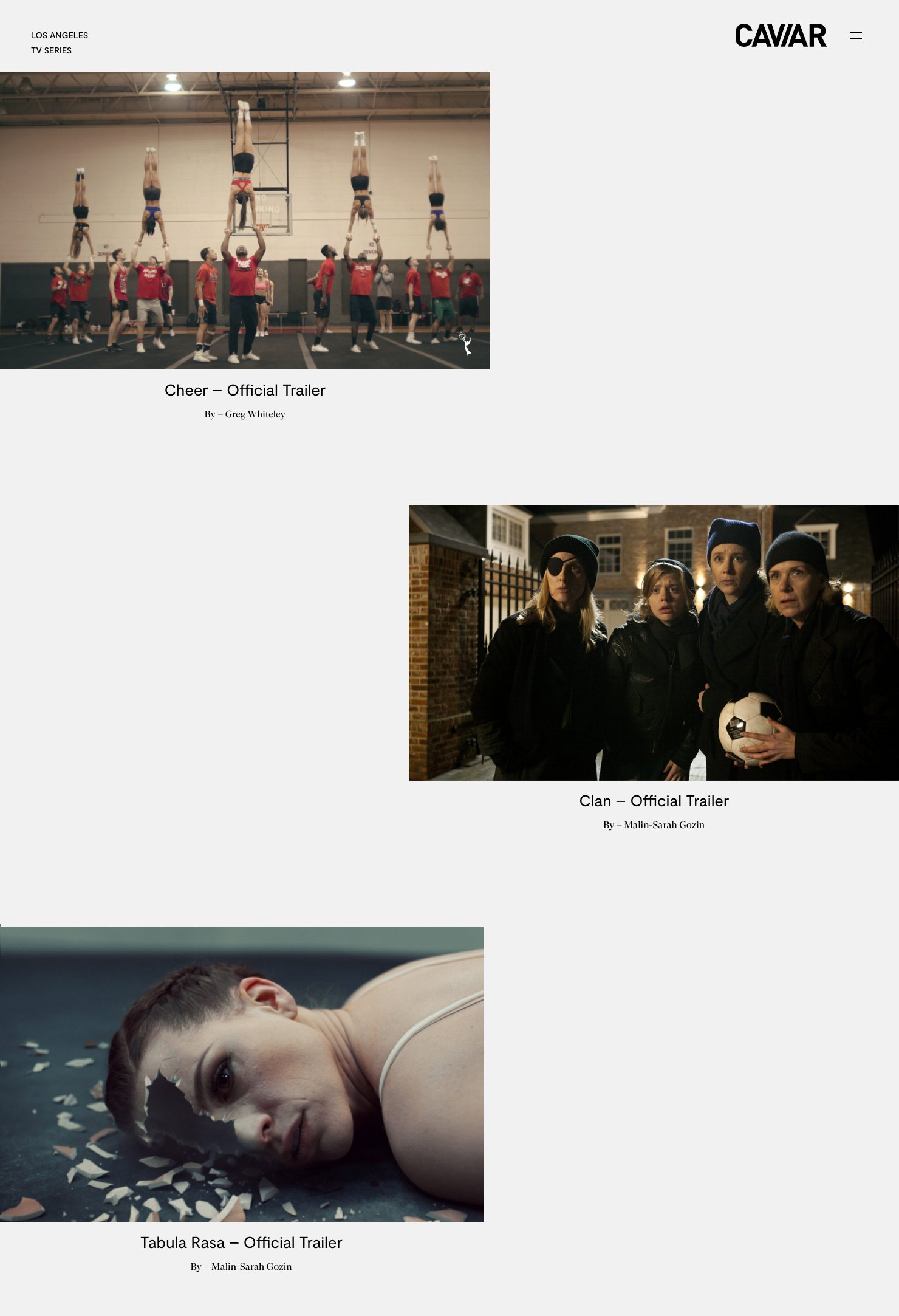
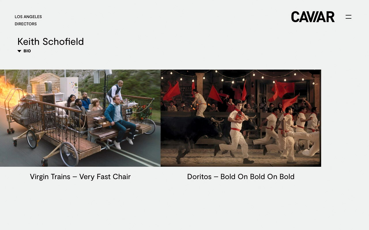
The previous incarnation of the Caviar site was vibrant to the point that it was beginning to compete against their portfolio. This was coupled with clashing design sensibilities between their markets and respective target audiences. So we did what we do best - created a sophisticated, minimal design that would let their work shine while also playing homage to a design core that Dave Funkhouser has coined, “Minimal European Street.”
With a region-detect IP functionality, each office can fully control the presentation of their work and the structure of their site according to the needs of their local market.
