Talent agency and production company ILA has an uncommon edge in the space: their approach naturally challenges common industry notions of what it means to be a photographer, with their strong and expansive roster of creatives whose work is rooted in fashion photography but for whom video content is a natural extension of their practice. They came to us to build an aesthetically driven digital home for their roster, one that offered integrated and organic representation of their photographers as multidisciplinary creatives. We created an artful portfolio site that puts their work front and center, with a layout that takes cues from the fashion world and allows projects that are both still and in motion to be presented with style.
ILA
Website Design
Style and security in a digital platform
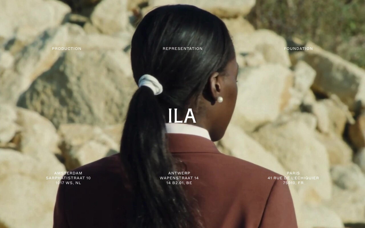
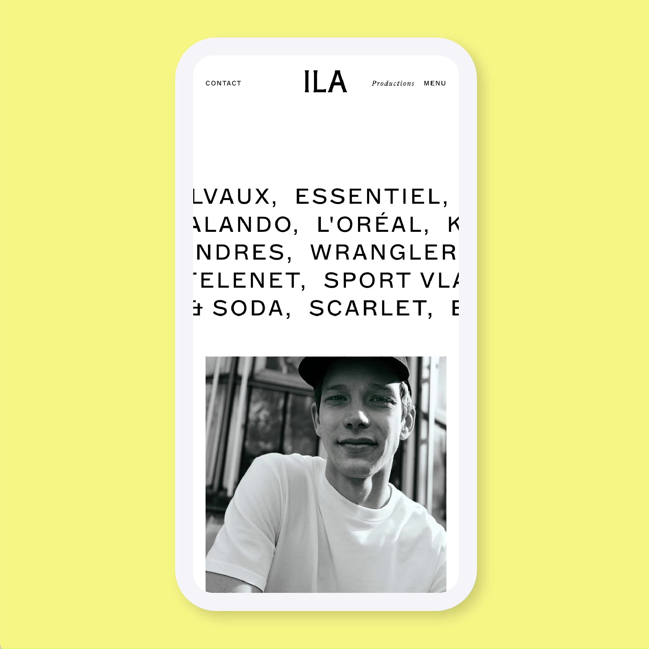
ILA’s new website is a digital experience that walks the line between minimalistic design and anti-design, leaving open space in each grid that allows their stunning photo and film content to shine at every stage and taking inspiration from the pages of glossy fashion and design magazines. For their digital home base, we put their exemplary photographic work at the forefront, making it the star of the show and the focal point for visitors. We took inspiration from classic fashion and print design layouts, using considered fonts, minimal color palette, and a stark backdrop to create a framework for the photos to live in that doesn’t compete with their visual impact.
In addition to style, industry-specific security concerns were a consideration when building out the site, as many agencies in their field want to protect their proprietary imagery. To keep their content in their hands, we implemented safeguards throughout the site to prevent downloads and screen grabs of ILA’s original high resolution images.

Creative Strategy
Intuitive design big enough for an expansive form
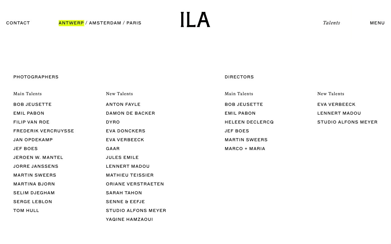
With ILA’s unique position in mind, we wanted to carve a strategic path forward that would showcase each individual creative’s portfolio and allow the user to see the entirety of their capabilities — however, working with such a large volume of photography as part of this strategy presented a unique design challenge.
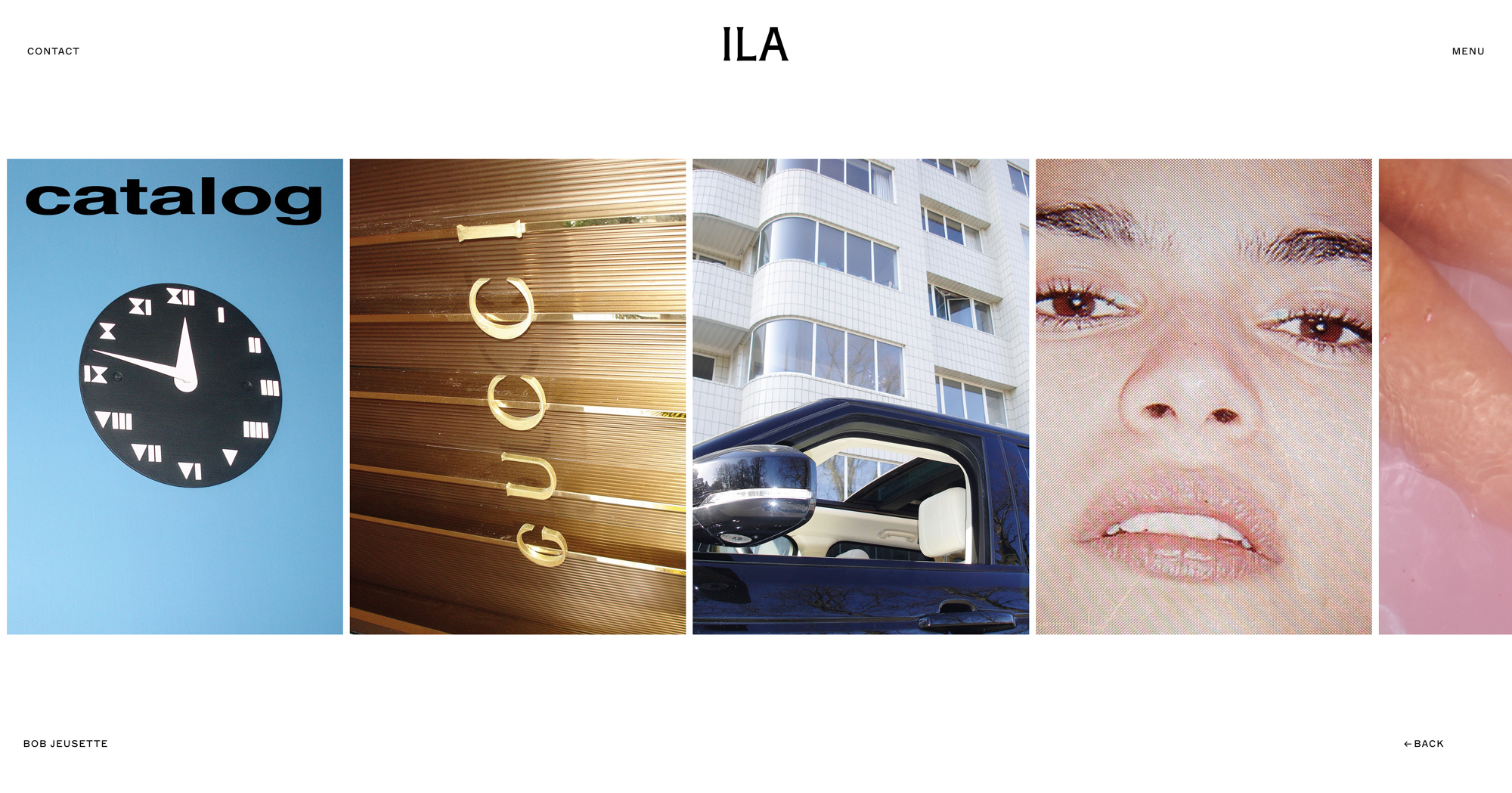
We designed and built a streamlined yet intuitive grid system that allowed for exploration of entire portfolios in a way that is organized and easy and enjoyable to navigate. Integrating still imagery with video content, the resulting presentation is architectural, organized, and stylish.
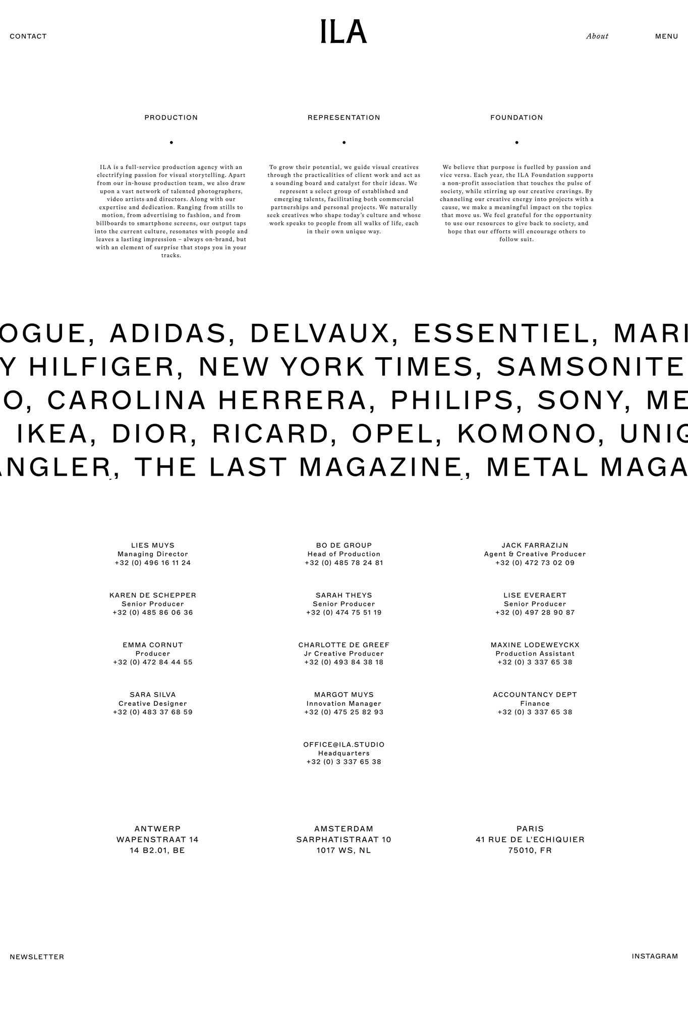
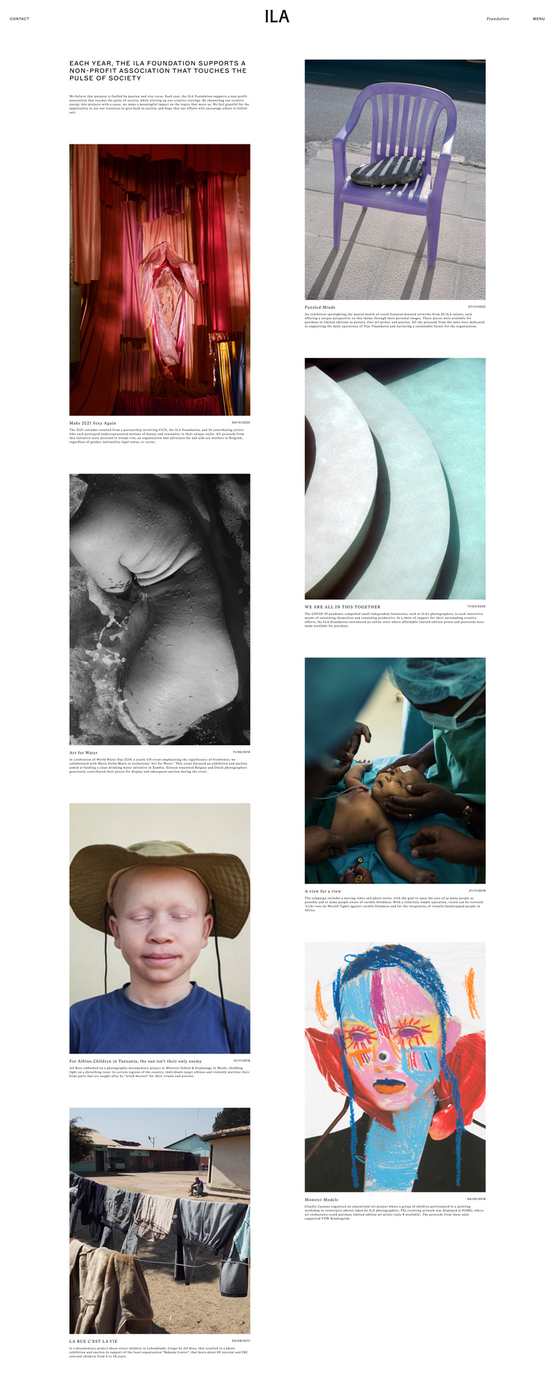
We applied the same principles to the section of the site dedicated to the ILA Foundation, their non-profit organization. While presenting calls-to-action and offering information about special events, this section holds true to the overall style of the site and embodies the feeling of exploring the pages of a magazine, retaining a cohesive presentation across their brand.
