As a company, Prettybird is always looking to subvert expectations. We’ve enjoyed a long-standing partnership with the creative powerhouse, and in our most recent collaboration they challenged us to create a site that would go beyond a traditional presentation of a creative roster in the production world.
Prettybird
Strategy
Shining a spotlight on Prettybird’s roster of talent
We knew that to be successful in this project meant to not only create a site that was forward-thinking and futuristic, but that tells Prettybird’s story in a cinematic way, highlights their breadth of talent, and creates a memorable user experience.
Our focus was on highlighting not only their cool factor, but their capability to attract and retain talent, which shows potential partners that they are a great choice for cultivating a career.


Website Design
Using animation to move beyond a traditional portfolio
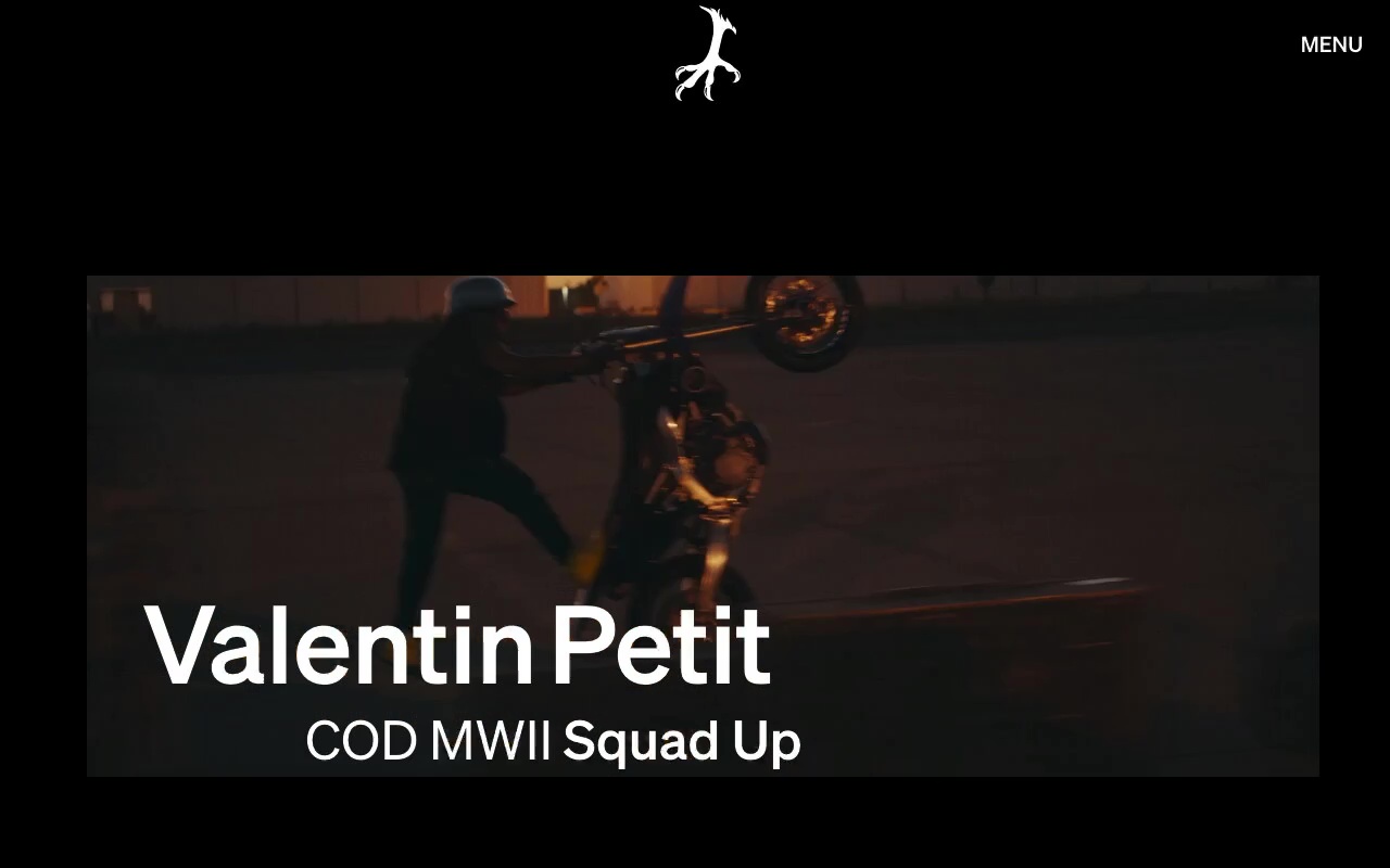
Their new homepage, the Creator Canvas, allows for true immersive discovery by pairing smooth, inviting motion with Prettybird’s exceptional portfolio of up-and-coming and established filmmakers. Inspired by the scroll of social media feeds, the Canvas uses narrative animation to present a captivating cosmos of stunning content for the user to explore.
With this feature, the user is able to choose their own adventure, from enjoying the imagery of featured projects to diving deeper into the company’s story throughout the site, fluidity was a consistent standard we held ourselves to in the user experience of Prettybird.
Dual Navigation
Balancing avant garde exploration with traditional menu design
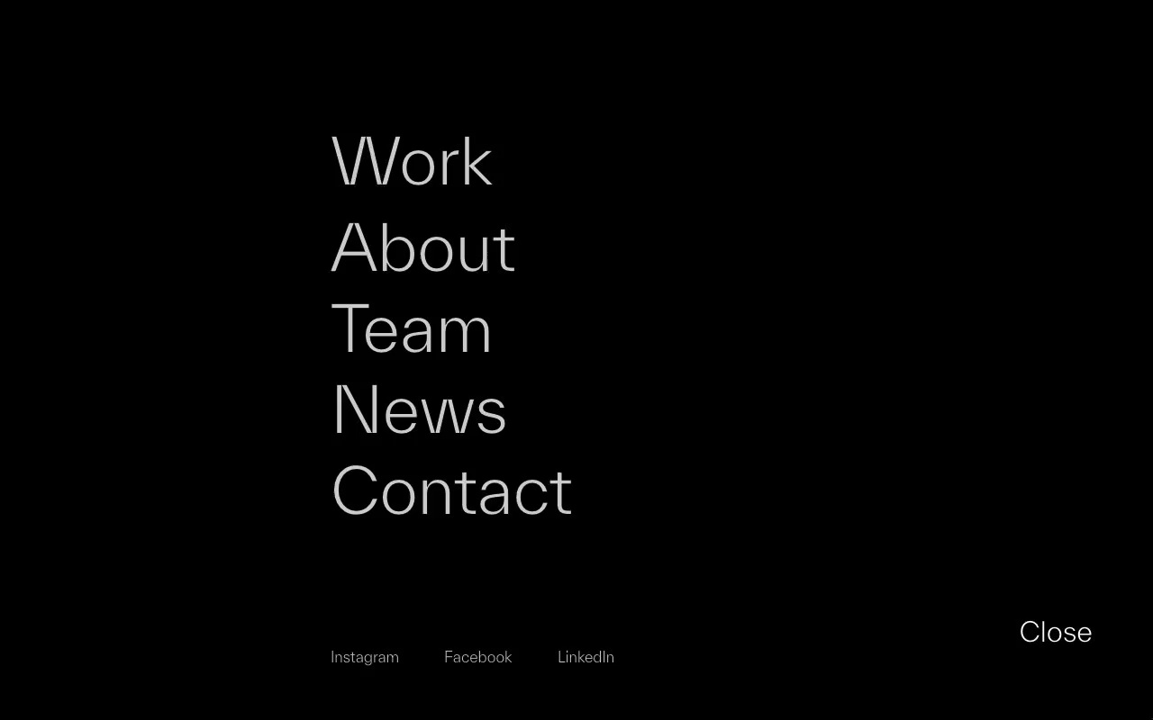
We paired this avant garde homepage with an easily-accessible shelf menu, ensuring the user can always have a quick-access view of all the sites' parts — plus, navigating to the shelf menu doesn’t sacrifice the user’s place in the canvas.
This index allows everyone from casual visitors to those looking for specific information to navigate the site intuitively and with ease, and wander for as long as they like with the knowledge that they always have the ability to return to a clear, crisp, traditional menu.
Ventureland
Building an edgy digital home for Prettybird’s creative partner
Always on the cutting edge, Prettybird has branched into original film and content production with their award-winning partner company, Ventureland, who we had previously worked with on brand design. Naturally, we needed to incorporate a sense of edge and adventure into their site, as well.

We used the concept of a prism — something that refracts, reflects, and surprises — to represent that Ventureland is all about defying expectations. As the user scrolls through the page, they zoom deeper into this prism world, which is angular, fractal, and unexpected.
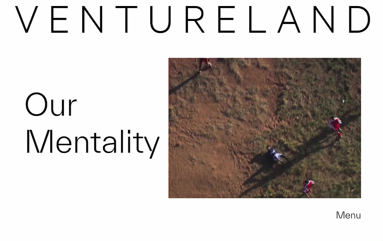
To provide a sense of groundedness in this dimensional space, we incorporated elements of classic magazine design that simplify content and bring the user back down to earth — before launching off again.
