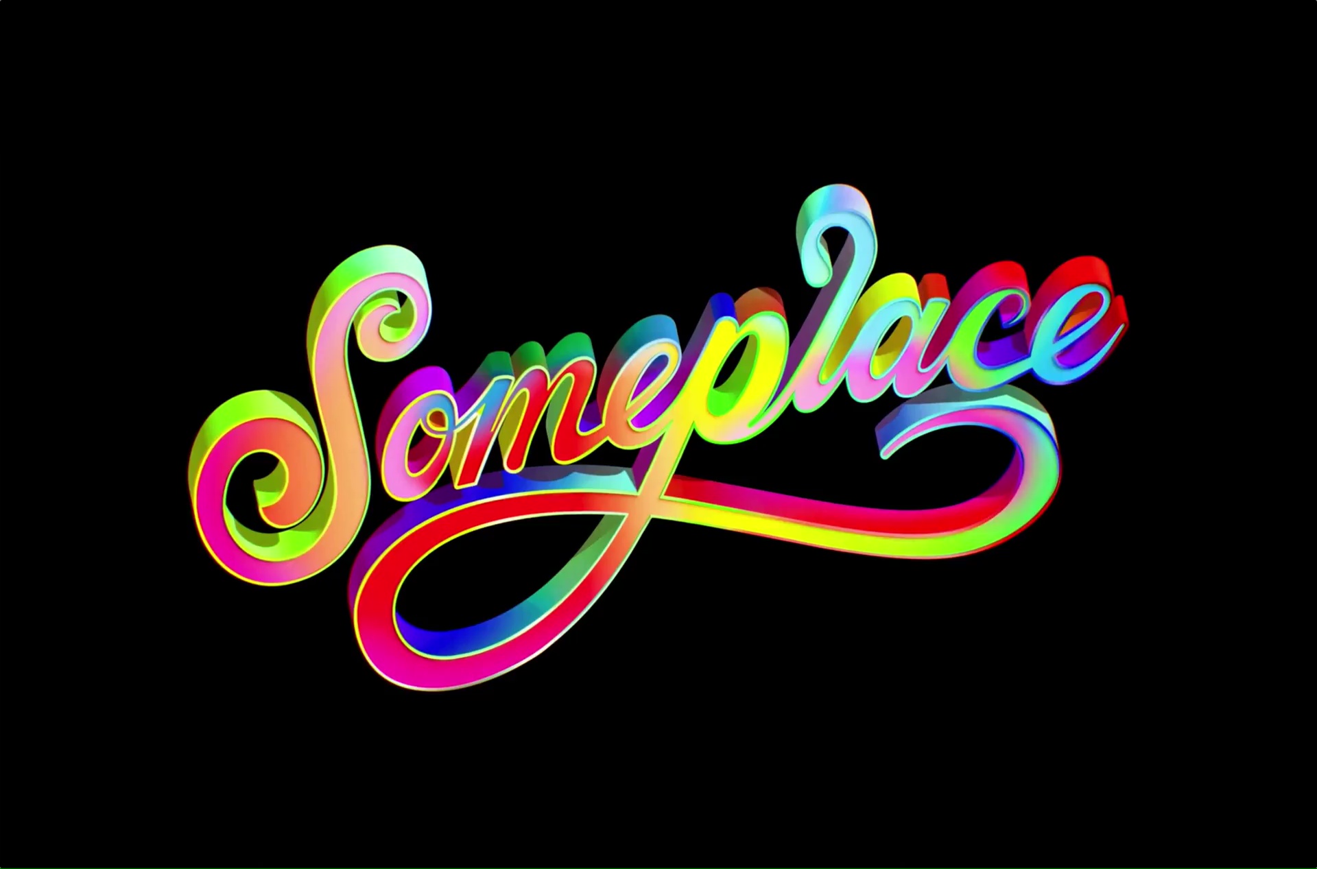
In recent years, the creatives behind cutting-edge LA-based creative agency Someplace observed a looming “sameness” growing in the advertising industry and wanted to combat that with a wave of color, vibrancy, and excitement — through both their work and their web presence. They came to Funkhaus to collaborate on a bold new site with a standout landing page that welcomes the user into their unique world.
Someplace
Digital
Matching the brand’s creativity with a dynamic and eye-catching site
With 20 years of collective experience, Someplace was already standing on solid ground with their work pedigree — our job was to bring the new incarnation of their brand to life online, jumping off from the incredible identity illustrations done by Steven Wilson Studio.
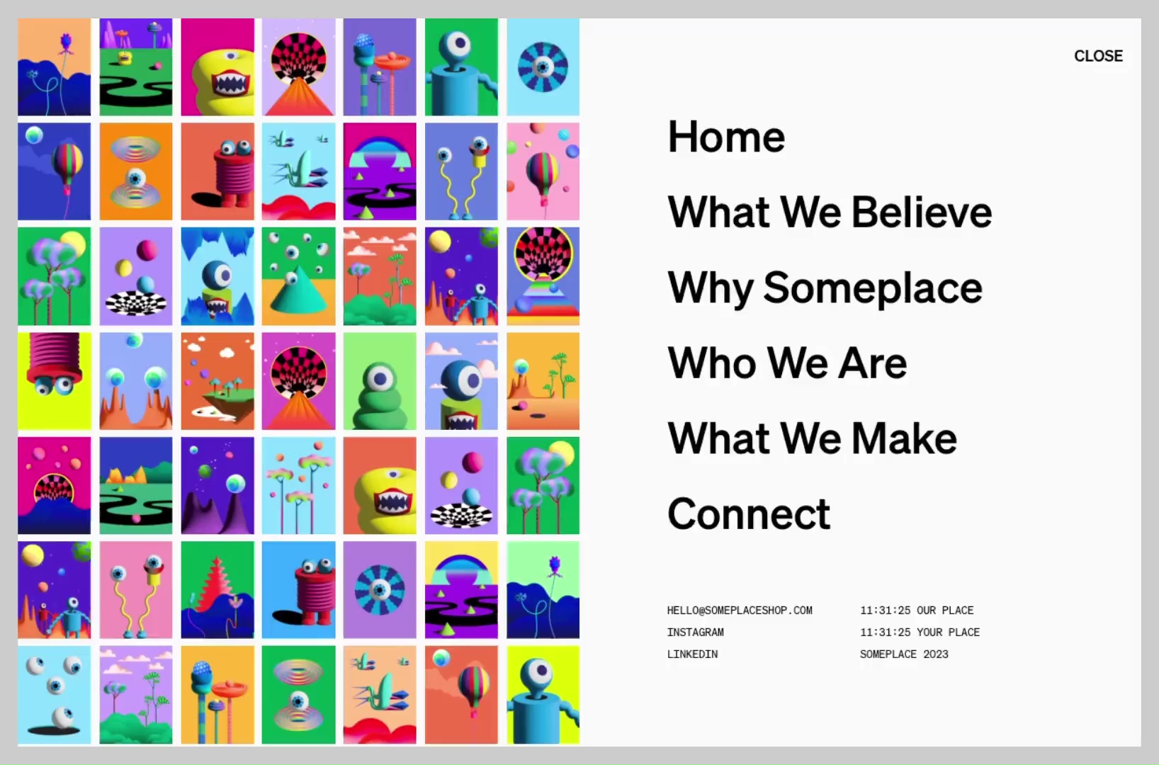
We played with fun, colorful, and loud design elements, balancing functionality with whimsy and creating a user experience that feels like you’re entering a whole new world.
As they put it, “every brand has ‘Someplace’ in the world” and this was our creation of that for them. The resulting site makes a big splash, and is built with a structural modularity that will grow with the brand over time.
Animation
Encouraging exploration through an immersive digital experience
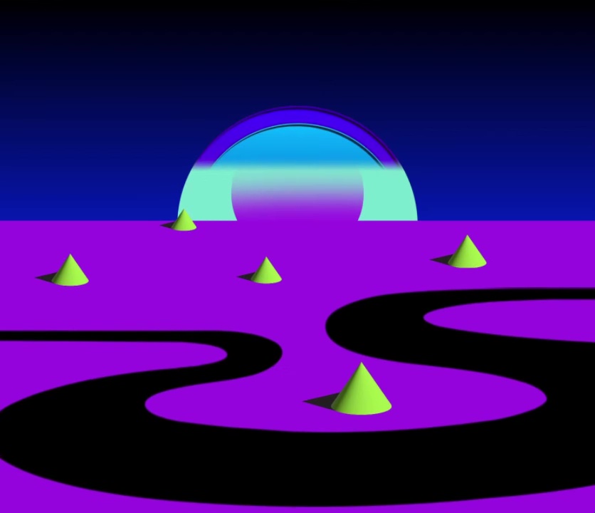
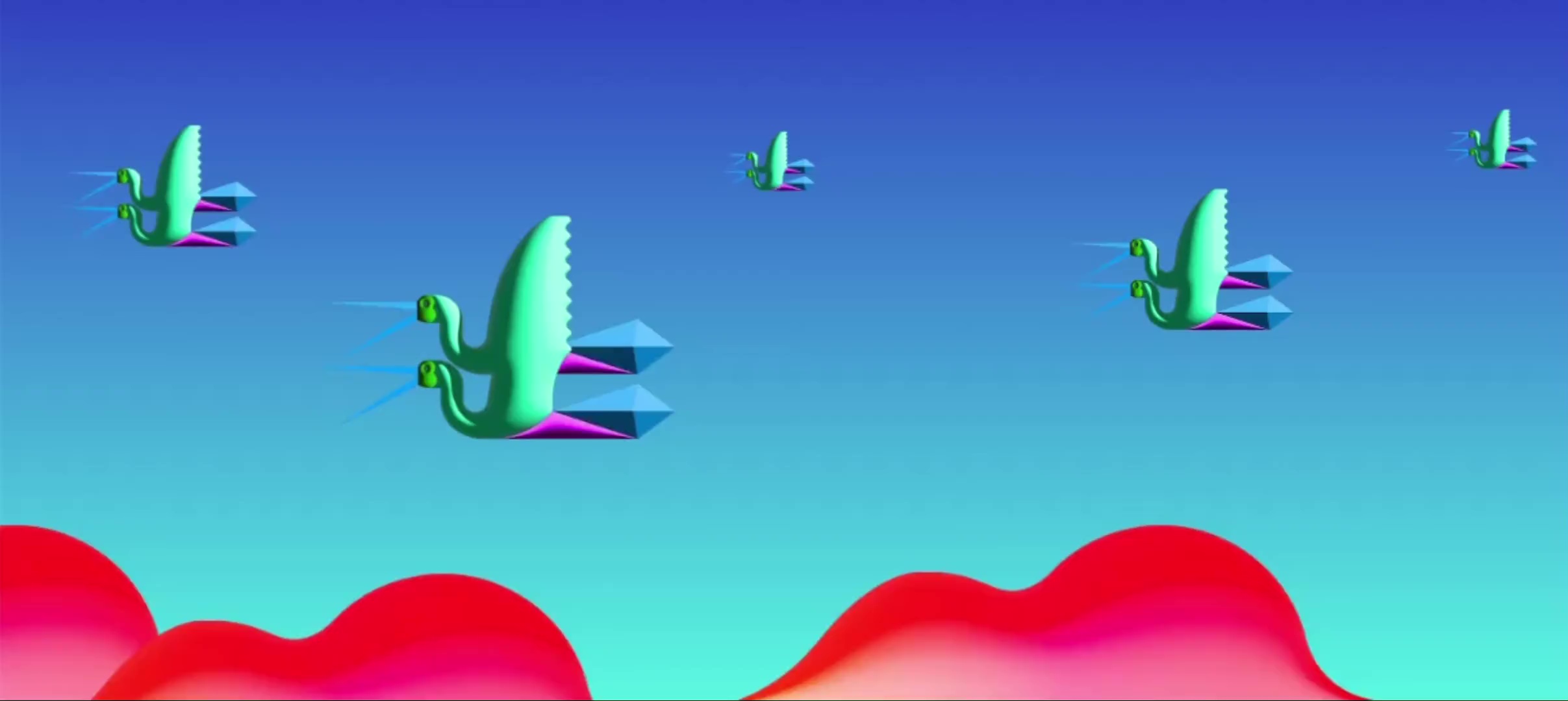
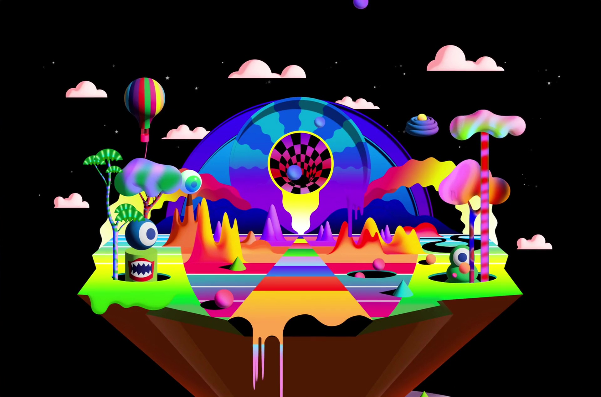
We knew that the experience of visiting Someplace’s new site had to be unforgettable, so we utilized Lottie formats to create the eye-catching animation that now appears on their homepage: a psychedelic island-scape consisting of one core graphic accentuated by a number of smaller animations.
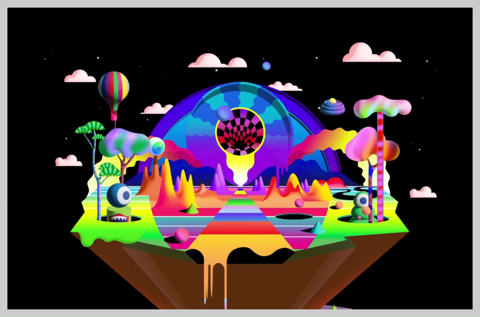
The island animates on scroll, triggering balls bouncing, little monsters appearing and disappearing, and clouds hovering — each individual animations playing on their own timelines.
As users explore the site, they continue to interact with additional animations, all unified by an ultra-saturated color palette and recurring characters.
We pushed each other to make our work great. That's usually a sign of a great partnership.
Daniel Sheniak, CMO of Someplace
